
Editor Interface
There are two editor interfaces in WordPress, the Classic Editor and the Block Editor. Most KB contributors at UVM are more familiar with the Classic Editor, and most articles in the KB were developed using the Classic Editor. It is recommended to use the Classic Editor in most cases.
Getting Started with the Block Editor (optional)
Most existing articles were created using the Classic Editor, which is what you see in this screenshot:
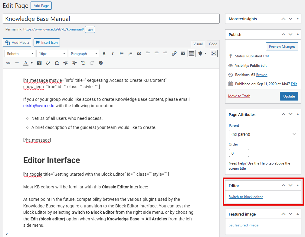
At some point in the future, compatibility between the various plugins used by the Knowledge Base may require a transition to the Block Editor interface. You can test the Block Editor by selecting Switch to block editor from the right side menu, or by choosing the Edit (block editor) option when viewing Knowledge Base -> All Articles from the left-side menu.
It is recommended to test the Block Editor only with new or draft articles. Editing existing published articles in the Block Editor that were created using the Classic Editor adds complexity.
If you switch to Block Editor, make sure to Update or Save changes first.
The rest of documentation in this article below refers to the Classic Editor.
Conventions: Styling, Naming, etc.
Proper and consistent style and naming conventions are critical not only for user experience, but also for the effectiveness of the KB-search feature and SEO.
What Should Be Documented
- Document the Best way—don’t document every way.
- Don’t document something that’s already documented well elsewhere—point to reputable documentation instead.
- Exception: there are significant UVM-specific aspects of the process.
Writing Voice and Tone
- Use you when referring to the reader.
- Avoid using We as the author. Instead, use a passive voice, for example, It is recommended…
- Avoid jargon or technical language.
- In cases where this is unavoidable, try to link to resources with explanations of the jargon.
Article Titles
Article titles should be concise, clear, and accurately represent the contained content. Avoid multi-line titles, and strip superfluous language where possible.
For example, “Accessing Network Folders” is a much better title than “How to connect to the Shared, My Docs, Netfiles, and Zoo Network Folders”.
An article’s title is used to create the article’s URL, so it’s important to have a well-considered title from the beginning. You can rename an article and manually change it’s URL later, but avoid that when possible.
If you change an article URL (A.K.A. permalink), the old permalink will lead to a 404 page not found error. This can lead to broken links in other articles and on search engines, and can negatively affect the reputation of Knowledge Base. For these reasons, a redirect should be set up to send people to the new URL when they click on a link to the old URL. Record the old permalink and please contact etskb@uvm.edu when modifying a permalink.
Punctuation and Style
The use of consistent grammar, punctuation, sentence structure, and formatting is paramount and includes, but is not limited to, the following rules:
- End complete sentences with a period, question mark, or exclamation mark!
- When describing a link or button that includes an ellipsis (i.e. Settings…), include the ellipsis in the description.
- When referring to a screen element the reader must interact with, make the text of the element bold (i.e. “Click the Settings… button.”).
- Use Roboto font.
Headings
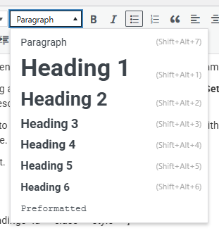
- Headings should be nested in order, not skipping any.
- Heading 1 is reserved for the Title and should not be used within the editor.
- Toggles are interpreted by web browsers as Heading 3.
- As such, toggles should always be nested below a Heading 2.
- When dividing text within a toggle into sections, Heading 4 should be used next.
- Use Preformatted for code blocks and terminal commands.
- Use Paragraph for all other non-heading text.
- Change the typographic emphasis (and less commonly, the font size) manually if required.
Numbered and Bulleted Lists
Concrete, sequential steps should use ordered/numbered lists. A user should be able to to follow each step to complete the desired task or process.
Unordered/bulleted lists should be used when order doesn’t matter, like when you’re describing service features or recommendations.
Best Practices for Lists (and an Unordered/Bulleted List Example!)
- Edit text down to only what is needed.
- Use specific wording, identical to the actual options or text (i.e. “Click the Settings… button.”).
- Use appropriate, consistent punctuation.
- Include only 1 (or 2 if brief) steps per list item.
Ordered/Numbered List Example
To request your transcript through MyUVM, follow these steps:
- Visit MyUVM and sign in with your NetID and password.
- Within the Academic Records card, select Request My Official Transcript.
- Click Mail or Email, depending on your desired delivery method.
Formatting Phone Numbers
- Always include the area code.
- Phone numbers should be formatted thusly: (802) 656-2604
Buttons & Hyperlinks
Formatting Hyperlinks
- If your sentence is similar to “Click here to complete the form“, or “Visit the Registrar page for more information“, the entire sentence should be hyperlinked.
- Do your best to keep these hyperlinked sentences concise and descriptive.
- References to specific services, supplemental KB articles, and other resources may hyperlink specific relevant words.
- Try to hyperlink several words, rather than only one word. This improves visibility of that link.
- If the same hyperlink appears in an article multiple times, use the same link text for each instance.
Creating Button Hyperlinks
In some cases, it can be useful to have an obvious button, front-and-center on a KB guide, like this:
Creating this button requires some basic editing of your guide in the Code section, as this theme does not include a gui-based method of creating them.
- Click Code in the top-right corner.
- Copy and paste the following into the spot where your button will appear.
<p class="button-kb"><a href="https://www.path.tld">Button Text</a></p>
- Replace https://www.path.tld with the destination URL.
- Replace Button Text with the text to display on the button.
Categories & Tags
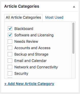
Categories
Categories are the high-level organization for the KB, and are visible on the main Knowledge Base page.
Each article must have at least one category assigned to it, but can have multiple if appropriate. If a user selects one of the Help Topics from the KB main page, they will see a listing of all articles associated with that category.
Tags
Tags make the KB search more effective. They also help with search engine optimization. It is recommended to assign one or more tags to each article, although it is not required.
Rules and recommendations:
- Chose existing tags before creating new ones, especially for articles about a specific product, like “Outlook”.
- Use simple, concise names ( “Assignment” vs. “Assignment Tool”).
- Don’t use tags to specify author or department.
- Use vendor names where appropriate ( Nintendo vs. Wii U).
- Use Title Case for Tags ( “Browser Cache” vs. “browser cache”).
- Use spaces in multi-word tags, not dashes or underscores ( “Microsoft Teams” vs. “Microsoft-Teams”).
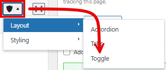
Toggles, Messages, Tabs, & Accordions
This guide refers to short codes used by the KnowAll KB theme. Shorcodes can be inserted by selecting the expanding the Heroic Shortcodes menu or by copying and pasting an existing Shortcode. You can read more about Heroic Short Codes here.
Toggles
[ht_toggle title="Toggle Title" id="" class="" style="" ]
This is the toggle content.
[/ht_toggle]
Toggles are an organizational device used in nearly every article, except in cases where the article scope is exceedingly small. Using toggles to condense information enables an article to contain a lot of content without appearing bloated. Users can skip over toggles that are not relevant to them.
In the majority of cases, a toggle should contain all the steps needed to complete a given task – even when some of those steps are redundant with other sections of the guide.
Examples of common uses:
- Connecting to UVM Wireless – toggles for a variety of operating systems and device types
- Clearing Browser Cache – toggles for common browsers
- KB Manual – toggles for various features and practices
It is not possible to have a toggle within a toggle (nested toggle).
Messages
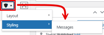
[ht_message mstyle="info" title="Message Title" show_icon="true" id="" class="" style="" ]
This is the message body.
[/ht_message]
Messages offer an effective way to draw a reader’s attention to important information. They should be used sparingly and should never be overly packed with information. Messages should always have the Show Icon box checked or set to “true” and include a Title.
It is not possible to nest toggles within a message, but it is possible to put messages in a toggle (as is the case here!).
Accordions & Tabs
While a Toggle is a single, self-contained set of instructions or processes, accordions and tabs are a way of organizing like-content into a single entity. The most notable feature of accordions and tabs is that they always have one section expanded.
Why avoid Accordions and Tabs
Below is the default text organization of an accordion (without [] brackets). Tabs are very similar, but have a different ht_ tag.
ht_accordion sections=”2″ section_head_1=’Section Head’ section_content_1=’Section Content’ section_head_2=’Section Head’ section_content_2=’Section Content’ id=”” class=”” style=””
- Tedious and confusing to add new sections.
- You must add incremental section_head and section_content fields, as well as increment the count of sections. For longer accordions and tabs, this can be complex and lead to hard-to-find errors.
- Fields are encapsulated by quotation marks.
- If you ever quote your text (i.e. Click “More Options”), you have to swap the encapsulating characters from double quotes to inverted commas.
- The opposite is true if you ever use an apostrophe (i.e. UVM’s Admissions department).
- It’s a big block of text, which can be difficult to parse or troubleshoot when updating content.
Just don’t use them. Use toggles instead.
Images & Screenshots
Screenshot Shortcut
- macOS Screenshot Shortcut Keys
- Option + Shift + 4 (+ spacebar to screenshot a window instead)
- More Info (screenshots on macOS)
- Windows Screenshot Shortcut Keys
- Windows Key () + Shift + S
- More Info (general shortcut keys)
Screenshot Editing Recommendations
Screenshots are valuable enhancements to any article and can provide useful context for support staff, users who have strayed from the correct steps, and for visual learners.
Use light mode and default themes.
Switch your computer, device, or app to light mode before taking screenshots. Use default themes to keep the focus on the important elements and ensure the screenshots are accurate for the greatest number of users.
Display relevant steps and context.
A screenshot should be a visual representation of the instructions immediately proceeding it in a support article. Show the icons, buttons, links, or fields you’ve instructed the user to interact with. Sometimes it’s also helpful to include some surrounding visual context to help the user see that they are on the right track and help them find the relevant elements, like in this example:
Don’t show the entire window—crop it down.
If possible, you should crop unnecessary space in your screenshots. You can also try to reduce the size of the application or browser window before capturing to reduce the need to cut-out sections or limit blank space. This example highlights the elements the user needs to interact with, and cuts out the superfluous items from the context menu:

Use screenshot adornments.
Put a box around key buttons or menus to draw a user’s eye. Use an arrow to point a user to the next step. If you must use multiple arrows, make sure they show a flow from one step to the next. However, sticking to 1 or 2 steps per screenshot is ideal in most cases.
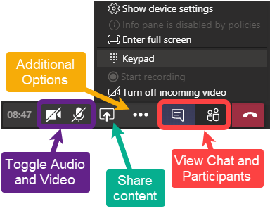
Additional adornments can sometimes help when to draw attention away from or towards a certain element, like in this example:
Too many adornments can detract from the usefulness of a screenshot. If everything on the page is highlighted, then nothing is highlighted.
Keep it consistent.
If you use a red box and an arrow to indicate where to click on the screen, use the same shapes and colors to indicate the same actions throughout the article.
Screenshots supplement written instruction, not replace it.
It may be tempting to only include your step-by-step instructions in the screenshot, but that affects the accessibility and usability of a guide. It’s crucial that Knowledge Base guides are accessible. The more effective a guide, the more users are able to self-help, leading to fewer support requests.
If you do choose to include text adornments in your screenshot, ensure that text is also written explicitly in the guide. Here is an example of a screenshot with adornments that would require supplemental description in the article:
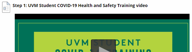
Screenshots that contain video players
When documenting a process that includes screenshots of a video, avoid displaying the entire playback image. Otherwise, the screenshot looks like an element on the screen that the user should interact with.
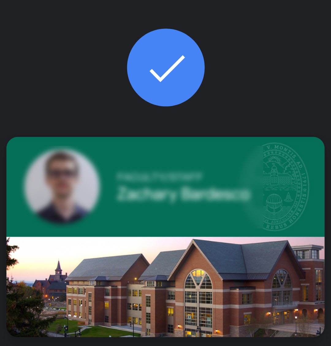
Blur personal details.
Avoid including your own name and email in screenshots.
Uploading your Image
With your adequately annotated and cropped image prepared, you can now upload it.
The Simple Method
- Position the cursor in the content (click the place in the guide where you want the image to go).
- Drag-drop the image file into the WordPress window.
- The image should upload and be selected. Click Insert into page.
After your image has been uploaded, you can edit the image options by clicking on the image, then clicking the pencil icon.
- Alternative Text: Text describing the image’s purpose
- Caption: Generally not required
- Alignment
- None is usually recommended. It displays the image its own blank line.
- Left and Right position the image next to the article text and the paragraph is wrapped around the image.
- Center is often avoided. The reasoning for this is noted lower in this guide in the section on positioning images.
- Size: Leave as Full Size unless a smaller image is desirable for aesthetic reasons or formatting issues after viewing the preview or published article. You can also resize an image by selecting it and clicking and dragging on the squares in the corner of the image.
- Link To: Leave as Media File. This ensures the lightbox plugin functions correctly. Read more about the plugin below.
- URL: Leave as is. This is dynamically set based on file name and the path to the file on the server.
Editing an Existing Image
If you wish to edit the options for your image, click the image once and then click the Edit button () which appears. Click the Remove button () instead to delete an image. Removing or Editing an image this way only affects the current article, not the Media Library.
When editing an existing image, enter alt text if there is none.
Media Library
All the images uploaded to your website can be viewed and edited in the Media Library. Click Media in the left hand navigation menu of the dashboard to view them.
Alt Text
For accessibility, all images should have an alt text. This allows screen readers to describe the image, and displays on the screen in cases when the image cannot be loaded. In HTML, this appears in the img tag as:
alt="image description"
In the WordPress interface, you can edit alt text using the Alternative Text field in the Image details window.
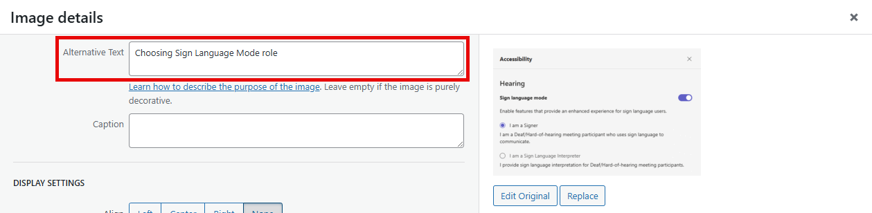
If you make changes to the Alternative Text field, make sure to click Update after and then Save the article the image is attached to.
You can edit alt text from the WordPress Media Library, but if you do, it will not automatically update the alt text for any attached versions of that image in articles. Always make sure appropriate alt text is provided as you’re adding images to any article as you are editing. If you notice missing alt text for an image in an existing article, consider adding some.
Alt Text should be descriptive but concise. Here are some general guidelines:
- Do not include “screenshot of” or “image of”. That part is already implied.
- Avoid punctuation.
- Try to keep alt text to under 125 characters.
- Someone using a screen reader should get the same benefit from the alt text as someone looking at the image.
- Avoid alt text altogether for images that are purely decorative.
- See additional suggestions on the web.
Plugins & Theme
Better Font Awesome
The FontAwesome plugin can be used to insert logos and other helpful graphics into your content.
The Insert Icon button on the editor toolbar displays all available FontAwesome icons. This list is searchable. Icons can be inserted using that menu or by copying an existing icon’s shortcode.
Here are some of the common icons you may use:
[icon name=”apple” class=”” unprefixed_class=””]
[icon name=”windows” class=”” unprefixed_class=””]
[icon name=”trash” class=”” unprefixed_class=””]
[icon name=”chevron-down” class=”” unprefixed_class=””]
Contact Form 7
We use contact forms in a few places on the KB – the most notable being the form for Submitting a Help Ticket.
Copy Anything to Clipboard
This plugin makes makes it so you can surround text with <pre> tags, creating a box that people can copy text from.
Here's an example!
Relavanssi
This plugin improves the KB’s search capabilities, allowing for various weighting based on the article’s title, categories, tags, content, and metadata.
User Role Editor
This plugin gives site administrators greater control over the many roles and associated rights of Knowledge Base editors, authors, or subscribers.
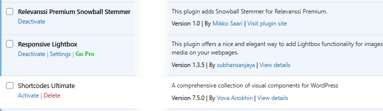
Responsive Lightbox
This is a lightbox plugin, expanding images when clicked to 100% their upload size, and dimming the rest of the web page. Click the image below for an example.
Thanks for contributing to the ETS Knowledge Base!