| Charts allow you to present data entered into the worksheet in a visual
format using a variety of graph types. Before you can make a chart you
must first enter data into a worksheet. This page explains how you can
create simple charts from the data.
The The Chart Wizard takes you through the process of
creating a chart by displaying a series of dialog boxes. The Chart Wizard
is opened by clicking on one of these buttons in the Standard Toolbar ......... ![[chart wizard]](chartwizard.gif) or
or 
Basic Features.
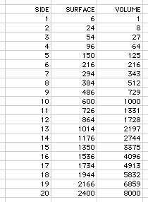
Open a new Worksheet.
-
Enter the following data:
-
In B2 type "SIDE"
-
In C2 type "SURFACE"
-
In D2 type "VOLUME"
-
Starting in B3, and using Autofill, create a column of numbers from 1 -
20 in the column labeled "Side"
-
Starting in C3, enter the formula for calculating the SURFACE of a cube
(6xA),
each of whose sides is the length specified in column B3.
-
Starting in D3, enter the formula for calculating the VOLUME of a cube
(LXWXH),
each of whose sides is the length specified in column B3.
-
Using the Fill command, calculate the Surface and Volume of cubes with
sides from 1 - 20 cm.
-
Your Worksheet should now look like this.
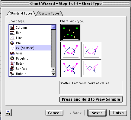
Click on the chart icon .
The Chart Wizard Tool Bar will appear on
the screen.
Create a graph of Side vs. Surface as follows:
-
Select "X-Y Scatter", and click on the "Next" button.
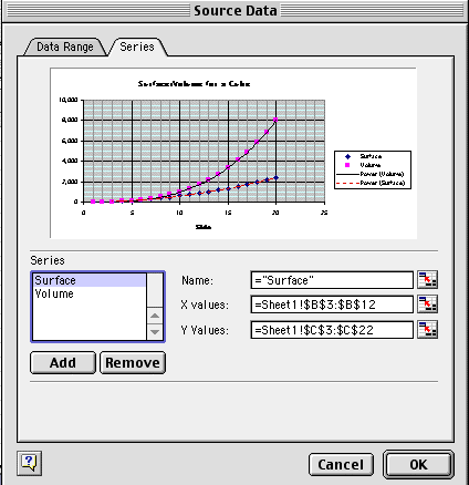
-
In the "Source Data" dialog box which opens,
click on the "Series" tab.
-
Click on "Add". Fill in the dialog box which opens as follows:
-
Name. Type in "SURFACE"
-
X values. Type an "=" then drag the cursor over the cells
from B3:B22.
-
Y values. Type an "=" then drag the cursor over the cells from C3:C22.
Create a graph of Side vs. Volume and as follows:
-
Click on "Add". Fill in the dialog box which opens as follows:
-
Name. Type in "VOLUME"
-
X values. Type an "=" then drag the cursor over the cells
from B3:B22.
-
Y values. Type an "=" then drag the cursor over the cells from D3:D22.
-
Click on the "Next" button.
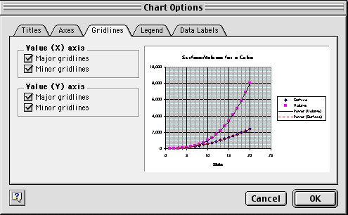
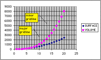
In the "Chart Options" dialog box which
opens:
-
Click on the "Gridlines" tab. Under "Value (X) axis", click on the
checkboxes for "major gridline" and "minor gridline".
-
Click on the "Titles" tab. Enter "Surface and Volume of a Cube" for the
Chart Title.
-
Enter "Side" for the X axis.
-
Click on the "OK" button.
-
The Chart should look like this (without the
Callouts!):
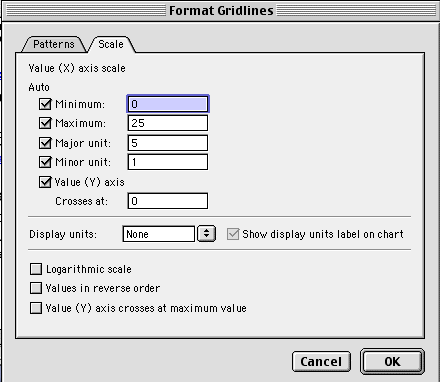
Double-click on one of the minor gridlines. In the "Format
Gridlines" dialog box which opens, click on the "Patterns" tab. This
will permit a selection of color and pattern for the minor gridlines. Select
a medium grey.
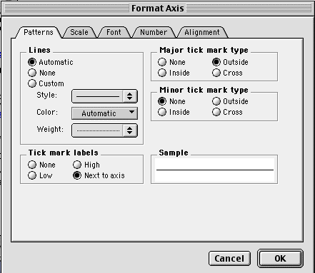
Double-click on the numbers on the Y-axis scale. In the "Format
Axis" dialog box which opens:
-
Select the "Scale" tab. Set the major units to "2000"
-
Set the Font to Geneva Italic Bold, 10 point.
-
The chart should look like this.
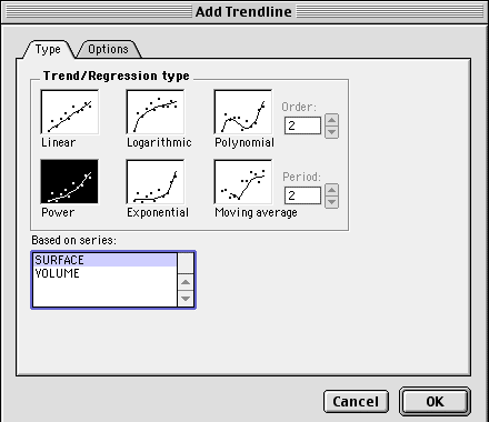
Under the "Chart Options" menu, select "Add Trendline". In the
"Add
Trendline" dialog box which appears, select "Surface" and "Power",
as shown. Add a "Power" trendline to the plot of Volume.
-
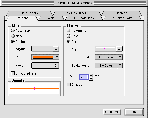
Double-click on the filled box symbols of the "Volume" trendline. In the
"Format
Data Series" dialog box which appears:
-
Select a light line weight.
-
Select orange for the line color.
-
set the marker style to a circle.
-
set the background color to "none".
-
set the size to 7 point.
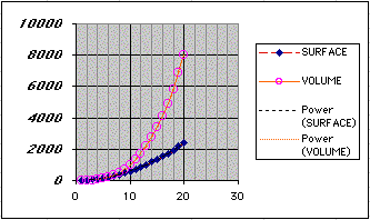
-
The chart should look like this.
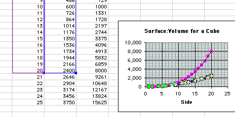
The series and the chart can be extended easily. Click
on the markers of a plot to select them. Excel will simultaneously
select the columns and values which are plotted.
-
Fill down the values for the sides to 21-25 cm long.
-
Use the handles to select the new cells.
-
Excel now plots the values in the new cells as well.
Chart Location - Click As new sheet
if the chart should be placed on a new, blank worksheet or select As
object in if the chart should be embedded in an existing sheet and
select the worksheet from the drop-down menu.

-
When you shake up a Vinagrette, the small droplets
of oil coalesce into larger and larger droplets, and finally into a single
layer. Why is this?
-
The egg is the largest of all human cells. Why is
this?
-
"The Blob" was a 1958 horror movie
classic. It launched the Hollywood careers of both Steve McQueen and
Burt Bacharach. Why can there never really be a blob which eats Manhattan?
|

Other Features.
Resizing the Chart. To resize the chart,
click on its border and drag any of the nine black handles to change the
size. Handles on the corners will resize the chart proportionally while
handles along the lines will stretch the chart.
Moving the Chart. Select the border of
the chart, hold down the left mouse button, and drag the chart to a new
location. Elements within the chart such as the title and labels may also
be moved within the chart. Click on the element to activate it, and use
the mouse to drag the element to move it.
Chart Menu
-
Chart Type - Select the Chart. In the "Chart Type" menu, select
the type of chart desired.
-
Source Data - Additional Data Series can be plotted on the same chart.
-
Enter the values to be plotted in the worksheet.
-
In the "Source Data" menu, select the "Series" tab.
-
Click on the "Add" button to add another series, and fill in the
boxes as above.
-
Chart Options. Self Explanatory.
Format the X axis. Double click on the X axis. The
"Format
Axis" dialog box appears.
-
Patterns - Self-explanatory
-
Scale - Self-explanatory
-
Font - Self-explanatory
-
Number - Self-explanatory
-
Alignment - This tab brings up the "Orientation" dialog box. The
text can be angled upward or downward, either with the slider bar, or by
typing the desired angle into the box.
Copying the Chart to Microsoft Word
A finished chart can be copied into a Microsoft Word document. Select
the chart and click Copy. Open the destination document in Word
and click Paste. |
