DEDICATION
To
My Parents
and
Bohyoung and YunsooAcknowledgements
First and most of all, I would like to thank my advisor, Ben Shneiderman, for his support, guidance, and all his smiles. It was fortunate for me to work with him first as a teaching assistant, next as a research assistant, and finally as a colleague. His respect for and trust in me really have made me go forward with confidence. His enthusiasm and driving force in research and learning was so amazing that even just trying to catch up with him has enabled me to energize my research efforts.
I am also a fortunate to be a student who has had a rare opportunity to work with another guru, Dr. Eric Hoffman. I appreciate his generous financial support for three years with a lot of flexibilities. His vision and enthusiasm in molecular genetics and bioinformatics inspired me to grow my attention in those cutting edge areas.
There are several faculty members whose inputs contributed to the advance of my Ph.D. research. Ben Bederson helped me build my interest in HCI through his HCI class and information visualization class. Eric Baehrecke was my first biology mentor, and he also supported my first year research with HCE. Steve Mount was a motivated user of HCE and provided interesting and challenging suggestions. Lise Getoor and Amitabh Varshney provided invaluable fresh perspectives to my dissertation.
I would like to thank all of HCIL members. Cheerful and encouraging faculty members and friendly student colleagues supported my research by making HCIL a great place to work. Bongshin Lee who built the preliminary version HCE with me as a class project deserves special thanks for continuous feedback and comments on my research. Anne Rose always showed her wonderful smiles to me even when I distracted her with many questions and requests. Harry Hochheiser also deserves my special thanks for his constructive feedback on my research and papers. Catherine Plaisant, Hyunmo Kang, Bongwon Suh, Bill Kules, Haixia Zhao, Aaron Clamage, Hilary Hutchinson, and other HCIL members have provided with a supportive, engaging, and often intellectually challenging research environment in HCIL.
Lastly, my special thanks go to my family members: My parents deserve my appreciation deep in my mind through their devotion to the elder son for over 30 years. Their everyday diligence was an example of my life, and their sacrifice empowered me to break though adversities. Without their devotion and sacrifice, it could not have been possible for me to be what I am. I am very fortunate to have a bright and dedicated wife, Bohyoung. She encouraged me to study in the U.S., waited for me to finish my long military service, and supported me as an intellectual colleague as well as a wonderful wife. My Ph.D. life simply could not be successful without her sacrifice and support. Yunsoo also deserves thanks for playing alone many days waiting for his dad to finish writing this dissertation. His smile, cry, and everything have greatly helped me go forward over the course of my Ph.D. life.
Table of Contents
List of Tables
List of Figures
- Chapter 1 Introduction
Technology advances in many research areas have resulted in easy and efficient generation of observational data sets, most of which are multidimensional or multivariate. The most important task for researchers is to extract valuable insights from those (often large) data sets. New disciplines like data mining have been getting more attention from researchers as they are meant to effectively support such tasks. When researchers have to analyze a new observational data set, they first try to learn what the data set looks like - descriptive modeling. Among other analysis methods for descriptive modeling, cluster analysis is most widely used to describe the entire data set by suggesting natural groups in the data set. Even though clustering algorithms produce useful clustering results, the cognitive understanding of the result is often not good enough to guide discovery since the result is statically represented in most cases, as is common in data mining applications.
Information visualization techniques can help solve this problem. Cognition of the clustering results can be amplified by dynamic queries and interactive visual representation methods, and understanding of the clustering results is transformed to another important data mining task - exploratory data analysis. Interactive information visualization techniques enable users to effectively explore clustering results and help them find the informative clusters that lead to insights.
Besides having a good descriptive model of multidimensional data sets, another challenging task is to identify important features or patterns hidden in the multidimensional space. I use the term, “feature,” in a broader sense. What I mean by a “feature” is not only a dimension (or a variable) but also any interesting characteristics (e.g. clusters, gaps, outliers, and relationships between dimensions) of the data set. Dealing with multidimensionality has been challenging to researchers in many disciplines due to the difficulty in comprehending more than three dimensions to discover relationships, outliers, clusters, and gaps. This difficulty is so well recognized that it has a provocative name: “the curse of high dimensionality.”
One of the commonly used methods to cope with multidimensionality is to use low-dimensional projections. Since human eyes and minds are effective in understanding one-dimensional (1D) histograms, two-dimensional (2D) scatterplots, and three-dimensional (3D) scatterplots, these representations are often used as a starting point. Users can begin by understanding the meaning of each dimension (since names can help dramatically, they should be readily accessible) and by examining the range and distribution (normal, uniform, erratic, etc.) of values in a histogram. Then experienced analysts suggest applying an orderly process to note exceptional features such as outliers, gaps, or clusters.
Next, users can explore two-dimensional relationships by studying 2D scatterplots and again use an orderly process to note exceptional features. Since computer displays are intrinsically two-dimensional, collections of 2D projections have been widely used as representations of the original multidimensional data. This is imperfect since some features may be hidden, but at least users can understand what they are seeing and come away with some insights.
Advocates of 3D scatterplots argue that since the natural world is three dimensional, users can readily grasp 3D representations. However, there is a substantial empirical evidence that for multidimensional ordinal data (rather than 3D real objects such as chairs or skeletons), users struggle with occlusion and the cognitive burden of navigation as they try to find desired viewpoints. Advocates of higher dimensional displays have demonstrated attractive possibilities, but their strategies are still difficult to grasp for most users.
Preliminary studies on multidimensional data analysis led us to design and implement an interactive visualization tool, Hierarchical Clustering Explorer (HCE) (available at www.cs.umd.edu/hcil/hce) [74]. HCE supports interactive exploration of hierarchical clustering results to enable users to build a good description of their data sets. Through years of experience with HCE users dealing with multidimensional data sets, the two basic statistical principles [62] for exploratory data analysis were extended to encompass the interactive visualizations and user interactions, and presented our orderly principles for interactive multidimensional data exploration - Graphics, Ranking, and Interaction for Discovery (GRID) principles. GRID principles have been implemented into HCE as the rank-by-feature framework.
Chapter 2 covers related work and Chapter 3 introduces the Hierarchical Clustering Explorer and explains interactive exploration of hierarchical clustering results. Chapter 4 makes the case for the GRID principles and the rank-by-feature framework for axis-parallel 1D and 2D projections. Potentially interesting ranking criteria and transformations are also discussed in Chapter 4. Application examples of the rank-by-feature framework are presented in Chapter 5. Chapter 6 explains data structures and implementation details of HCE. Chapter 7 summarizes the evaluation results of the rank-by-feature framework and HCE. This dissertation concludes with possible future work and contributions in Chapter 8.
- Chapter 2 Related Work
Since the focus of this dissertation is interactive exploration of multidimensional data sets using low dimensional projections, this chapter introduces work using projection methods in related fields.
- 2.1 Two Dimensional Projection Techniques
Two-dimensional projections have been utilized in many visualization tools and graphical statistics tools for multidimensional data analysis. Projection techniques such as principal components analysis (PCA) [39], multidimensional scaling (MDS) [84], Sammon's mapping [69], and parallel coordinates [43] are used to find informative two-dimensional projections of multidimensional data sets. Self-organizing maps (SOM) [49] can also be thought of as a projection technique. Taking a look at only a single projection for a multidimensional data set is not enough to discover all the interesting features in the original data since any projection may obscure some features [28]. Thus it is inevitable for users to scrutinize a series of projections to reveal the features of the data set.
Since two-dimensional presentations offer ample power while maintaining comprehensibility, many variations have been proposed. I distinguish the three categories of two-dimensional presentations by the way axes are composed:
(1) Non axis-parallel projection methods use a (linear/nonlinear) combination of two or more dimensions for an axis of the projection plane. Principal component analysis (PCA) is a well-established technique in this category.
(2) Axis-parallel projection methods use existing dimensions as axes of the projection plane. One of the existing dimensions is selected as the horizontal axis, and another as the vertical axis, to make a familiar and comprehensible presentation. Sometimes, other dimensions can be mapped as color, size, length, angle, etc.
(3) Novel methods use axes that are not directly derived from any combination of dimensions. For example, the parallel coordinate presentation is a powerful concept in which dimensions are aligned sequentially and presented perpendicular to a horizontal axis [43]. Recent survey of multidimensional visualization techniques belonging to the category (3) is found in [26].
- 2.1.1 Non-axis-parallel Projection Methods
Projection methods in the category (1), non-axis-parallel, were developed by statisticians. The idea of projection pursuit [29] is to find the most interesting low-dimensional projections to identify interesting features in a multidimensional data set. An automatic projection method known as the grand tour [6] , is a method for viewing multidimensional data via orthogonal projection onto a sequence of two-dimensional subspaces. It changes the viewing direction, generating a movie-like animation that makes a complete search of the original space. However, it might take several hours to complete a reasonably complete visual search even in four dimensions [40]. An exhaustive visual search is out of the question as the number of dimensions grows.
Friedman and Tukey devised a method to automate the task of projection pursuit [28]. They defined interesting projections as ones deviating from the normal distribution, and provided a numerical index to indicate the interestingness of the projection. When an interesting projection is found, the features on the projection are extracted and projection pursuit is continued until there is no remaining feature found. XGobi [19] or GGobi [80] (Figure 2.1) is a widely-used graphical tool that implemented both grand tour and projection pursuit, but not the ranking that I propose.
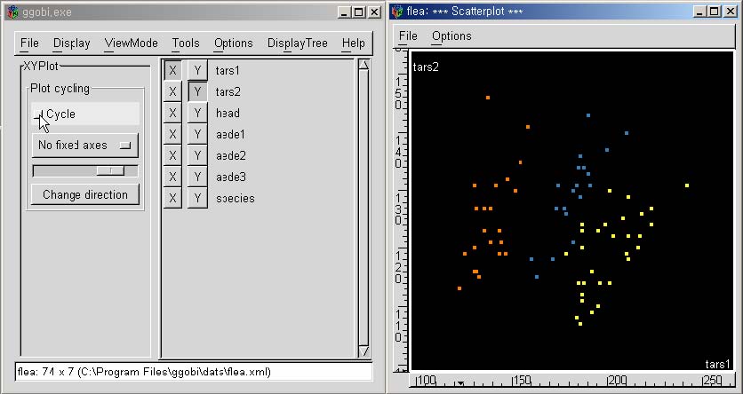
Figure 2.1 GGobi (www.ggobi.org)
There are clustering methods that utilize a series of low-dimensional projections in category (1). Among them, HD-Eye system (Figure 2.2) by Hinneburg et al. [37] implements an interactive divisive hierarchical clustering algorithm built on a partitioning clustering algorithm, or OptiGrid [36]. They show projections using glyphs, color or curve-based density displays to users so that users can visually determine low-dimensional projections where well-separated clusters are and then define separators on the projections.
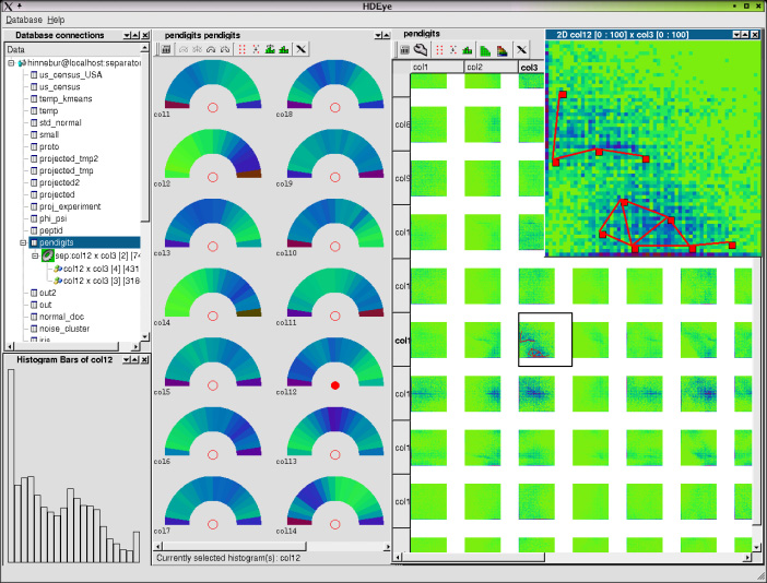
Figure 2.2 HD-Eye [37]
These automatic projection pursuit methods have made impressive gains in the problem of multidimensional data analysis, but they have limitations. One of the most important problems is the difficulty in interpreting the solutions from the automatic projection pursuit. Since the axes are the linear combination of the variables (or dimensions) of the original data, it is hard to determine what the projection actually means to users. Conversely, this is one of the reasons that axis-parallel projections (projection methods in category (2)) are used in many multidimensional analysis tools [34, 79, 87].
- 2.1.2 Axis-parallel Projection Methods
Projection methods in the category (2), axis-parallel, have been applied by researchers in machine learning, data mining, and information visualization. In machine learning and data mining, ample research has been conducted to address the problems of using projections. Most work focuses on the detection of dimensions that are most useful for a certain application, for example, supervised classification. In this area, the term “feature selection” is a process that chooses an optimal subset of features according to a certain criterion [57], where a feature simply means a dimension. Basically, the goal is to find a good subset of dimensions (or features) that contribute to the construction of a good classifier.
Unsupervised feature selection methods are also studied in close relation with unsupervised clustering algorithms. In this case, the goal is to find an optimal subset of features with which clusters are well identified [2, 3, 34, 35]. In pattern recognition, researchers want to find a subset of dimensions with which they can better detect specific patterns in a data set.
In subspace-based clustering analysis, researchers want to find projections where it is easy to naturally partition the data set. There are clustering algorithms based on axis-parallel projections of the multidimensional data. CLIQUE [3] partitions low-dimensional subspaces into regular hyper-rectangles. It finds all dense units in each k-dimensional subspace using the dense units in (k-1)-dimensional subspaces, and then connects these axis-parallel dense units to build a “maximal” set of connected dense units which will be reported in disjunctive normal form. PROCLUS [2] does not partition subdimensions but instead finds a set of k-medoids drawn from different clusters, together with appropriate sets of dimensions for each medoid. Then it assigns the data items to the medoids through a single pass over the database.
- 2.2 Evaluation of 2D Projections
In early 1980’s, Tukey who was one of the prominent statisticians who foresaw the utility of computers in exploratory data analysis envisioned a concept of “scagnostics” (a special case of “cognostics” – computer guiding diagnostics) [85]. With high dimensional data, it is necessary to use computers to evaluate the relative interest of different scatterplots, or the relative importance of showing them and sort out such scatterplots for human analyses. He emphasized the need for better ideas on “what to compute” and “how” as well as “why.” He proposed several scagnostic indices such as the projection-pursuit clottedness and the difference between classical correlation coefficient and robust correlation. I brought his concept to reality with the rank-by-feature framework in the Hierarchical Clustering Explorer where I create interface controls, design practical displays, and implement more ranking ideas.
There are also some research tools and commercial products for helping users find more informative visualizations. Spotfire [79] has a guidance tool called “View Tip” (Figure 2.3) for rapid assessment of potentially interesting scatterplots, which shows an ordered list of all possible scatterplots from the one with highest correlation to the one with lowest correlation.
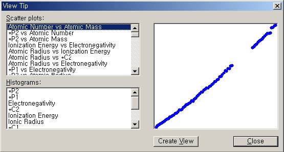
Figure 2.3 View Tip in Spotfire
Michael Friendly's Corrgram (Figure 2.4) [30] uses a color and shape coded scatterplot matrix display [86] to show correlations between variables. Variables are permuted so that correlated variables are positioned adjacently. Guo et al. [34, 35] also evaluated all possible axis-parallel 2D projections according to the maximum conditional entropy to identify ones that are most useful to find clusters. They visualized the entropy values in a matrix display called the entropy matrix [58] that is also a color coded scatterplot matrix (Figure 2.5). My dissertation research takes these nascent ideas with the goal of developing a potent framework for discovery.
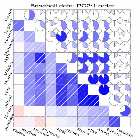
Figure 2.4 Corrgram [30]
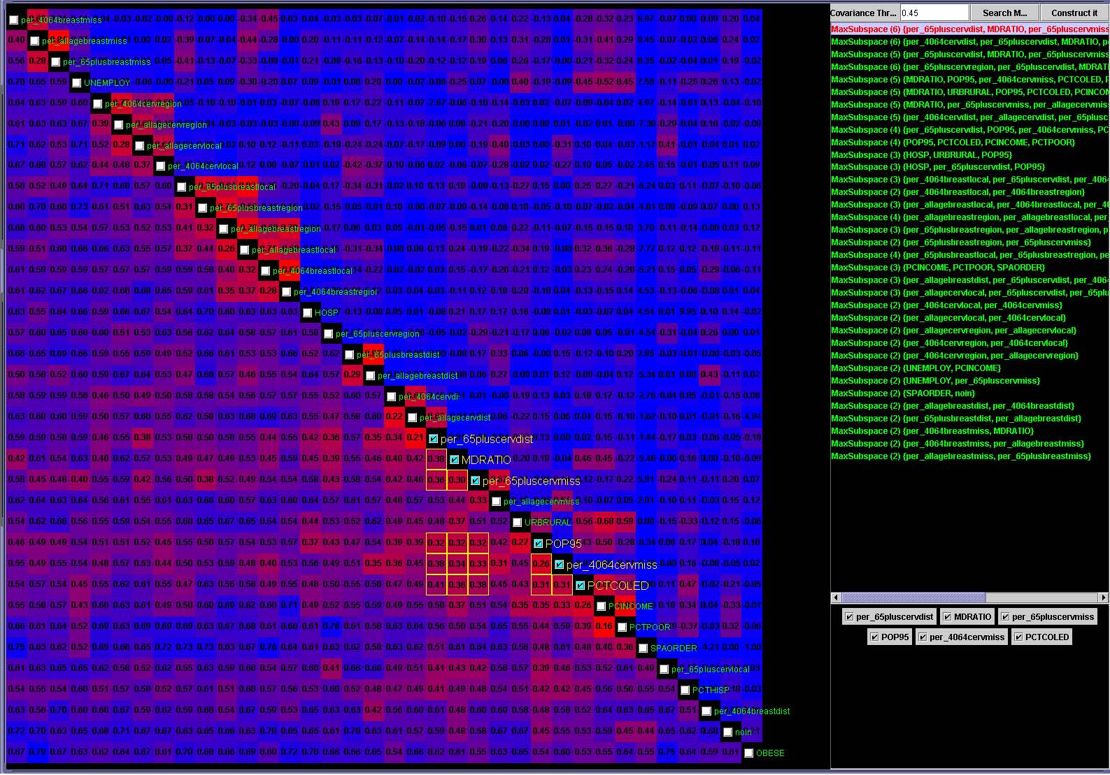
Figure 2.5 GeoVista Studio [58]
- 2.3 Arrangement of Dimensions
In the information visualization field, about 30 years ago, Jacques Bertin presented a visualization method called the Permutation Matrix [10]. It is a reorderable matrix where a numerical value in each cell is represented as a graphical object whose size is proportional to the numerical value, and where users can rearrange rows and columns to get more homogeneous structures. This idea seems trivial, but it is a powerful way to observe meaningful patterns after rearranging the order of the data presentation.
Since then, other researchers have also tried to optimally arrange dimensions so that similar or correlated dimensions are put close to each other. This helps users find interesting patterns in multidimensional data [5, 30, 89]. Yang et al. [89] proposed innovative dimension ordering methods implemented in XmdvTool [87] (Figure 2.6) to improve the effectiveness of visualization techniques including the scatterplot matrix display and the parallel coordinates view in category (3). They rearrange dimensions within a single display according to similarities between dimensions or relative importance defined by users.
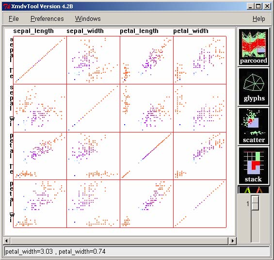
Figure 2.6 Scatterplot Matrix in XmdvTool [87]
The rank-by-feature framework idea is to rank all dimensions or all pairs of dimensions whose visualization contains desired features. Since my work provides a framework where statistical tools and algorithmic methods can be incorporated into the analysis process as ranking criteria, I think my work contributes to the advance of information visualization systems by bridging the analytic gaps that were recently discussed by Amar and Stasko [4].
- 2.4 Discussion
This survey of research related to understanding multidimensional data sets shows the broad range of problems. Various visualization techniques for multidimensional data illustrated different perspectives that should be considered to facilitate visual understanding of the data. The difficulty in appreciating multiple dimensions has made researchers in different disciplines develop various methods to visualize multidimensional data sets. Although there are software tools for exploring and understanding multidimensional data sets [19, 79, 87], the utility of interactive interaction techniques has not been thoroughly explored.
Data mining and database research have suggested that clustering is a useful descriptive feature to reveal what the data looks like and what its characteristics are. In this sense, the visualization of multidimensional data clustering result has been an important area of multidimensional data visualization, where algorithmic work and visualization techniques can be combined to aid users to explore and understand the data sets. Among other clustering algorithms, the traditional hierarchical agglomerative algorithm is qualitatively effective [24], and furthermore the visual representation of the clustering result (or dendrogram) is so intuitive and easy to understand that many researchers utilize it for understanding their data sets and presenting the result [24, 74]. Although Spotfire and some other tools provide tools for visualizing dendrograms, further work is necessary to incorporate interactive exploration methods into the understanding of the hierarchical clustering results.
Finding interesting axis-parallel two-dimensional projections has been an important task for identifying useful features of the original multidimensional data set. Most work for finding interesting 2D projections has focused on detecting 2D projections well suited for partitioning data. Most of them have one specific definition of what an “interesting” projection is. The definition of “interestingness” can be different from user to user, or from application to application. For example, if users are interested in inferring why a group of items are clustered together in a hierarchical clustering, the most interesting projection would be the one that best separates the group from others. However, if users are seeking functional relationships between dimensions, the most interesting projection would be the one where all items are aligned on the diagonal.
Combining interactive tools with the powerful data mining approaches especially clustering analysis is essential to help users effectively explore and understand multidimensional data sets, but at the same time it presents several challenges. The design of the interactive interface for such tools should deal with the issues about how to naturally integrate dynamic interaction techniques into the exploration process, and how to effectively provide sufficient contextual explanation about the analysis result (for example, in case of cluster analysis, why they are clustered together). Furthermore, it might be difficult to implement interactive visualization systems that practically combine the rapid, incremental updates of visualization with the computational requirements of data mining.
- Chapter 3 Hierarchical Clustering Explorer
The Hierarchical Clustering Explorer (HCE) [74] was originally developed for interactive visualization of hierarchical clustering results of multidimensional data sets. It has been used by a variety of users who want to “see” their data set, “find” interesting patterns, and “build” a descriptive model. This chapter describes HCE as a visualization tool for understanding multidimensional data sets through interactive exploration of hierarchical clustering results using dynamic queries and coordination among multiple views. Multivariate data is accommodated by normalization or transformation to produce multidimensional data. Principles and a framework for systematic exploration of multidimensional data sets to find interesting features beyond clusters will be described in Chapter 4.
- 3.1 Hierarchical Clustering and Dendrogram Display
One of the requirements of good clustering algorithms is the ability to determine the number of natural clusters in the data set. However, most existing clustering algorithms ask users to specify the number of clusters that they want to generate. This requirement makes clustering algorithms perform unnecessary merges or splits, which produce unnatural clusters. Furthermore, the natural number of clusters is mostly dependent on users’ preferences or applications. A possible solution to this problem is to use the hierarchical agglomerative clustering (HAC) algorithm [45] and allow users to control parameters to determine the proper number of clusters. Unlike most clustering algorithms, HAC generates a hierarchical structure of clusters instead of sets of clusters.
The HAC algorithm [45] is summarized as follows. Let's assume that we want to cluster n data items, and we have n*(n-1)/2 similarity (or distance) values between every possible pair of n data items:
- 1. Initially, each data item occupies a cluster by itself. So there are n clusters at the beginning.
There are many possible choices in updating the similarity values in step 3. Among them, most common ones are complete-linkage, average-linkage, and single-linkage. Complete-linkage sets the similarity values between the new cluster and the remaining clusters to be the minimum of similarities between each member of the new cluster and the rest. Average-linkage uses average similarity value as a new similarity values. Single-linkage takes the maximum.
Hierarchical clustering results are usually represented as dendrograms. A dendrogram is a binary tree, in which each data item corresponds to a terminal node of the binary tree and the distance from the root to a subtree indicates the similarity of the subtree – highly similar nodes or subtrees have joining points that are farther from the root. For example, in Figure 3.1, the Euclidean distance between A and D is the smallest among all possible pairs, they are merged together as a subtree and the height of the subtree is very short because they are very similar in terms of the similarity/distance measure. On the other hand, B and E are not so close to each other, the height of the corresponding subtree is much taller because they are not so similar.
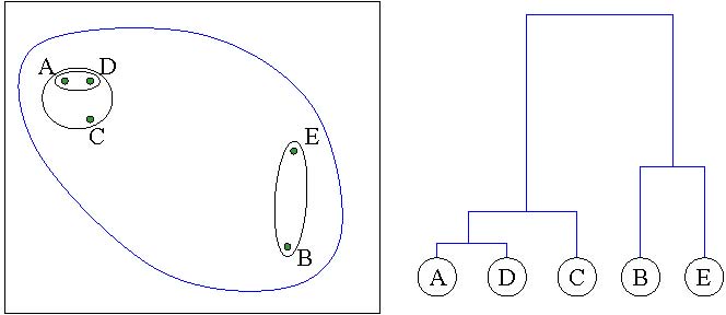
Figure 3.1 Hierarchical agglomerative clustering and dendrogram. Five data points (A, B, C, D, E) on a 2D plane are clustered, and the dendrogram (a binary tree) on the right side shows the clustering result by using Single-linkage and Euclidean distance. The height of each subtree represents the distance between the two children.
- 3.2 Color Mosaic Displays for Multidimensional Data Sets
Multidimensional data sets are usually represented in a table where a row represents an item and a column represents a variable (or a dimension). For example, Figure 3.2(a) shows a small multidimensional data set (77 rows and 13 columns) about nutrition information of breakfast cereals. Each row is a cereal, and each column is a nutrition component. A graphical representation of this data set is to color-code each value in the table according to a color mapping scheme. This graphical representation of a table is called “Color Mosaic.” There are other names for the representation such as heat map and patchgrid.
A usual way to show a color mosaic is to maintain the same layout of the original table and just color-code each cell (Figure 3.2(b)). Even though this vertical layout is a natural representation, HCE uses a transposed layout (Figure 3.2(c)) by default to show more items in a limited screen space. Since the width of a computer screen is usually bigger than the height and multidimensional data sets usually have many more rows than columns, the horizontal layout can accommodate more items on a screen.
|
|
|
|
(a) cereal data set |
(b) vertical color mosaic |
|
|
|
|
(c) horizontal color mosaic |
|
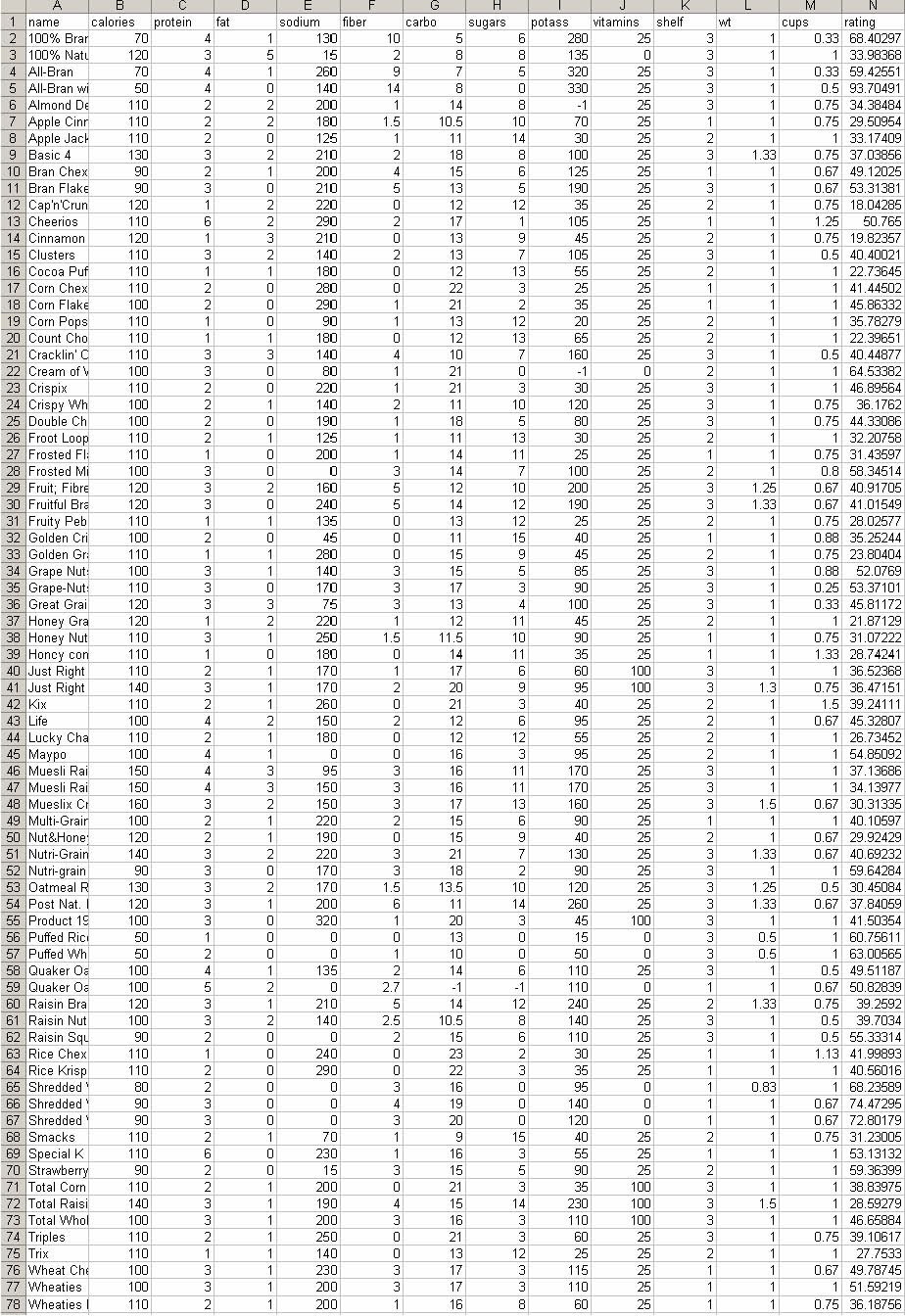
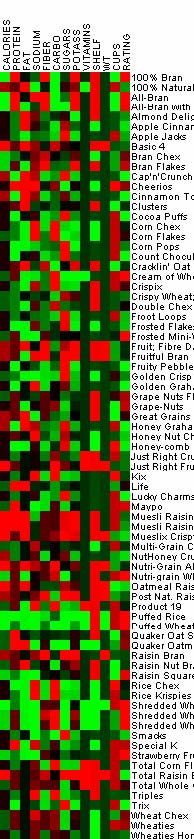
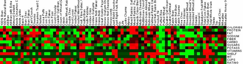
Figure 3.2 Color mosaic displays for a multidimensional data set. In (a) and (b), each row is a cereal while each column is a cereal in (c). The default layout in HCE is (c).
When researchers want to identify hot spots and understand the distribution of data, they can examine the color mosaic. In general, a dendrogram is displayed with a color mosaic at the leaves (Figure 3.3(a)). The arrangement of rows and columns of the color mosaic display is changed according to the clustering result. The graphical pattern of the underlying data is shown by coloring each tile on the basis of the numerical value corresponding to the tile. The color mapping is specified by a color mapping control using a histogram for all numerical values in the data set (Figure 3.3(b)). By default, in HCE, a high value has a bright red color and a low value has bright green color. The middle value has a black color. The vertical red line specifies the value above which all values are mapped to the brightest red color, and the vertical green line specifies the value below which all values are mapped the brightest green color. As a value gets closer to the middle value between the green and the red lines, the color becomes darker. A right click on a vertical color line shows a color-selection dialog box to allow users to use a different set of colors for color mapping.
User controls over the color mapping are necessary to enable users to see subtle differences in the ranges of interest. For skewed data distributions, this is essential to avoid a situation where a large part of screen is filled with all green or red, indicating that most of the values are near extremes. Users can change the color mapping for color mosaic display by dragging the red and green vertical line over the histogram to adjusting the range of color stripe displayed (Figure 3.3(b)). Users can instantly see the result of new color mapping on the color mosaic display, so that they can identify the proper color mapping for the data set.
|
|
|
|
(a) color mosaic attached to dendrogram |
(b) color mapping |
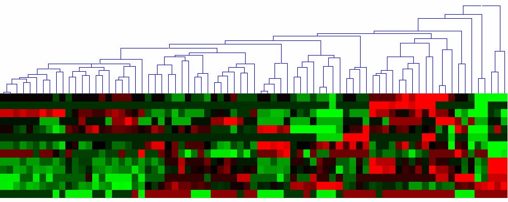
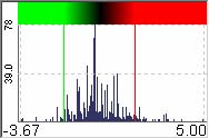
Figure 3.3 A color mosaic display attached to a dendrogram visualizes a hierarchical clustering result of the cereal data set. The arrangements of rows and columns are changed according to the clustering result. Users can change the color mapping for the color mosaic by dragging vertical color lines (green or red) on a histogram.
- 3.3 Visualization of Hierarchical Clustering Results
HCE users begin by performing a hierarchical agglomerative clustering and build a dendrogram with a color mosaic display underneath. Then they start with an overview to see the entire data set and to reveal the distribution of values and locate hot spots. With the minimum similarity bar, users can interactively adjust a parameter (minimum similarity) to find the most natural number of clusters. Another dynamic control, the detail cutoff bar allows users to reduce clutter from too much detail by aggregating leaf nodes by the average vector. Next they can see how the hierarchical clusters are presented in other familiar and easy-to-understand views such as 1-dimensional histograms and 2-dimensional scatterplots. The coordination between the overview color mosaic and those views is bi-directional, that is, users can select a group of items in a view and see where they fall in other views.
- 3.3.1 Overview in a Limited Screen Space
Overviews are important because they enable researchers to identify hot spots and understand the distribution of data. However, there are significant screen limitations when visualizing large data sets on commonly used displays that are 1600 pixels wide. Even limiting each item to a single pixel means that, for data sets larger than 1600 points, the corresponding dendrogram (and color mosaic) does not fit in a single screen. To accommodate large data sets, HCE provides a compressed overview by replacing leaves with average values of adjacent leaves. This view shows the entire hierarchy at the cost of some lost detail at the leaves (Figure 3.4(a)). A second overview allocates several pixels per item, but requires scrolling to view all items (Figure 3.4(b)). In this scrolling overview, users can adjust the level of detail shown in the overview by adjusting the range slider attached below the dendrogram view to change the item widths and viewing range. With either overview, HCE users can click on a cluster and view the detailed information at the bottom of the display, which also includes the item names.
|
|
|
(a) Compressed overview of 12422 items |
|
|
|
(b) Overview with zoom and scroll. Only a few hundred items are shown. |
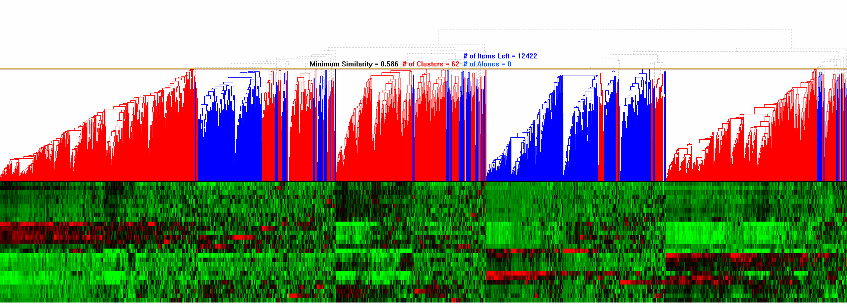
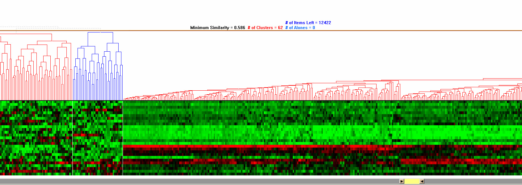
Figure 3.4 Overviews of hierarchical clustering results
- 3.3.2 Minimum Similarity Bar
One of the key components in HCE is the minimum similarity bar. By dragging down the bar whose y-coordinate determines the minimum similarity threshold, users can filter out the less similar elements. In this way, users can easily find the clusters of elements that are tight enough to satisfy the threshold. To prevent users from losing global context during dynamic filtering, the entire dendrogram structure is shown on the background, and users can highlight the position of a cluster in the original data set by just clicking on the cluster. Figure 3.5 shows the process of cluster discovery using the minimum similarity bar.
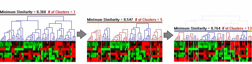
Figure 3.5 Minimum similarity bar: The y coordinate of the bar determines the minimum similarity value. Users can drag down the bar to filter out items that are distant from a cluster. The minimum similarity values changed from 0.36 to 0.764 in this example to separate 1 large cluster into 13 small clusters.
Let’s assume that a hierarchical clustering
algorithm was performed on a data set, . The final result would be a
binary tree T, where each branch is a cluster , and is the left and
right child in the branch respectively. is the intra-cluster
similarity of . Let be the minimum similarity value defined as ![]()
![]()
![]()
![]()
![]()
![]()
![]()
![]()
![]()
![]() , where y is the current y-coordinate of the minimum similarity bar. derives a view of the clustering result by defining , a set of clusters whose intra-cluster similarities are greater than or equal to .
, where y is the current y-coordinate of the minimum similarity bar. derives a view of the clustering result by defining , a set of clusters whose intra-cluster similarities are greater than or equal to . ![]()
![]()
![]()
![]() , where
, where
i) ![]()
ii) ![]()
iii) ![]()
iv) ![]()
The first and second conditions are to control the number of clusters by excluding less similar clusters. The third condition is to exclude clusters with only one element that are not generally meaningful in terms of cluster quality. The fourth condition is trivial from the third condition.
- 3.3.3 Detail Cutoff Bar
Having an overview is as important as obtaining enough detail. It reveals the overall patterns of the whole data set, which guides users to the next search direction. One of the generally accepted visualization schemes is to start with an overview, and then allow users to dynamically access detail information [76]. It is important to keep providing an overview of the entire data set, while allowing detailed analysis of a selected part.
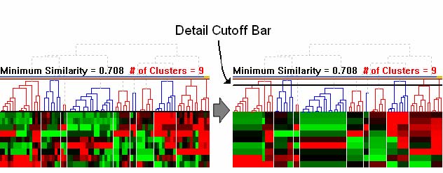
Figure 3.6 Detail cutoff bar: Users can adjust the level of detail by dragging up with the detail cutoff bar. All the subtrees below the bar are rendered using the average of leaf node values belonging to the subtree. This bar makes it possible to concentrate on more global structures.
In HCE, users can adjust the
level of detail by dragging up the detail cutoff bar, another dynamic
filtering bar of HCE (Figure 3.6). Let be the current y-coordinate
of the minimum similarity bar, and be that of the detail cutoff bar.
Let be a cluster in that is the current cluster set defined by. For ,
define as follows. ![]()
![]()
![]()
![]()
![]()
![]()
![]()
![]() , where
, where
i) , ![]()
iii) ![]()
Then, each cluster is
rendered using the average vector of leaf node elements as shown in
Figure 3.6. In this way, users can hide the detail below the detail
cutoff bar so that they can concentrate on more global structure of the
original data. Especially for a large dendrogram, this bar helps users
visually figure out the overall patterns of data values and structures
of the clusters satisfying current minimum similarity threshold. Once
users find an interesting cluster in the adjusted dendrogram, they can
dig into enough detail by dragging down the bar again. ![]()
- 3.3.4 Clustering Results Comparison
One troubling component of clustering analysis is that there is no perfect clustering algorithm. There are different ways to compute distances between items in a multidimensional data set (Euclidean, correlation coefficient, Manhattan distance, etc.). Moreover, there are different ways to compute the similarity values between groups of items, called linkage (average, complete, single, etc.).
Therefore, researchers need some mechanism to examine and compare two clustering results. HCE enables users to view results of two hierarchical clustering algorithms on the screen at once (Figure 3.7). Users can see the mapping of each item between the two different clustering results by double-clicking on a specific cluster. The selected cluster will highlight in yellow and lines from each item in that cluster will be drawn to their position in the second clustering result. If they find some items that are mapped to different clusters, they can examine the items more carefully to understand what made the difference.
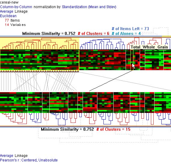
Figure 3.7 Cluster comparisons: Users can see the mapping of each item between the two different clustering results by double-clicking a specific cluster. The selected cluster will be highlighted in yellow and lines from each item in that cluster will be drawn to their position in the second clustering result. As mouse moves on a color mosaic, a black line will show the mapping between the item under cursor and the corresponding item by connecting the two items.
This strategy is tedious and the criss-crossing lines can be confusing, but this is a first step in giving users tools to address the complex nature of such comparisons. Showing relationships between non-proximal items is a basic problem in information visualization research. Color-coding, blinking, and drawing lines are the three basic methods, but each has its problems. HCE already uses color-coding heavily and blinking would add distraction to an already complex display, so drawing lines was our best alternative. Biology research partners are excited to have this capability and spend hours probing the clusters to see which genes have switched into other clusters by use of an alternate clustering algorithm. Munzner et al. [63] addressed a similar problem and presented a scalable tree comparison method, but further improvement in developing metrics for measuring similarity and tools to highlight important changes would be necessary.
Another possible verification method is to select a subset of the dimensions (or variables), and do the clustering on the reduced set. It is easier to verify the correctness of a clustering method in lower dimensions than in higher dimensions. HCE users can use a dialog box to select a subset of the dimensions to take part in the clustering. The resulting color mosaic has a white space between the selected dimensions and the others (Figure 3.8). Users can concentrate their inspection on the selected dimensions and see the clusters more clearly in the scatterplot. The capacity to redo the clustering using different dimensions helps users gain an understanding of the relationships among dimensions and helps identify which dimensions have a strong effect on the outcomes.
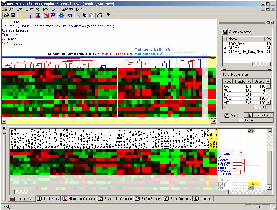
Figure 3.8 Clustering on a reduced set: Users can select a subset of the dimensions (columns in the data set), and do the clustering only on the subset to verify the clustering results. The horizontal white line between dimensions in the dendrogram view separates the 9 selected dimensions (upper) and the 5 others (lower). Users can concentrate their inspection on the selected (upper) part and see the clusters more clearly in the scatterplot.
- 3.3.5 Clustering Result Evaluation by F-measure
Visual inspection of clustering results is an intuitive and powerful tool for users to evaluate the results [73]. However, as the number of items gets bigger, it becomes more difficult to evaluate the clustering results only by using visual representation. Therefore, it is necessary to use reasonable clustering evaluation measures in addition to visual inspection.
There are two kinds of clustering result evaluation measures, internal and external. The former is for the case where users are not aware of the correct clustering. It compares the clusters using internal measures such as distance matrix without any external knowledge. The latter is for the case where users already know the correct classes of their samples. In the case study with human and mouse samples [72], researchers already knew the correct class labels of samples, and thus used external measures. Possible external measures include purity, entropy, and F-measures. Among them, F-measures [68] have been used as an external clustering result evaluation measure in many studies across many fields including information retrieval and text-mining [18, 52, 53]. Furthermore the F-measure has been successfully applied to hierarchical clustering results [52].
I applied the F-measure to
the entire hierarchical structure of clustering results and also to the
set of clusters determined by the minimum similarity threshold in HCE.
Let , … ,, … , be the right clusters according to the target biological
variable. Let , … , , … , be the clusters from the hierarchical
clustering results. In computing the F-measure, each cluster is
considered as a query and each class (or each correct cluster) is
considered the correct answer of the query. The F-![]()
![]()
![]()
![]()
![]()
![]() measure of a correct cluster (or a class) and an actual cluster is defined as follows:
measure of a correct cluster (or a class) and an actual cluster is defined as follows: ![]()
![]()
![]() , where
, where![]() ,
, ![]() .
.
The precision values and recall values are defined by the information retrieval concepts. The F-measure of a class is given by ![]()
![]()
![]()
![]() .
.
Finally, the F-measure of the entire clustering result is given by
![]() , where is the total number of arrays in the experiment.
, where is the total number of arrays in the experiment. ![]()
The F-measure score is between 0 and 1. The higher the F-measure score is, the better the clustering result is. When I calculate the F-measure for the entire cluster hierarchy, for each external class I traverse the hierarchy recursively and consider each subtree as a cluster. Then the F-measure for an external class is the maximum of F-measures for all subtrees.
As users drag the minimum similarity bar, a line graph of F-measure score is superimposed on the dendrogram display so that they can easily see the global pattern of F-measure scores right on the clustering result. At the same time, each array name is color-coded according to its predefined class so that users can assess the quality of clustering from the visual representation as well as from the numerical F-measure scores.
- 3.3.6 Clustering Quality Improvement by Weighting
In some cases like Affymetrix GeneChip experiments, researchers have not only a numerical value (detection signal value) but also its significance measure for the value (detection p-value). In these cases, the quality of the unsupervised hierarchical clustering can be improved by using the significant value for a more meaningful distance calculation between items.
In [72], this idea was
applied to the unsupervised clustering result of Affymetrix GeneChip
data. The detection p-values was incorporated into an unsupervised
clustering algorithm as weights for signal values instead of filtering
based on present/absent calls. It would give greater potential
sensitivity by considering all probe sets in an analysis without a cost
of poor signal-noise ratio by involving confidence factor in the
clustering process. There are many possible similarity measures for
unsupervised clustering methods, and it is also possible to develop a
weight measure for most similarity measures. For example, a weighted
Pearson correlation coefficient can be derived as follows from the
Pearson correlation coefficient that has been widely used in the
microarray analysis. Let and be the vectors representing two arrays
to be compared, and let ![]()
![]()
![]() and
and ![]() be the vectors representing p-values for x and respectively. Then the weighted Pearson correlation coefficient is given by
be the vectors representing p-values for x and respectively. Then the weighted Pearson correlation coefficient is given by ![]()
![]()
 ,
,
where ![]() ,
, ![]() ,
, ![]()
By using this weighted distance measure, the clustering result was improved in the case study with human muscle biopsies and mouse lung samples [72]. Other similarity measures such as Euclidean distance, Manhattan distance, and cosine coefficient can be extended to their weighted versions in a similar way.
- 3.4 Interaction with Parallel Coordinates View
Many microarray experiments measure gene expression over time [14, 91]. Researchers would like to group genes with similar expression profiles or find interesting time-varying patterns in the data set by performing a cluster analysis. Another way to identify genes with profiles similar to known genes is to directly search for the genes by specifying the expected pattern of a known gene. When researchers have some domain knowledge such as the expected pattern of a previously characterized gene, researchers can try to find genes similar to that pattern. Since it is not easy to specify the expected pattern at a single try, they have to conduct a series of searches. Therefore, they need an interactive visual analysis tool that allows easy modification of the expected pattern and rapid update of the search result.
Clustering and direct profile search can complement each other. Since there is no perfect clustering algorithm right for all data sets and applications, direct profile search could be used to validate the clustering result by projecting the search result onto the clustering result view. Conversely, a clustering result could be used to validate the profile search by projecting the cluster result on the profile view. Therefore, coordination between a clustering result and a direct search result makes the identification process more valid and effective.
‘Profile Search’ in the Spotfire DecisionSite (www.spotfire.com) calculates the similarity to a search pattern (so called 'master profile') for all items in the data set and adds the result as a new column to the data set. The built-in profile editor makes it possible to edit the search pattern, but the editor view is separate from the profile chart view where all matching profiles are shown, so users need to switch between two views to try a series of queries. The modification of master profile in the profile editor view is interactive, but search results are not updated dynamically as the master profile changes.
TimeSearcher [38] supports interactive querying and exploration of time-series data. Users can specify interactive timeboxes over the time-varying patterns, and get back the profiles that pass though all the timeboxes. Users can drag and drop an item from the data set into the query window to create a query with a separate timebox for each time point over the item in the data set. Each timebox at each time point can be modified to change the query.
HCE 3.0 reproduces Spotfire’s and TimeSearcher’s basic functions with a novel interface, the parallel coordinates view powered by a direct-manipulation search, that allows rapid creation and modification of desired profiles using novel visual metaphors. Key design concepts are:
(1) interactive specification of a search pattern on the information space: Users can submit their queries simply by mouse drags over the search space rather than using a separate query specification window.
(2) dynamic query control: Users can get query results instantaneously as they change the search pattern, similarity function, or similarity threshold.
(3) sequential query refinement: Users can keep the current query results as a new narrowed search space for subsequent queries.
The parallel coordinates view consists of three parts (Figure 3.9): the information space where input profiles are drawn and queries are specified, the range slider to specify similarity thresholds, and a set of controls to specify query parameters. Users specify a search pattern by simple mouse drags. As they drag the mouse over the information space, the intersection points of mouse cursor and vertical time lines define control points. Existing control points, if any, at the intersecting vertical time lines are updated to reflect the dragging. A search pattern is a set of line segments connecting the contiguous control points specified. Users choose a search method and a similarity measure on the control panel. They can change the current search pattern by dragging a control point, by dragging a line segment vertically or horizontally, or by adding or removing control points. All modifications are done by mouse clicks or drags, and the results are updated instantaneously. This integration of the spaces where the data is shown and where the search pattern is composed reduces users' cognitive load by removing the overhead of context switching between two different spaces.
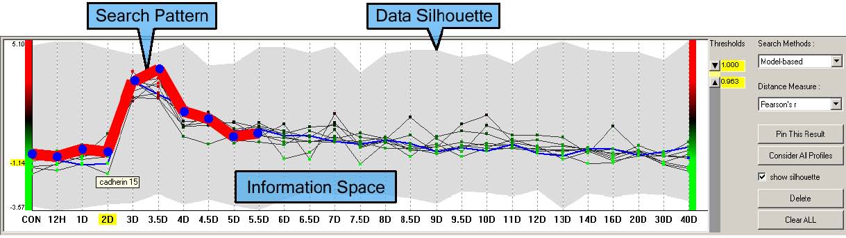
Figure 3.9 Parallel coordinates view: Layout of the parallel coordinates view and an example of model-based query on the mouse muscle regeneration data. The data silhouette (the gray shadow) represents the coverage of all expression profiles (also known as ‘data envelope’ in TimeSearcher). The bold red line is a search pattern specified by users’ mouse drags. Thin regular solid lines are the result of the current query that satisfies the given similarity threshold. The data set shown is a temporal gene expression profile on the mouse muscle regeneration [91].
Incremental query processing enables rapid updates (within 100 ms) so that dynamic query control is possible for most microarray data sets. The easy and fast search for interesting patterns enables researchers to attempt multiple queries in a short period of time to get important insights into the underlying data set.
In the parallel coordinates view, users can submit a new query over the current query result. If users click the “Pin This Result” button after submitting a query, the query result becomes a new narrowed search space (Figure 3.9). I call this “pinning.” Pinning enables sequential query refinement, which makes it easy to find target patterns without losing the focus of the current analysis process. If users click on a cluster in the dendrogram view, all items in the cluster are shown in the parallel coordinates view. By pinning this result, users can limit the search to the cluster to isolate more specific patterns in the cluster.
Genes included in the search result are highlighted in the dendrogram view. Conversely, if users click on a cluster in the dendrogram view, profiles of the genes in that cluster are shown in the parallel coordinates view so that users can see the patterns of genes in a different view other than color mosaic. Through the coordination between the parallel coordinates view and the dendrogram view, users can easily see the representative patterns of clusters and compare patterns between clusters. Since queries done in the parallel coordinates view identify genes with a similar profile, the search results should be consistent with clustering results if the same similarity function is used. In this regard, the parallel coordinates view helps researchers validate the clustering results by applying their domain knowledge through direct-manipulation searches.
In the parallel coordinates view, users can run a text search (called search-by-name query) by typing in a text string to find items whose name or description contains the string. Moreover, two different types of direct-manipulation queries are possible in the parallel coordinates view: model-based queries and ceiling-and-floor queries.
- 3.4.1 Model-based Queries
Users can specify a model pattern (or a search pattern) simply by mouse drags as shown in Figure 3.9, and select a distance/similarity measure among three different ones and assign the similarity/distance threshold values. All profiles satisfying the similarity/distance threshold range will be rapidly shown in the information space. The three different measures are ‘Pearson correlation coefficient’, ‘Euclidean distance’, and ‘absolute distance from each control point.’ The first measure is useful when the up-down trends of profiles are more important than the magnitudes, while the second and the third measures are useful when the actual magnitudes are more important. When users know the name of a biologically relevant gene, they can perform a text-based search first by entering a name or a description of the gene (Figure 3.11). Then they can choose one of the matching genes and make them a model pattern by right-clicking on the pattern and selecting “Make it a model pattern.” They can adjust or delete some control points based on their domain knowledge. Finally, they adjust the similarity thresholds to get the satisfying results and project those results onto other views.
- 3.4.2 Ceiling-and-Floor Queries
Ceilings and floors are novel visual metaphors to specify value ranges using direct manipulation. A ceiling imposes upper bounds and a floor imposes lower bounds on the corresponding time points. Users can define ceilings and floors on the information space so that only the profiles between ceilings and floors are shown as a result (Figure 3.10). Users can specify a ceiling by dragging with the left mouse button depressed and a floor by dragging with the right mouse button depressed. They can change ceilings and floors with mouse actions in the same way as they do for changing search patterns in model-based queries. This type of query is useful when users know the up-down patterns and the appropriate value ranges at the corresponding time points of the target profiles. Compared to model-based queries, ceiling-and-floor queries allow users to specify separate bounds for each control point.
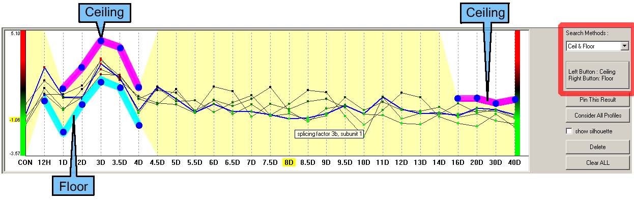
Figure 3.10 An example of the ceiling-and-floor query. Bold line segments above the profiles define ceilings, and bold line segments below profiles define floors. Profiles below ceilings and above floors at the time points where ceilings or floors are defined are shown as a result. Users can move a line segment or a control point of ceilings or floors to modify current query. The highlighted region gives users informative visual feedbacks of the current query. The data set shown is a temporal gene expression profile on the mouse muscle regeneration [91].
- 3.4.3 Search-by-Name Query
Users can type in a string to find items whose name or description contains the string (Figure 3.11). Searches are done either incrementally or not. By default, a search is performed when users click on the “FindIt!” button. When the “Incremental Search” checkbox is checked, a search is done incrementally. For example, when users type “m,” only the items containing “m” in their name will be shown. As users type in “u”, the result will be updated to show the items whose names have the substring “mu”.
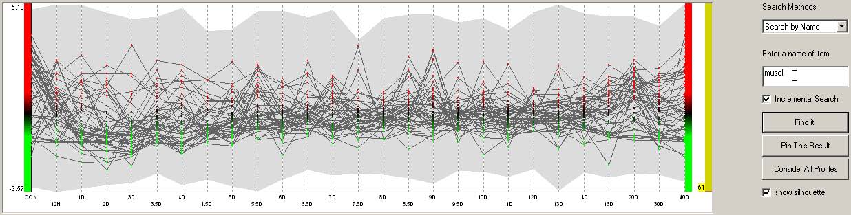
Figure 3.11 An example of the search-by-name query.
A good combination of a search-by-name query and a model-based query is to search an item, or a gene, using the search-by-name query and then make one of the search results a model pattern by a right mouse click and select “Make it a model pattern.” By revising the new model pattern and threshold values, users can easily find a group of items similar to a known item. Interactive coordination with the dendrogram view will also enable users to check whether the items are in the same or similar cluster.
- 3.4.4 Coordination Example
Researchers performed a microarray experiment to generate a gene expression profile data set that indicates relative levels of expression for each of these genes (> 12000) in murine muscle samples [91]. They measured expression levels at 27 time points to find genes that are biologically relevant to the muscle regeneration process. They already know that MyoD is a gene that is the most relevant to muscle regeneration. They run the hierarchical clustering with the data set, and identify a relevant cluster that peaks at day 3. In the parallel coordinates view, they search MyoD using search-by-name query, then make it a model pattern to perform a model-based query. They modify the model pattern to emphasize the peak at day 3 and then adjust the similarity thresholds to get the search result that mostly overlaps with the relevant day 3 cluster (Figure 3.12 & Figure 3.13). Finally, they confirm through other biological experiments that 2 genes (Cdh15 and Stam) in the overlapped result set are novel downstream targets of MyoD.
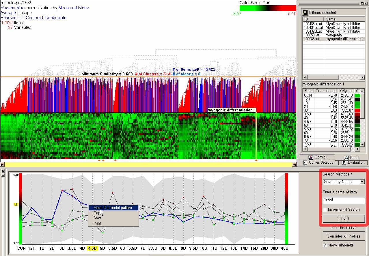
Figure 3.12 Run a search-by-name query with MyoD to find 5 genes whose names contain MyoD, and the 5 genes are projected onto the current clustering result visualization shown by triangles under the color mosaic. Select a gene (myogenic differentiation 1) and make it a model pattern for next query.
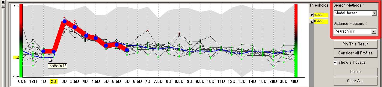
Figure 3.13 Modify the model pattern to emphasize the peak at day 3 (notice the bold red line), and run a model-based query to find a small set of candidate genes. The updated search result will be highlighted in the dendrogram view and other views.
- 3.5 Interaction with Tabular and Hierarchy Views
Interactive visualization techniques combined with cluster analysis help researchers discover meaningful groups in their data sets. A direct-manipulation search coordinated with clustering result visualization facilitates insight into the clustering result and data set. Further improvement is possible if there is another well-understood and meaningful knowledge structure for the same data set. For example, when marketers perform a cluster analysis on the customer transaction data, they discover customer groups based on purchasing patterns. If they have another knowledge structure on the data such as customer preferences or demographic information, they can acquire more insight into the clustering results by projecting the additional information onto the clustering results. In this market analysis example, if a geographic hierarchy of states, counties, and cities were available, it might be possible to discover that purchasers of expensive toys reside in large southern cities. They are likely to be older grandparents in retirement communities.
This section explains two interactive components in HCE (the tabular view and the gene ontology view) as means to coordinate clustering results with external domain knowledge. This section continues with the genomic data case study.
- 3.5.1 Tabular View
In recent decades, biological knowledge has been accumulated in public genomic databases (GenBank, LocusLink, FlyBase, MGI, and so on) and it will increase rapidly in the future [9]. These databases are useful sources of external domain knowledge with which biologists gain insights into their data sets and clustering results. Biologists frequently utilize those databases to obtain information about genomic instances that they are interested in. However, those databases are so diverse that researchers have difficulties in identifying relevant information from the databases and combining them.
HCE 3.0 implements a tabular view (Figure 3.14) as a hub of database annotations where users can see annotations extracted from those databases for items in the data set. Each row represents an item and each column represents an annotation from an external knowledge source. Users can specify a URL for each column to link a web database so that they can look up the database for a cell on the column. The tabular view is coordinated with other views such as the dendrogram, hierarchy, scatterplot, and histogram views. If users select a group of items in other views, rows of the selected items are highlighted in the tabular view. By looking at the annotations for the selected items in the table view and looking them up in the corresponding databases, users can gain more insights into the items from the domain knowledge in the databases. Conversely, if users select a bunch of rows in the tabular view, the selected items are also highlighted in other views. For example, after sorting by a column and selecting rows with the same value on the column, users can easily verify how closely those items group together in the dendrogram view.
Researchers can do annotation either by using one or more of the public genomic databases or by using annotation files provided by gene chip makers. For example, Affymetrix provides annotation files for all their GeneChips, and users can easily import an annotation file and combine it with the data set.
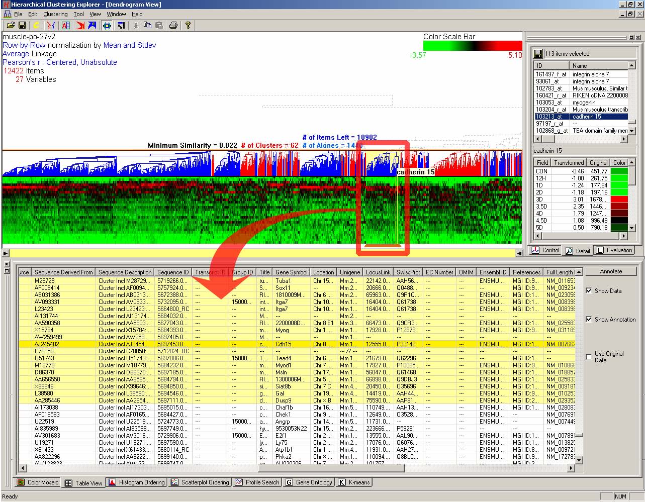
Figure 3.14 Tabular view: Each row has annotations for a gene. Each column represents an annotation from an external database. All of 12422 genes are in the tabular view, and there are 28 annotation columns. When users select a cluster of 113 genes in the dendrogram view, the annotation information for those genes is highlighted in the tabular view. The Affymetrix U74Av2 chip annotation file downloaded from www.affymetrix.com was imported and combined with the data set. The data set shown is a temporal gene expression profile on mouse muscle regeneration [91].
If web databases are available for the data set, users can specify a URL template for each column to link the column to a web database so that they can look it up for a cell on the column. If users right-click on a column header, an input dialog box (Figure 3.15) pops up, where they can enter a URL template for the column. “%s” is used to indicate the place where the search term is replaced. A right-click on a cell and then selection of a value in the cell will open up the corresponding web database on the default web browser. User can get additional information about the value on the web browser.
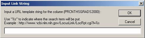
Figure 3.15 Input dialog box to enter a URL template
- 3.5.2 Hierarchy View: Gene Ontology Browser
One of the major reasons that biologists cannot efficiently utilize the abundant knowledge in public genomic databases is the lack of a shared controlled vocabulary. The Gene Ontology (GO) project [32] is a collaborative effort to build consistent descriptions of gene products in different databases. The GO collaborators have been developing three ontologies - structured, controlled vocabularies with which gene products are described in terms of their associated biological processes, molecular functions, and cellular components in a species-independent manner.
The good news is that Gene Ontology (GO) annotation is a widely accepted, well-understood and meaningful knowledge structure for gene expression data. GO annotations of genes in a cluster or a direct manipulation search result might reveal a clue as to why the genes are grouped together. With the GO annotation, researchers can easily recognize the biological process, molecular function, and cellular component that genes in a cluster are associated with. Furthermore, it is possible to test a hypothesis that an unknown gene might have biological roles that are the same as or similar to those of the known genes in the same cluster. Interactive coordination with the GO annotation enables researchers to upgrade their insights by combining generally accepted knowledge from other researchers.
The bad news is that GO annotation is stored in a large DAG (directed acyclic graph) which makes it difficult to examine the annotation and to further integrate with other data sets such as microarray experiment data. There are many tools listed at www.geneontology.org such as MAPPFinder [21], and GoMiner [90] that integrate microarray experiment data with GO annotation. In those tools, users can input a criterion for a significant gene-expression change or a list of interesting genes, and then relevant GO terms are identified and shown in a tree structure or a DAG display. HCE 3.0 integrates the three ontologies – molecular function, biological process, and cellular component into the process of understanding clusters and patterns in gene expression profile data. The ontologies are shown in a hierarchical structure as in Figure 3.16.
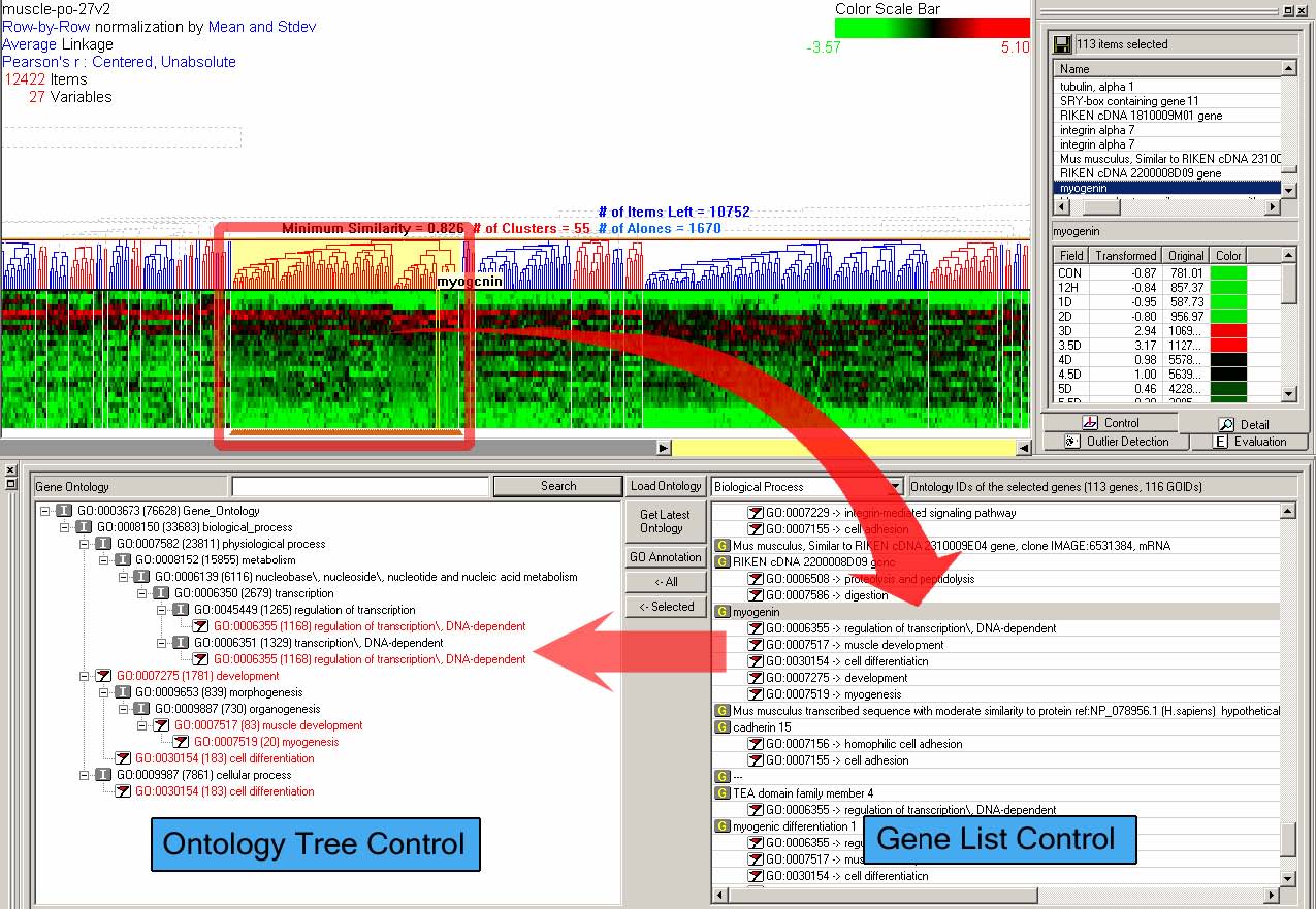
Figure 3.16 HCE 3.0 with gene ontology browser on: Users can select a cluster in the dendrogram view (at the top left corner), which is highlighted with a rectangle. 113 genes in the selected cluster are shown in the gene list control at the bottom right corner. All paths to the selected GO terms (associated with ‘myogenin’) are shown with a flag-shape icon in the ontology tree control at the bottom left corner. The data set shown is in vivo murine muscle regeneration expression profiling data using Affymetrix U74Av2 (12,488 probe sets) chips measured in 27 time points.
The gene ontology hierarchy is a DAG, but I use a tree structure to show the hierarchy since tree structures are easier for users to understand and easier for developers to implement than DAGs. Thus, a gene ontology term may appear several times in different branches, but the path from the root to a node is unique. Coordination between the gene ontology browser and other views in HCE 3.0 is bi-directional.
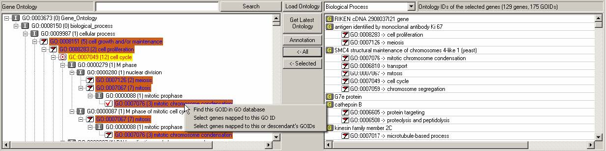
Figure 3.17 Interaction in the gene ontology browser
Figure 3.17 shows an example of interaction at the gene ontology browser. Gene list control is populated with the selected genes and their GO information. All GO terms and IDs associated with a gene will be shown below the gene name with indentation. Users can select one gene ontology from the three ontologies (molecular function, biological process, and cellular component) using the combo box above the list control. The number of the selected genes and the number of their associated GO terms are also shown right next to the combo box.
All paths to the GO IDs selected in the gene list control are shown in the ontology tree control. The selected GO IDs are highlighted in orange and with a red flag icon. ‘I’ represents ‘IS-A’ relationship and ‘P’ represents ‘PART-OF’ relationship. Each node has a number within parentheses, which represents the number of genes that have the GO ID of the node or any descendants of the node (Figure 3.17). When users click the “Load Ontology” button to look at the whole gene ontology hierarchy, the number within parentheses represents the number of genes in the whole data set. When users click the button, either “<-ALL” or “<-Selected” to look at the selected part of hierarchy that is only for genes in the gene list control, the number within parenthesis represents the number of genes among the selected genes.
Users can also search the current gene ontology either by a GO term (e.g., ‘cell cycle’) or by a GO ID (e.g., ‘GO:0007049’). A right click on a GO node in the ontology tree control will highlight all genes associated with the node or its descendents in all other views.
Users can download the
latest gene ontology from the ftp server at Gene Ontology Consortium by
clicking the “Get Latest Ontology” button. Users can also load and
combine an Affymetrix GeneChip Annotation file (“Annotation” button) if
the data set is an Affymetrix microarray data set. When users click the
“<- All” button, all GO IDs in the gene ontology control in the Gene
List Control are highlighted with orange color in the ontology tree
control, where the node to which most GO IDs are mapped are highlighted
in purple with a special icon like ![]() .
.
- 3.6 Summary and Discussion
The interactive exploration using dynamic query controls such as the minimum similarity bar and the detail cutoff bar enhanced users’ understanding of hierarchical clustering results. A variety of software packages also offers the hierarchical clustering. Almost all of them just implement the algorithm and produce static displays of dendrograms, which include Cluster and TreeView [23], Mathematica [88], MATLAB [82], SAS [71], R [66], and GeneSpring [77]. Spotfire DecisionSite allows more interactions on the dendrogram than those static implementations do. Some of them offer more choices of linkage methods and distance measures than HCE does. There are also web-based tools that offers the hierarchical clustering results, which include Expression Profiler [25], and NCBI GEO [8]. While a more limited number of clustering parameters are available in those web-based tools, web interfaces are certainly accessible to more people since there is no need to install any software. A promising future direction could be to deploy interactive visualization tools such as HCE via the web. There might be unique requirements for web-based interactive visualization tools.
An issue that was not addressed in this dissertation on hierarchical clustering is the way dendrogram nodes are arranged in a dendrogram. If there are n items, 2n-1 linear orderings for a hierarchical clustering result are possible. A different ordering could sometimes generate a significantly different visualization of a hierarchical clustering result. HCE implements two heuristic methods for dendrogram nodes arrangement, and there are also other interesting ways to do that by using optimization techniques [7, 11] or a low-dimensional embedding [50].
The tabular view and the hierarchy view enabled users to combine external knowledge with the clustering result so that further insights can be offered. The profile search view equipped with direct manipulation search methods complemented the clustering result visualization in such a way that users’ domain knowledge was superimposed on the dendrogram view. Coordination between clustering results and external domain knowledge, such as the Gene Ontology, is also being added to commercial software tools, such as Spotfire DecisionSite [79] and CoMotion [60]. I expanded on this important idea by allowing rapid multiple selections in secondary databases through tabular and hierarchical views. More general data formats to represent external domain knowledge and more meaningful ways to evaluate and highlight an important subset of knowledge are necessary to yield deeper insights into underlying data sets.
- Chapter 4 Rank-by-Feature Framework
Cluster analysis is the most widely used descriptive modeling technique - building a model to describe how the data is organized. HCE enables interactive descriptive modeling by allowing interactive controls over the clustering results. The hierarchy shown in the dendrogram and the linear presentation in the color mosaic help users reveal clusters that represent important patterns. However, they can hide some aspects of the high dimensional nature (typically 4-100 dimensions) of the data.
High-dimensional displays such as parallel coordinates [42, 43] and other novel techniques [46] could be useful but many users have difficulty comprehending these visualizations. Even three-dimensional displays can be problematic because of the disorientation brought on by the cognitive burden of navigation [15, 17]. Two-dimensional scatterplots are limited to two variables at a time for the x and y axes, but they are readily understood by most users. Furthermore, without the distraction of operating the navigation controls, users can concentrate on the data.
However, since one two-dimensional scatterplot cannot reveal the high dimensional aspect of a multidimensional data set, it is inevitable to examine a series of scatterplots. This raises a problem of how to examine all those scatterplots efficiently. Users can just wander around a bunch of scatterplots randomly find some interesting ones, but usually it is not the case especially when they are exploring a high dimensional space. In these cases, even the number of possible one-dimensional histograms is too big to traverse one by one. Low dimensional projections such as scatterplots and histograms have been used in several research tools to investigate multidimensional data sets. However, current systems often are a patchwork of graphical and statistical methods leaving many researchers uncertain about how to explore their data in an orderly manner.
In this chapter, I address this problem and present the major contribution of this dissertation, a systematic framework - rank-by-feature framework that enables users to explore multidimensional data in an orderly manner using 1D and 2D projections. I generalize the ideas behind the rank-by-feature framework and present general principles for exploratory multidimensional data analysis.
- 4.1 Three Categories of Two-Dimensional Presentations
I distinguished the three categories of two-dimensional presentations by the way axes are composed in Chapter 2: (1) Non axis-parallel projection methods, (2) Axis-parallel projection methods, and (3) Novel methods use axes that are not directly derived from any combination of dimensions.
Although presentations in category (1), non-axis-parallel, can show all possible 2D projections of a multidimensional data set, they suffer from users’ difficulty in interpreting 2D projections whose axes are linear/nonlinear combination of two or more dimensions. For example, even though users may find a strong linear correlation on a projection where the horizontal axis is 3.7*body weight - 2.3*height and the vertical axis is waist size + 2.6*chest size, the finding is not so useful because it is difficult to understand the meaning of such projections.
Techniques in category (2), axis-parallel, have a limitation that features can be detected in only the two selected dimensions. However, since it is familiar and comprehensible for users to interpret the meaning of the projection, these projections have been widely used and implemented in visualization tools. A problem with these category (2) presentations is how to deal with the large number of possible low-dimensional projections. If we have an m-dimensional data set, we can generate m*(m-1)/2 2D projections using the category (2) techniques. I believe that my work offers an attractive solution to coping with the large numbers of low-dimensional projections and that it provides practical assistance in finding features in multidimensional data.
Techniques in category (3) remain important, because many relationships and features are visible and meaningful only in higher dimensional presentations. Our principles could be applied to support these techniques as well, but that subject is beyond this dissertation’s scope.
There have been many commercial packages and research projects that utilize low-dimensional projections for exploratory data analysis, including spreadsheets, statistical packages, and information visualization tools. However, users have to develop their own strategies to discover interesting projections and to display them. I believe that existing packages and projects, especially information visualization tools for exploratory data analysis, can be improved by enabling users to systematically examine low-dimensional projections.
- 4.2 Overview and Implementation in HCE
This dissertation presents a conceptual framework for interactive feature detection named rank-by-feature framework to address these issues. In the rank-by-feature framework (the rank-by-feature interface for 2D scatterplots is shown at the bottom half of Figure 4.1), users can select an interesting ranking criterion, and then all possible axis-parallel projections of a multidimensional data set are ranked by the selected ranking criterion. Available ranking criteria are explained in section 4.4.2 and 4.5.2. The ranking result is visually presented in a color-coded grid (“score overview”), as well as a tabular display (“ordered list”) where each row represents a projection and is color-coded by the ranking score. With these presentations users can easily perceive the most interesting projections, and also grasp the overall ranking score distribution. Users can manually browse projections by rapidly changing the dimension for an axis using the item slider attached to the corresponding axis of the projection view (histogram and boxplot for 1D, and scatterplot for 2D).
For example, let’s assume that users analyze the US counties data set with 17 demographical and economical statistics available for each county. The data set can be thought of as a 17 dimensional data set. Users can choose “Pearson correlation coefficient” as a ranking criterion at the rank-by-feature framework if they are interested in linear relationships between dimensions. Then, the rank-by-feature framework calculates “scores” (in this case, Pearson correlation coefficient) for all possible pairs of dimensions, and ranks all pairs according to there scores. Users could easily identify that there is a negative correlation between poverty level and percentage of high school graduates after they skim through the score overview (a color-coded grid display at the lower left corner of Figure 4.1), where each cell represents the scatterplot for a pair of dimensions and it is color-coded by the score value for the scatterplot. All possible pairs are also shown in the ordered list (a list control right next to the score overview at Figure 4.1) together with the numerical score values in a column. The scatterplot is shown at the lower right corner of Figure 4.1. More details on the rank-by-feature framework are explained in this chapter. More details on application examples of the rank-by-feature framework with the US counties data set and a microarray data set are explained in Chapter 5.
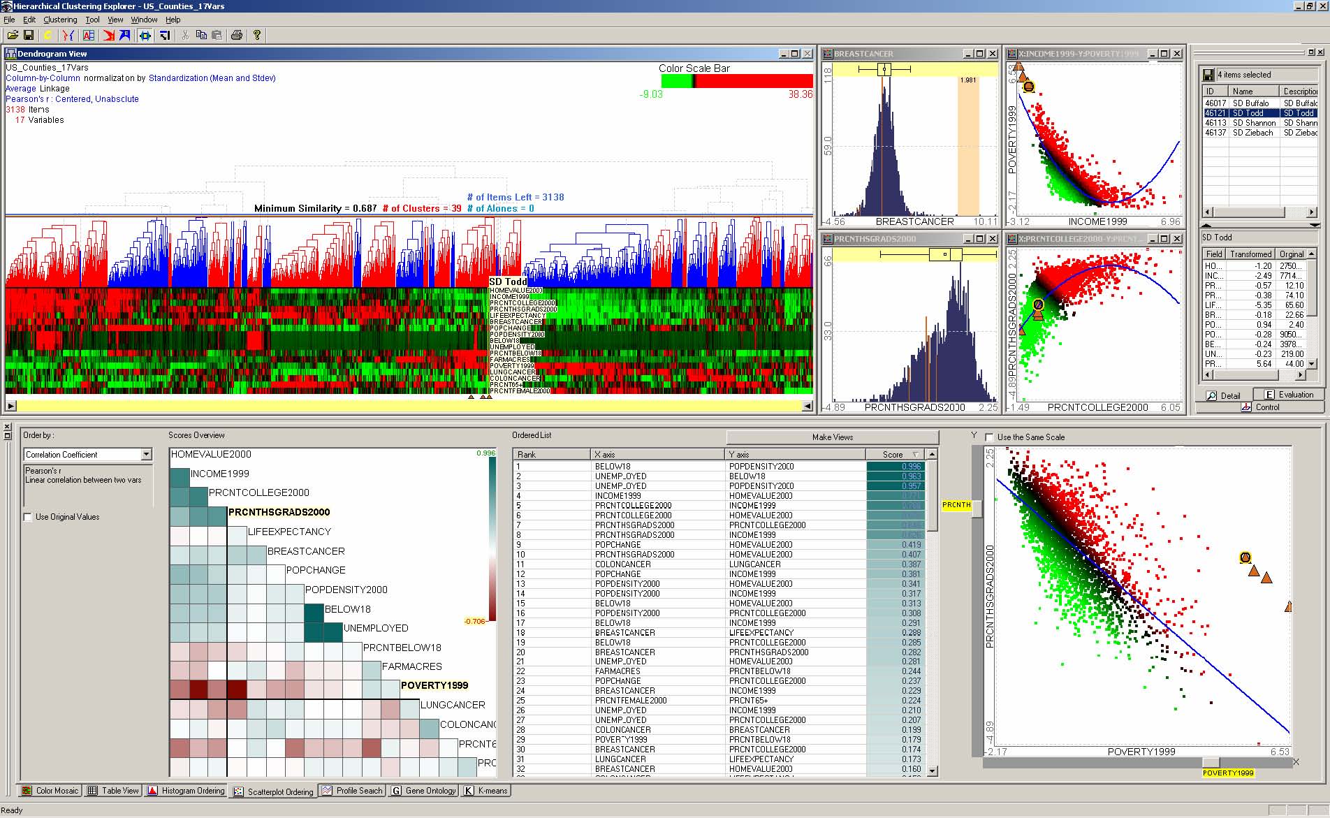
Figure 4.1 The Hierarchical Clustering Explorer (HCE) with a US counties statistics data set.
The rank-by-feature framework was implemented in our interactive exploration tool for multidimensional data, the Hierarchical Clustering Explorer (HCE) [74] (Figure 4.1) as two new tab windows (“Histogram Ordering” for 1D projections, and “Scatterplot Ordering” for 2D projections). The interactively coordinated displays in HCE 3.0 include: dendrogram view, histogram views, scatterplot views, details view at the top, and 7 tabs (Color Mosaic, Table View, Histogram Ordering, Scatterplot Ordering, Profile Search, Gene Ontology, and K-means) at the bottom (Scatterplot Ordering tab is selected in the Figure 4.1) as shown in Figure 4.1. The dendrogram view at the top left corner visualizes the hierarchical clustering result of a US counties statistics data set enabling users to interactively explore the clustering result. Among the seven tabs, Histogram Ordering and Scatterplot Ordering implement the rank-by-feature framework interface for 1D and 2D respectively. In Figure 4.1, two histograms and two scatterplots are selected through the rank-by-feature interfaces and are shown as separate child windows to the right of the dendrogram view. Four selected US counties are listed in the top half of the details view and the statistics for one of the counties are shown at the bottom half. A 2D scatterplot ordering result using “Pearson correlation coefficient” as the ranking criterion is shown in the Scatterplot Ordering tab. Four counties that are poor and have a medium number of high school graduates are selected in the scatterplot browser and they are all highlighted in other views with triangles. By using the rank-by-feature framework, users can easily find interesting histograms and scatterplots, and generate separate windows to visualize those plots. All these plots are interactively coordinated with other views (e.g. dendrogram and color mosaic views, tabular view, parallel coordinate view) in HCE 3.0. If users select a group of items in any view, they can see the selected items highlighted in all other views. Thus, it is possible to comprehend the data from various perspectives to get more meaningful insights.
- 4.3 GRID Principles
A playful analogy may help clarify our goals [75]. Imagine you are dropped by parachute into an unfamiliar place – it could be a forest, prairie, or mountainous area. You could set out in a random direction to see what is nearby and then decide where to turn next. Or you might go towards peaks or valleys. You might notice interesting rocks, turbulent streams, scented flowers, tall trees, attractive ferns, colorful birds, graceful impalas, and so on. Wandering around might be greatly satisfying if you had no specific goals, but if you needed to survey the land to find your way to safety, catalog the plants to locate candidate pharmaceuticals, or develop a wildlife management strategy, you would need to be more systematic. Of course, each profession that deals with the multi-faceted richness of natural landscapes has developed orderly strategies to guide novices, to ensure thorough analyses, to promote comprehensive and consistent reporting, and to facilitate cooperation among professionals.
Our principles for exploratory analysis of multidimensional data sets have similar goals. Instead of wandering, analysts should clarify their goals and use appropriate techniques to ensure a comprehensive analysis. A good starting point is the set of principles put forth by Moore and McCabe, who recommended that statistical tools should (1) enable users to examine each dimension first and then explore relationships among dimensions, and (2) offer graphical displays first and then provide numerical summaries [62]. I extend Moore and McCabe’s principles to include ranking the projections to guide discovery of desired features, and realize this idea with overviews to see the range of possibilities and coordination to see multiple presentations. An orderly process of exploration is vital, even though there will inevitably be excursions, iterations, and shifts of attention from details to overviews and back.
The rank-by-feature framework is especially potent for interactive feature detection in multidimensional data. To promote comprehensibility, I concentrate on axis-parallel projections; however, the rank-by-feature framework can be used with general geometric projections. Although 3D projections are sometimes useful to reveal hidden features, they suffer from occlusion and the disorientation brought on by the cognitive burden of navigation. On the other hand, 2D projections are widely understood by users, allowing them to concentrate on the data itself rather than being distracted by navigation controls.
Detecting interesting features in low dimensions (1D or 2D) by utilizing powerful human perceptual abilities is crucial to understand the original multidimensional data set. Familiar graphical displays such as histograms, scatterplots, and other well-known 2D plots are effective to reveal features including basic summary statistics, and even unexpected features in the data set. There are also many algorithmic or statistical techniques that are especially effective in low-dimensional spaces. While there have been many approaches utilizing such visual displays and low-dimensional techniques, most of them lack a systematic framework that organizes such functionalities to help analysts in their feature detection tasks.
Our Graphics, Ranking, and Interaction for Discovery (GRID) principles are designed to enable users to better understand distributions in one (1D) or two dimensions (2D), and then discover relationships, clusters, gaps, outliers, and other features. Users work by viewing graphical presentations (histograms, boxplots, and scatterplots), and then choose a feature detection criterion to rank 1D or 2D axis-parallel projections. By combining information visualization techniques (overview, coordination, and dynamic query) with ranking, summaries and statistical methods users can systematically examine the most important 1D and 2D axis-parallel projections. GRID principles are summarized as:
(1) study 1D, study 2D, then find features
(2) ranking guides insight, statistics confirm.
Abiding by these principles, the rank-by-feature framework has an interface for 1D projections and a separate one for 2D projections. Users can begin their exploration with the main graphical display - histograms for 1D and scatterplots for 2D - and they can also study numerical summaries for more details.
The rank-by-feature framework helps users systematically examine low-dimensional (1D or 2D) projections to maximize the benefit of exploratory tools. In this framework, users can select an interesting ranking criterion. Users can rank low-dimensional projections (1D or 2D) of the multidimensional data set according to the strength of the selected feature in the projection. When there are many dimensions, the number of possible projections is too large to investigate by looking for interesting features. The rank-by-feature framework relieves users from such burdens by recommending projections to users in an ordered manner defined by a ranking criterion that users selected. This framework has been implemented in our interactive visualization tool, HCE 3.0 ( www.cs.umd.edu/hcil/hce/ ).
- 4.4 1D Histogram Ordering
Users begin the exploratory analysis of a multidimensional data set by scrutinizing each dimension (or variable) one by one. Just looking at the distribution of values of a dimension gives them useful insight into the dimension. The most familiar graphical display tools for 1D data are histograms and boxplots. Histograms graphically reveal the scale and skewness of the data, the number of modes, gaps, and outliers in the data. Boxplots are also excellent tools for understanding the distribution within a dimension. They graphically show the five-number summary (the minimum, the first quartile, the median, the third quartile, and the maximum). These numbers provide users with an informative summary of a dimension’s center and spread, and they are the foundation of multidimensional data analysis for deriving a model for the data or for selecting dimensions for effective visualization.
- 4.4.1 Graphical User Interface
The main display for the rank-by-feature framework for 1D projections shows a combined histogram and boxplot (Figure 4.2). The interface consists of four coordinated parts: control panel, score overview, ordered list, and histogram browser. Users can select a ranking criterion from a combo box in the control panel, and then they see the overview of scores for all dimensions in the score overview according to the selected ranking criterion. All dimensions are aligned from top to bottom in the original order, and each dimension is color-coded by the score value. By default, cells of high value have bright blue green colors and cells of low value have bright brown colors. The cell of middle value has the white color. As a value gets closer to the middle value, the color intensity attenuates. Users can change the colors for minimum, middle, and maximum values. The color scale and mapping are shown at the top right corner of the overview (B).
Users can easily see the overall pattern of the score distribution, and more importantly they can preattentively identify the dimension of the highest/lowest score in this overview. Once they identify an interesting row on the score overview, they can just mouse over the row to view the numerical score value and the name of the dimension is shown in a tooltip window (Figure 4.2). The mouseover event is also instantaneously relayed to the ordered list and the histogram browser, so that the corresponding list item is highlighted in the ordered list and the corresponding histogram and boxplot are shown in the histogram browser. The score overview, the ordered list, and the histogram browser are interactively coordinated according to the change of the dimension in focus. In other words, a change of dimension in focus in one of the three components leads to the instantaneous change of dimension in focus in the other two components.
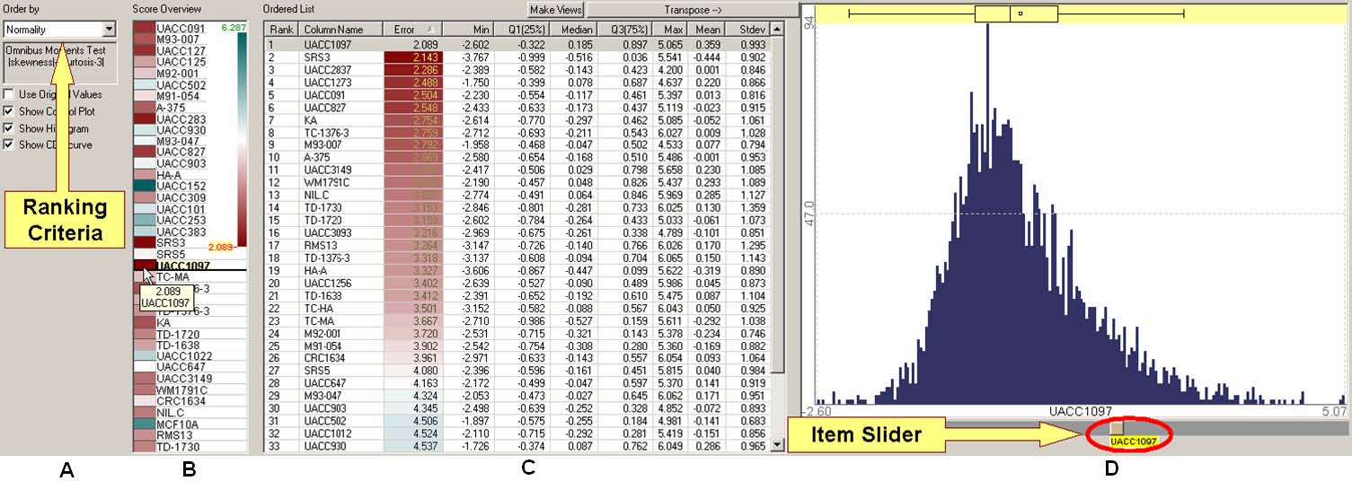
Figure 4.2 Rank-by-feature framework interface for histograms (1D). All 1D histograms are ordered according to the current ranking criterion (A) in the ordered list (C). The score overview (B) shows an overview of scores of all histograms. A mouseover event activates a cell in the score overview, highlights the corresponding item in the ordered list (C) and shows the corresponding histogram in the histogram browser (D) simultaneously. A click on a cell at the score overview selects the cell and the selection is fixed until another click event occurs in the score overview or another selection event occurs in other views. A selected histogram is shown in the histogram browser (D), where users can easily traverse histogram space by changing the dimension for the histogram using an item slider. A boxplot is also displayed above the histogram to show the graphical summary of the distribution of the dimension. (Data shown is from a gene expression data set from a melanoma study (3614 genes x 38 samples)).
In the ordered list, users can see the numerical detail about the distribution of each dimension in an orderly manner. The numerical detail includes the five-number summary of each dimension and the mean and the standard deviation. The numerical score values are also shown at the third column whose background is color-coded using the same color-mapping as in the score overview.
While numerical summaries of distributions are very useful, sometimes they are misleading. For example, when there are two peaks in a distribution, neither the median nor the mean explains the center of the distribution. This is one of the cases for which a graphical representation of a distribution (e.g., a histogram) works better. In the histogram browser, users can see the visual representation of the distribution of a dimension at a time. A boxplot is a good graphical representation of the five-number summary, which together with a histogram provides an informative visual description of a dimension’s distribution. It is possible to interactively change the dimension in focus just by dragging the item slider attached to the bottom of the histogram.
- 4.4.2 Ordering Criteria
Since different users may be interested in different features in the data sets, it is desirable to allow users to customize the available set of ranking criteria. However, I have chosen the following ranking criteria that I think fundamental and common for histograms as a starting point, and I have implemented them in HCE 3.0:
(1) Normality of the distribution (0 to inf):
Many statistical analysis methods such as t-test, ANOVA are based on the assumption that the data set is sampled from a Gaussian normal distribution. Therefore, it is useful to know the normality of the data set. Since a distribution can be nonnormal due to many different reasons, there are at least ten statistical tests for normality including the Shapiro-Wilk and Kolmogorov-Smirnov tests. The omnibus moments test for normality was used in the current implementation. The test returns two values, skewness (s) and kurtosis (k). Since s is 0 and k is 3 for a standard normal distribution, |s|+|k-3| is calculated to measure how the distribution deviates from the normal distribution and rank variables according to the measure. Users can confirm the ranking result using the histogram browser to gain an understanding of how the distribution shape deviates from the familiar bell-shaped normal curve.
(2) Uniformity of the distribution (0 to number of bins):
For the uniformity test, an information-based measure called entropy was used. Given k bins in a histogram, the entropy of a histogram H is , where p![]() i is the probability that an item belongs to the i-th
bin. High entropy means that values of the dimension are from a
uniform distribution and the histogram for the dimension tends to be
flat. While knowing a distribution is uniform is helpful to understand
the data set, it is sometimes more informative to know how far a
distribution deviates from uniform distribution since a biased
distribution sometimes reveals interesting outliers.
i is the probability that an item belongs to the i-th
bin. High entropy means that values of the dimension are from a
uniform distribution and the histogram for the dimension tends to be
flat. While knowing a distribution is uniform is helpful to understand
the data set, it is sometimes more informative to know how far a
distribution deviates from uniform distribution since a biased
distribution sometimes reveals interesting outliers.
(3) The number of potential outliers (0 to n):
To count outliers in a distribution, I used the 1.5*IQR (Interquartile range: the difference between the first quartile (Q1) and the third quartile (Q3)) criterion that is the basis of a rule of thumb in statistics for identifying suspected outliers [62]. An item of value d is considered as a suspected (mild) outlier if d > (Q3+1.5*IQR) or d < (Q1-1.5*IQR). To get more restricted outliers (or extreme outliers), 3*IQR range can be used. It is also possible to use an outlier detection algorithm developed in the data mining. Outliers are one of the most important features not only as noisy signals to be filtered but also as a truly unusual response to a medical treatment worth further investigation or as an indicator of credit card fraud.
(4) The number of unique values (0 to n):
At the beginning of the data analysis, it is useful to know how many unique values are in the data. Only small number of unique values in a large set may indicate problems in sampling or data collection or transcription. Sometimes it may also indicate that the data is a categorical value or the data was quantized. Special treatment may be necessary to deal with categorical or quantized variables.
(5) Size of the biggest gap (0 to max range of dimensions):
Gap is an important feature that can reveal separation of data items and modality of the distribution. Let t be a tolerance value, n be the number of bins, and fmax be the maximum frequency. I define a gap as a set of contiguous bins {bk} where bk (k=0 to n) has less than t* fmax items. The procedure sequentially visits each bin and merges the satisfying bins to form a bigger set of such bins. It is a simple and fast procedure. Among all gaps in the data, histograms are ranked by the biggest gap size in each histogram. Since equal-sized bins are used, the biggest gap contains the most bins satisfying the tolerance value t.
For some of the ranking criteria for histogram ordering such as normality, there are many available statistical tests to choose from. I envision that many researchers could contribute statistical tests that could be easily incorporated into the rank-by-feature framework as plug-ins. For example, since outlier detection is a rich research area, novel statistical tests or new data mining algorithms are likely to be proposed in the coming years, and they could be made available as plug-ins.
- 4.5 2D Scatterplot Ordering
According to our fundamental principles for improving exploration of multidimensional data, after scrutinizing 1D projections, it is natural to move on to 2D projections where pair-wise relationships will be identified. Relationships between two dimensions (or variables) are conveniently visualized in a scatterplot. The values of one dimension are aligned on the horizontal axis, and the values of the other dimension are aligned on the vertical axis. Each data item in the data set is shown as a point in the scatterplot whose position is determined by the values at the two dimensions. A scatterplot graphically reveals the form (e.g., linear or curved), direction (e.g., positive or negative), and strength (e.g., weak or strong) of relationships between two dimensions. It is also easy to identify outlying items in a scatterplot, but it can suffer from overplotting in which many items are densely packed in one area making it difficult to gauge the density.
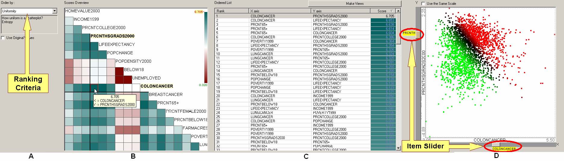
Figure 4.3 Rank-by-feature framework interface for scatterplots (2D). All 2D scatterplots are ordered according to the current ordering criterion (A) in the ordered list (C). Users can select multiple scatterplots at the same time and generate separate scatterplot windows to compare them in a screen. The score overview (B) shows an overview of scores of all scatterplots. A mouseover event activates a cell in the score overview, highlights the corresponding item in the ordered list (C) and shows the corresponding scatterplot in the scatterplot browser (D) simultaneously. A click on a cell at the score overview selects the cell and the selection is fixed until another click event occurs in the score overview or another selection event occurs in other views. A selected scatterplot is shown in the scatterplot browser (D), where it is also easy to traverse scatterplot space by changing X or Y axis using item sliders on the horizontal or vertical axis. (The data set shown is a demographic and health related statistics for 3138 U.S. counties with 17 attributes.)
- 4.5.1 Graphical User Interface
Scatterplots are used as the main display for the rank-by-feature framework interface for 2D projections. Figure 4.3 shows the interactive interface design for the rank-by-feature framework for 2D projections. Analogous to the interface for 1D projections, the interface consists of four coordinated components: control panel, score overview, ordered list, and scatterplot browser. Users select an ordering criterion in the control panel on the left, and then they see the complete ordering of all possible 2D projections according to the selected ordering criterion (Figure 4.3A). The ordered list shows the result of ordering sorted by the ranking (or scores) with scores color-coded on the background. Users can click on any column header to sort the list by the column. Users can easily find scatterplots of the highest/lowest score by changing the sort order to ascending or descending order of score (or rank). It is also easy to examine the scores of all scatterplots with a certain variable for horizontal or vertical axis after sorting the list according to X or Y column by clicking the corresponding column header.
Users cannot, however, see the overview of entire relationships between variables at a glance in the ordered list. Overviews are important because they can show the whole distribution and reveal interesting parts of data. I have implemented a new version of the score overview for 2D projections. It is an m-by-m grid view where all dimensions are aligned in the rows and columns. Each cell of the score overview represents a scatterplot whose horizontal and vertical axes are dimensions at the corresponding column and row respectively. Since this table is symmetric, I used only the lower-triangular part for showing scores and the diagonal cells for showing the dimension names as shown in Figure 4.3B. Each cell is color-coded by its score value using the same mapping scheme as in 1D ordering. As users move the mouse over a cell, the scatterplot corresponding to the cell is shown in the scatterplot browser simultaneously, and the corresponding item is highlighted in the ordered list (Figure 4.3C). The score overview, ordered list, and scatterplot browser are interactively coordinated according to the change of the dimension in focus as in the 1D interface.
In the score overview, users can preattentively detect the highest/lowest scored combinations of dimensions thanks to the linear color-coding scheme and the intuitive grid display. Sometimes, users can also easily find a dimension that is the least or most correlated to most of other dimensions by just locating a whole row or column where all cells are the mostly bright brown or bright blue green. It is also possible to find an outlying scatterplot whose cell has distinctive color intensity compared to the rest of the same row or column. After locating an interesting cell, users can click on the cell to select, and then they can scrutinize it on the scatterplot browser and on other tightly coordinated views in HCE 3.0.
While the ordered list shows the numerical score values of relationships between two dimensions, the interactive scatterplot browser best displays the relationship graphically. In the scatterplot browser, users can quickly take a look at scatterplots by using item sliders attached to the scatterplot view. Simply by dragging the vertical or horizontal item slider bar, users can change the dimension for the horizontal or vertical axis. With the current version implemented in HCE 3.0, users can investigate multiple scatterplots at the same time. They can select several scatterplots in the ordered list by clicking on them with the control key pressed. Then, click “Make Views” button on the top of the ordered list, and each selected scatterplot is shown in a separate child window. Users can select a group of items by dragging a rubber rectangle over a scatterplot, and the items within the rubber rectangle are highlighted in all other views. On some scatterplots they might gather tightly together, while on other scatterplots they scatter around.
- 4.5.2 Ordering Criteria
Again interesting ranking criteria might be different from user to user, or from application to application. I have chosen the following six ranking criteria that I think are fundamental and common for scatterplots, and I have implemented them in HCE. The first three criteria are useful to reveal statistical (linear or quadratic) relationships between two dimensions (or variables), and the next three are useful to find scatterplots of interesting distributions.
(1) Correlation coefficient (-1 to 1):
For the first criterion, I use Pearson's correlation coefficient (r) for a scatterplot (S) with n points defined as
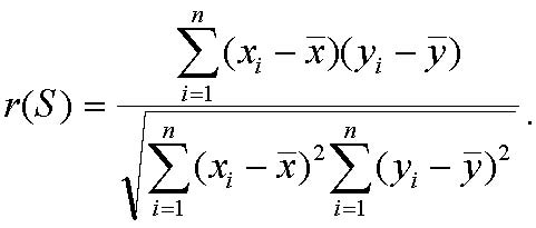 .
.
Pearson’s r is a number between -1 and 1. The sign tells us direction of the relationship and the magnitude tells us the strength of the linear relationship. The magnitude of r increases as the points lie closer to the straight line. Linear relationships are particularly important because straight line patterns are common and simple to understand. Even though a strong correlation between two variables does not always mean that one variable causes the other, it can provide a good clue to a true cause, which could be another variable. Moreover, dimensionality can be reduced by combining two strongly correlated dimensions, and visualization can be improved by juxtaposing correlated dimensions. As a visual representation of the linear relationship between two variables, the line of best fit or the regression line is drawn over scatterplots.
(2) Least square error for curvilinear regression (0 to 1)
This criterion is to sort scatterplots in terms of least-square errors from the optimal quadratic curve fit so that users can easily isolate ones where all points are closely/loosely arranged along a quadratic curve. Users are often interested to find nonlinear relationships in the data set in addition to linear relationships. For example, economists might expect that there is a negative linear relationship between county income and poverty, which is easily confirmed by correlation ranking. However, they might be intrigued to discover that there is a quadratic relationship between the two, which can be easily revealed using this criterion.
(3) Quadracity (0 to inf)
If two variables show a strong linear relationship, they also produce small error for curvilinear regression because the linear relationship is a special case of the quadratic relationship, where the coefficient of the highest degree term (x2) is zero. To emphasize the real quadratic relationships, I add “Quadracity” criterion. It ranks scatterplots according to the coefficient of the highest degree term, so that users can easily identify ones that are more quadratic than others. Of course, the least square error criterion should be considered to find more meaningful quadratic relationships, but users can easily see the error by viewing the fitting curve and points at the scatterplot browser.
(4) The number of potential outliers (0 to n)
Even though there is a simple statistical rule of thumb for identifying suspected outliers in 1D, there is no simple counterpart for 2D cases. Instead, there are many outlier detection algorithms developed by data mining and database researchers. Among them, distance-based outlier detection methods such as DB-out [48] define an object as an outlier if at least a fraction p of the objects in the data set are apart from the object more than at a distance greater than a threshold value. Density-based outlier detection methods such as LOF-based method [12] define an object as an outlier if the relative density in the local neighborhood of the object is less than a threshold, in other words the local outlier factor (LOF) of the object is greater than a threshold. Since the LOF-based method is more flexible and dynamic in terms of the outlier definition and detection, I included the LOF-based method in the current implementation.
(5) The number of items in the region of interest (0 to n)
This criterion is the most interactive since it requires users to specify a (rectangular, elliptical, or free-formed) region of interest by dragging the mouse with the left button depressed on the scatterplot browser. Then the algorithm uses the number of items in the region to order all scatterplots so that users can easily find ones with largest/smallest number of items in the given 2D region. An interesting application of this ranking criterion is when users specify an upper left or lower right corner of the scatterplot. Users can easily identify scatterplots where most/least items have low value for one variable (e.g. salary of a baseball player) and high value for the other variable (e.g. the batting average). In this way, users can use this ranking criterion to learn properties of associations between variables.
(6) Uniformity of scatterplots (0 to number of cells)
For this criterion, I calculate the entropy in the same way as I did for histograms, but this time I divide the two-dimensional space into regular grid cells and then use each cell as a bin. For example, if I have generated k-by-k grid, the entropy of a scatterplot S is
![]() , where pij is the probability that an item belongs to the cell at (i, j) of the grid.
, where pij is the probability that an item belongs to the cell at (i, j) of the grid.
Since the more scattered a scatterplot is the greater the entropy is, scatterplots of high entropy are ranked high according to this ranking criteria.
- 4.6 Transformations and Potential Ranking Criteria
Users sometimes want to transform the variable to get a better result. For example, log transformations convert exponential relationships to linear relationships, straighten skewed distributions, and reduce the variance. If variables have differing ranges, then comparisons must be done carefully to prevent misleading results, e.g. a gap in a variable whose range is 0~1000 is not usually comparable to a gap in a variable whose range is 2~6. Therefore transformations, such as standardization to common scales, are helpful to ensure that ranking results are useful. In the current rank-by-feature framework, users can perform five transformations (natural log, standardization, normalization to the first column or to the median, and linear scaling to a certain range) over each column or row of the data set when loading the data set. Then when they use the rank-by-feature framework, the transformation results will apply to the transformed values. An improvement to the rank-by-feature framework would allow users to apply transformations during their analyses, not only at the data loading time. More transformations, such as polynomial or sinusoidal functions, would also be useful.
I have implemented only a small fraction of possible ranking criteria in the current implementation. Among the many useful ranking criteria, I suggest three interesting and potent ones.
- 4.6.1 Modality
If a distribution is normal, there should be one peak in a histogram. But sometimes there are several peaks. In those cases, different analysis methods (such as sinusoidal fitting) should be applied to the variable, or the variable should be partitioned to separate each peak (bell-shaped curve). In this sense, the modality is also an important feature. One possible score for the detection of multi-modality could be the change of sign of the first derivative of the histogram curve. If there is one peak, there should be no change at the sign of the first derivative. If there are two peaks, the sign should change once.
- 4.6.2 Outlierness
The number of outliers can be one of the informative features that contribute to making a better sense of underlying data sets. However, sometimes “outlierness,” the strength of the outliers in a projection is more informative feature than the number of outliers. The strongest outlier by itself can be a very important signal to users, and at the same time the axes of the projection where the outlier turns out to be a strong outlier can also be informative features because variables for those axes can give an explanation of the outlier’s strength. One possible score for the outlierness could be the maximum value of the local outlier factor (LOF) on a projection.
- 4.6.3 Gaps in 2D
As we already saw in the 1D ordering cases, gaps are an informative feature in the data set. Several researchers in other fields also have studied related problems such as the largest empty rectangle problem [16, 22] and the hole detection [56]. The largest empty rectangle problem is defined as follows: Given a 2D rectangular space and points inside it, find the largest axis-parallel subrectangle that lies within the rectangle and contains no points inside it. The hole detection problem is to find informative empty regions in a multidimensional space. The time complexity of the current implementations prevents exploratory data analysis. A more rapid algorithm could use the grid-based approach that was effective in the uniformity criteria. The projection plane can be divided into a relatively small number of grid cells (say 100 by 100), so that it becomes easy to find the biggest gap, similar to the method used for ranking 1D histogram gaps.
- 4.7 Dealing with Categorical Data
Variables in multidimensional data sets are usually distinguished into two categories: categorical and quantitative. Categorical variables are also called nominal variables. Their values are elements of a bounded discrete set. For example, ‘type of songs’ is a categorical variable since all possible values can be drawn from an enumerated set, {rock, jazz, pop, hip-hop, R&B, classical, others}. If the set has only two elements, those variables are called binary. Quantitative variables can be further distinguished into ordinal and continuous, and there are more specific distinctions in the continuous variables. Until the previous section, HCE only deals with quantitative variables. Categorical variables require different treatments. If we can encode categorical values as integer values and treat them as quantitative values, for example, rock=1, jazz=2 and so on, then we can calculate for example Pearson correlation coefficient between a continuous variable and a categorical variable. But the result is meaningless because Pearson correlation coefficient measure is applicable only to quantitative variables pairs.
When we examine relationships between a pair of variables (categorical or quantitative), we have to consider more general relationships other than correlation coefficient. Correlation coefficient is one of many possible associations between variables. One of the most famous statistical methods to measure associations between two categorical variables is the chi-square statistic. Any non-categorical variables can be transformed to categorical variables by binning or quantizing the values. Thus, it is now possible to measure associations between categorical and quantitative variables. Since the term “association” means dependency in statistics, chi-square statistic is a measure of dependency between two variables.
Let’s assume that we measure an association between two variables, x and y. x has n bins (or categories) {xbi| i=1..n} and y has m bins (or categories) {ybj| j=1..m}. Then the chi-square statistic is calculated as follows:
![]() , where is the observed frequency of a value belonging to both xb
, where is the observed frequency of a value belonging to both xb![]() i and ybj, and is the expected frequency of a value belonging to both xb
i and ybj, and is the expected frequency of a value belonging to both xb![]() i and ybj.
i and ybj.
Like other statistics, the chi-square statistic also returns a p-value which represents the significance of an association. Smaller p-values mean greater significance. While the chi-square statistic and p-value confirms that there is some association, the nature or the strength of association is not revealed by the test statistic. The nature of association can be identified by investigating visual displays or through other ranking criteria such as “number of items in ROI.” There are several methods to evaluate the strength of associations. Mutual information measure from information theory can be a good candidate, or other statistic like Cramer’s V and Contingency coefficient C can also be another good choice [65]. Score overview can be improved by visualizing more than one measure at the same time. For example, each cell is color-coded by the significance of association, and size-coded by the strength of association, or vice versa. Figure 4.4 shows an improved score overview for ranking by association. The strength of association is coded by color in (a), (b), and (c). The existing score overview (a) is improved by introducing the significance measure for area coding.
|
|
|
|
(a) color only: Contingency coefficient C |
|
|
|
|
|
(b) color : Contingency coefficient C size : Chi-square p-value |
(c) color : Mutual information size : Chi-square p-value |
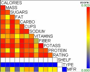
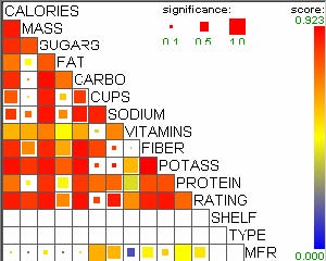
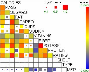
Figure 4.4 Score overview revised for ranking by association (77 cereals data set). The bigger the rectangle is, the more significant the association is.
According to Mackinlay [59], color saturation is more perceptually accurate to represent ordinal data types than area is. Thus, the ranking measure (strength of association for Figure 4.4) is better coded by color saturation, and confidence measure (significance of association for Figure 4.4) is better coded by size. Users can better identify more meaningful (or significant) and interesting scatterplots in (b) or (c) than in (a). Many associations look strong in (a), but not all of them are statistically significant. The significance information is not available in (a), but after size-coding the significance information, less significant associations get less attention due to the smaller size, so significant strong associations are more clearly recognized.
Similar coding scheme can be applied to other ranking criteria. For example, least square error measure can be incorporated as significance measure for the quadracity ranking criterion. Figure 4.5 more clearly reveals interesting and important scatterplots than Figure 5.1 (c) and (d).
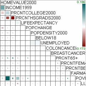
Figure 4.5 Revised score overview for quadracity ranking criterion
- 4.7.2 Ranking by Cluster Similarity
A row clustering result of a multidimensional data set can add a new categorical variable, or cluster labels (eg. cluster1, cluster 2, and so on). The new variable can take part in the ranking by association to identify other variables that have strong dependence with the variable. Sometimes researchers categorize not only rows (or items) but also columns (or variables). For example, microarray projects usually include more than two different phenotypes of samples (e.g. types of cancers and patient categories), and each sample is represented as a column in a data set. Then the phenotype information can be thought of as a category to stratify columns. The stratification partitions original data sets into two or more smaller data sets each of which has only a part of the columns with the same phenotype. Then each partition can be fed into the clustering algorithm to generate separate clustering results. By comparing those clustering results, biologist might find an interesting group of genes that are similarly or differentially expressed in different groups of homogeneous samples. Suppose two clustering results (CR1 and CR2) have been produced with two separate subsets of columns. A heuristic similarity measure is used to compare two clusters each of which is from CR1={CR1i|i=0..n} and CR2={CR2j|j=1..m}:
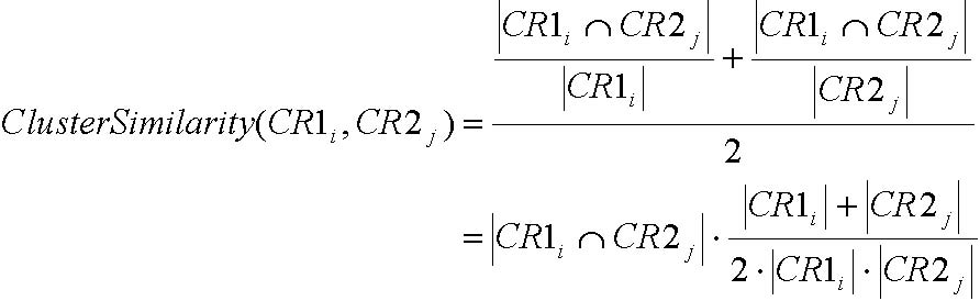 (5.1).
Other measures such as correlation between average patterns of two clusters or the F-measure discussed in section 3.3.5 can be another possible choice. The rank-by-feature framework can be easily extended to include these cluster similarity measures. In this case, the score overview should change to show measures between clusters instead of those between variables. The scatterplot browser should also change to display relationships between clusters instead of those between variables. Figure 4.6 shows the structure of two rank-by-feature user interface components for ranking by cluster similarity. In the score overview (a), each row or column represents a cluster in a clustering result. Each cell is color-coded by a cluster similarity measure like the equation (5.1). Similar cluster pairs can be preattentively identified in this display. In the scatterplot (b), each vertical or horizontal line represents an item in two clusters respectively. An intersection point has a blue square if the vertical item and the horizontal item are the same. The fraction of vertical or horizontal lines with a blue dot visualizes the similarity between two clusters. Linear alignment of blue dots on the scatterplot view tells us how similar the orders of items are in the two selected clusters.
|
|
||||||||||||||||||||||||||||||||||||||||||||||||||||||||||||||||||||||||||||||||||||||||||||||||||||||||||||||||||||||||||||||||||||||||||||||||||||||
|
(a) score overview |
(b) scatterplot |
||||||||||||||||||||||||||||||||||||||||||||||||||||||||||||||||||||||||||||||||||||||||||||||||||||||||||||||||||||||||||||||||||||||||||||||||||||||
Figure 4.6 Score overview and scatterplot display for cluster similarity ranking
This new ranking criterion was applied to a biological data set on spinal cord injuries [20]. A group of biologists studied molecular mechanisms of spinal cord degeneration and repair. They analyzed spinal cord above thoracic vertebrae T9 at various time points up to 28 days post injury. Mild, moderate and severe injury was examined. In this section, I selected two categories of injury samples; 10 control samples and 12 severe injury samples, and I ran the hierarchical clustering algorithm with the two different sets of samples to generate two dendrograms in two separate tab windows. Since the two dendrogram views are coordinated with each other and other views, users can click on a cluster in a dendrogram view and then the items in the cluster are highlighted with orange triangles in all other views including the other dendrogram view (Figure 4.7). Just by looking at where the orange triangles appear in the other dendrogram view, users can notice how items in a cluster are grouped in the other clustering result.
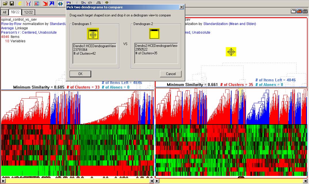
Figure 4.7 Interaction for cluster comparisons. A click on a cluster on a dendrogram highlights items in the cluster on both dendrograms with orange triangles. When users select the “Cluster Similarity” ranking criterion in the scatterplot ordering, a modeless dialog box opens, and users can drag the target-shaped icon over a dendrogram to pick a clustering result to compare.
The ranking by cluster similarity facilitates this task by providing an overview of similarity measures for all possible pairs of clusters in the two clustering results. When users select the “Cluster Similarity” ranking criterion from the scatterplot ordering tab, a modeless dialog box pops up (Figure 4.7) and users can drag and drop the target-shaped icon on dendrogram view tabs to choose two dendrograms to compare. The ranking result by cluster similarity ranking function is shown in Figure 4.8. Each cell of the score overview represents a pair of clusters. A mouseover event on the overview highlights the corresponding clusters in the selected dendrograms. The revised scatterplot view shows the overview of mapping of items between two clustering results.
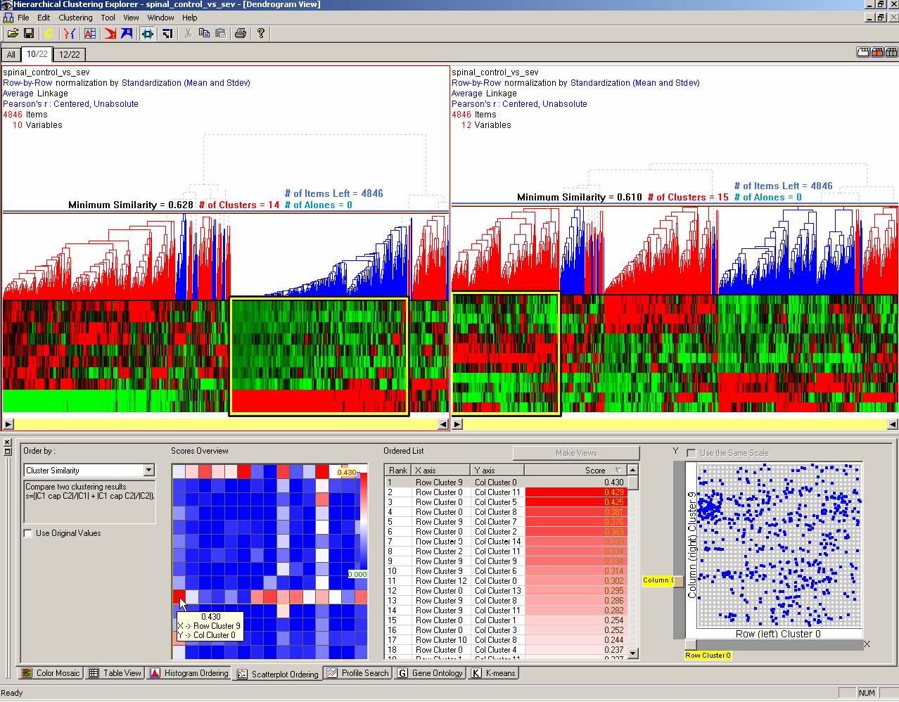
Figure 4.8 An example of ranking by cluster similarity with a spinal cord injuries data set [20] where there are two categories by severity of injuries. The left dendrogram shows a clustering result with control samples, and the right dendrogram shows one with severe injuries samples. When users select a pair of clusters on the score overview, the selected clusters are highlighted with a yellow rectangle in the dendrogram view.
- 4.8 Discussion
One of the important goals researchers want to achieve through interactive exploration of multidimensional data sets is to find interesting useful features (or structures) in the data sets. There can be two different kinds of features: global and local. In this dissertation, a feature is local if it exists only in either a subset of dimensions or a subset of all items in the data set. Otherwise it is global. As already mentioned in introduction (Chapter 1), I used the term, feature, in a broader sense to mean not only a dimension (or a variable) but also any interesting characteristics of the data set. Figure 4.9 shows the flow of feature detection task in HCE. Clustering or profile search reveal interesting groups in the data set, which leads to global features. If they are conducted using a subset of a data set or a subset of dimensions, those groups are local features. 1D or 2D ordering in the rank-by-feature framework can identify interesting dimensions or pairs of dimensions, which correspond to global features. If researchers identify a group of items in a histogram or scatterplot, that group can be a local feature. The distinction between local and global features is not clear sometimes. A feature once considered local can turn out to be a global feature later. The distinction however can help understand the task flow of HCE.
Figure 4.9 Feature detection task flow in HCE. Users open a multidimensional data set in HCE. After filtering and normalization, interactive tools in HCE enable users to find patters and models in the data set.
Dealing with missing values is an important task in data analysis applications. Improperly manipulated missing values can ruin analysis results and visualization. For example, if missing values are replaced by 0, the correlation coefficient for a scatterplot can be influenced by these missing values. In HCE, each value has its own weight flag. The weight flag is set to -1 for all missing values. Thus, missing values can be easily excluded from analysis processes such as clustering, profile search, and rankings. All those analysis processes use scoring functions such as Pearson's correlation coefficient and Euclidean distance. Input parameters to a scoring function can be modified in two different ways: (1) only the values that are not missing are passed to the scoring function, (2) weight flag vectors are passed to the function as well as the values. The former requires an extra filtering operation but it is a good choice in cases where it is difficult to change the function prototype. The latter does not involve any extra filtering operation, so it is applicable when the modification of a function prototype is possible. For example, the function prototype of the routine to calculate Pearson's correlation in HCE is
Patterns:
LocalFeatures
Models:
GlobalFeatures
Profile Search
Clustering:
HAC, K-means
2D Analysis:
Scatterplot Ordering
1D Analysis:
Histogram Ordering
Filtering & Normalization
Multidimensional Data Sets
START
double Pearson(float *x, float *xWeights, float *y, float *yWeights)
In future implementations, I might consider using various functions available in external statistical software packages such as R, Excel, SAS, and so on. In that case, the first method can be used, or it is possible to implement a wrapper function that has the prototype as in the second method and performs a filtering operation.
- 4.9 Conclusion
The take-away message from the natural landscape analogy in section 4.3 is that guiding principles can produce an orderly and comprehensive strategy with clear goals. Even when researchers are doing exploratory data analysis, they are more likely to make valuable insights if they have some notion of what they are looking for.
I believe that the proposed strategy for multidimensional data exploration with room for iteration and rapid shifts of attention enables novices and experts to make discoveries more reliably. The Graphics, Ranking and Interaction for Discovery (GRID) principles are:
(1) study 1D, study 2D, then find features
(2) ranking guides insight, statistics confirm.
The rank-by-feature framework enables users to apply a systematic approach to understanding the dimensions and finding important features using axis-parallel 1D and 2D projections of multidimensional data sets. Users begin by selecting a ranking criterion and then can see the ranking for all 1D or 2D projections. They can select high or low ranked projections and view them rapidly, or sweep through a group of projections in an orderly manner. The score overview provides a visual summary that helps users identify extreme values of criteria such as correlation coefficients or uniformity measures. Information visualization principles and techniques such as dynamic query by item sliders, combined with traditional graphical displays such as histograms, boxplots, and scatterplots play a major role in the rank-by-feature framework.
As future work, various statistical tools and data mining algorithms, including ones presented in section 4.6, can be incorporated into our rank-by-feature framework as new ranking criteria. Just as geologists, naturalists, and botanists depend on many kinds of maps, compasses, binoculars, or Global Positioning Systems, dozens of criteria seem useful in our projects. It seems likely that specialized criteria will be developed by experts in knowledge domains such as genomics, demographics, and finance. Other directions for future work include extending the rank-by-feature framework to accommodate 3D projections.
The concepts in the rank-by-feature framework and the current user interface might be difficult for many data analysts to master. However, our experience with a dozen biologists in gene expression data analysis tasks is giving us a better understanding of what training methods to use. Of particular importance is the development of meaningful examples based on comprehensible data sets that demonstrate the power of each ranking criterion. Screen space is a scarce resource in these information abundant interfaces, so higher resolution displays (I use 3800 x 2480 pixel display whenever possible) or multiple displays are helpful, as are efficient screen management strategies.
I hope the potent concepts in the rank-by-feature framework will be implemented by others with varied interfaces for spreadsheets, statistical packages, or information visualization tools. I believe that the GRID principles and the rank-by-feature framework will effectively guide users to understand dimensions, identify relationships, and discover interesting features.
- Chapter 5 Application Examples
In this section, I show an application example of the rank-by-feature framework with a collection of county information data set. The data set has 3139 rows (U.S. counties) and 17 columns (attributes). 17 attributes are explained in Table 5.1.
|
Variable Name |
Description |
|
HomeValue2000 |
median value of owner-occupied housing value, 2000 |
|
Income1999 |
per capita money income, 1999 |
|
Poverty1999 |
percent below poverty level, 1999 |
|
PopDensity2000 |
population, 2000 |
|
PopChange |
population percent change, 4/1/2000~7/1/2001 |
|
Prcnt65+ |
population 65 years old and over, 2000 |
|
Below18 |
person under 18 years old, 2000 |
|
PrcntFemale2000 |
percent of female persons, 2000 |
|
PrcntHSgrads2000 |
percent of high school graduates age 25+, 2000 |
|
PrcntCollege2000 |
percent of college graduates or higher age 25+, 2000 |
|
Unemployed |
person unemployed, 1999 |
|
PrcntBelow18 |
percent under 18 years old, 2000 |
|
LifeExpectancy |
life expectancy, 1997 |
|
FarmAcres |
farm land (acres), 1997 |
|
LungCancer |
lung cancer mortality rate per 100,000, 1997 |
|
ColonCancer |
colon cancer rate per 100,000, 1997 |
|
BreastCancer |
breast cancer per 100,000 white female, 1994~1997 |
Table 5.1 Metadata for the U.S. counties data set
Users first select the “Uniformity” for 1D ranking, and can preattentively identify the three dimensions (“population,” “percent under 18 years old,” and “person unemployed”) that have low values in the score overview as shown in Figure 5.1(a). This means the distribution of values of these dimensions is biased to a small range as shown in Figure 5.2(d). The county with the extreme value (highlighted in red at the right most bin of the histogram) on all three low-scored dimensions is “Los Angeles, CA.” In the histogram for “percent of high school graduates” that has a high score (Figure 5.2(a)), LA is mapped to a bin below the first quartile on the histogram (also highlighted in red), which means there are relatively lower percentage of high school graduates in LA.
|
|
|
|
(a) Uniformity |
(b) Correlation |
|
|
|
|
(c) Quadracity |
(d) Quadracity (in gray scale) |
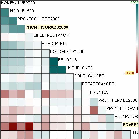
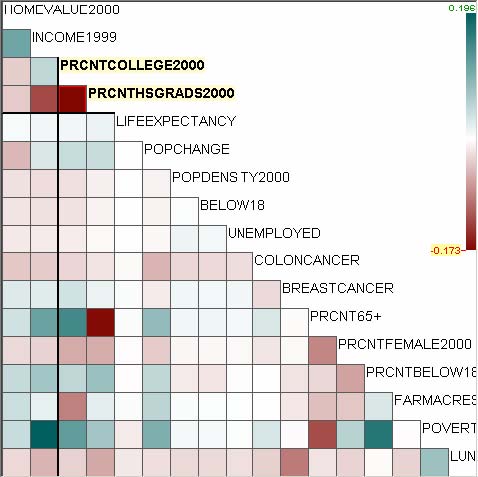
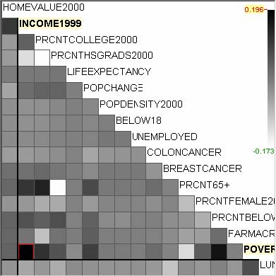
Figure 5.1 The score overviews for U.S. counties data. Bright blue green indicates high value and bright brown indicates low value. White is assigned to the value in the middle. When the value varies from negative to positive, white is assigned to the value 0 as in (b). Users who have color deficiencies or who desire different color palettes for their monitors/projectors can change color settings by right clicking on the color scale bar and choosing different colors (d).
|
|
|
|
(a) 6.7 |
(b) 6.1 |
|
|
|
|
(c) 4.5 |
(d) 1.5 |
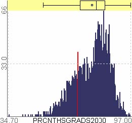
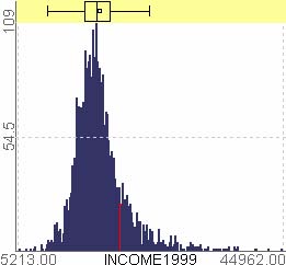
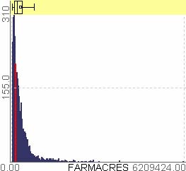
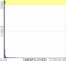
Figure 5.2 Four selected histograms ranging from high uniformity (a) to low uniformity (d). The bar for Los Angeles, CA (LA) is highlighted in red in each figure. In (d) the distribution is concentrated on the far left and LA appears as an outlier at the far right.
Figure 5.3 shows 4 histograms ranked by the biggest gap size. Gap detection was performed with standardized values (i.e. in this case all dimensions are transformed to a distribution whose mean is 0 and the standard deviation is 1). As discussed in section 4.6 (opening paragraph), the gap ranking criterion is affected by whether the original or transformed values are used for ranking. Ranking computations based on the original values (values before transformation), produce a different ranking result since the range of the values may change due to the transformation. The biggest gap is highlighted as a peach rectangle on each histogram. The bar to the right of the gap on (a) is for Los Angeles, CA, which confirms the previous ranking result (Figure 5.2(d)). The bar to the right of the gap on (b) is for Coconino, AZ, which means that Coconino County has exceptionally broad farm lands.
LA
LA
LA
LA
|
|
|
|
(a) 21.0 |
(b) 5.77 |
|
|
|
|
(c) 0.38 |
(d) 0.24 |
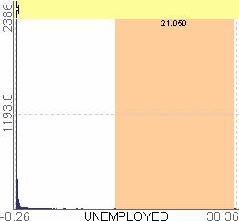
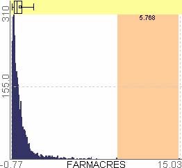
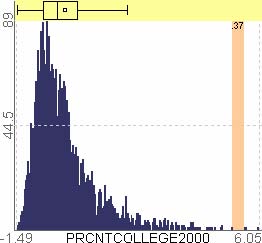
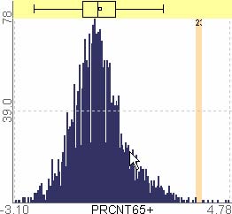
Figure 5.3 Four selected histograms ranging from big gap (a) to small gap (d). Gap detection was performed after standardizing each variable. The biggest gap is highlighted as a peach rectangle on each histogram. The bar to the right of the gap on (a) is for LA, and the bar to the right of the gap on (b) is for Coconino, AZ.
Next, if users move on to the rank-by-feature framework for 2D projections, they can choose “Correlation coefficient” as the ranking criterion. And again they preattentively identify three very bright blue green cells and two very bright brown cells in the score overview (Figure 5.1(b)). The scatterplot for one of the high-scored cells is shown in Figure 5.4(a), where LA is highlighted with an orange triangle in a circle at the top right corner. Interestingly, the three bright cells are composed by the three dimensions that have very low scores in 1D ranking by “Uniformity.” LA is also a distinctive outlier in all three high scored scatterplots. Users can confirm a trivial relationship between poverty and income, i.e. poor counties have less income (Figure 5.4(c)). The scatterplot for one of the two bright brown cells is shown in Figure 5.4(d), revealing that counties with high percentages of high school graduates are particularly free from poverty.
|
|
|
|
(a) 0.96 |
(b) 0.77 |
|
|
|
|
(c) -0.69 |
(d) -0.71 |
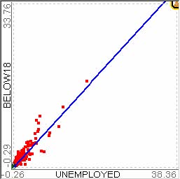
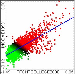
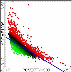
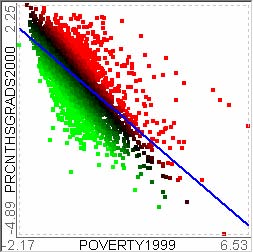
Figure 5.4 Four selected scatterplots ordered by correlation coefficient. The line of best fit is drawn as a blue line.
User can then run the ranking by quadracity to identify strong quadratic relationships, producing 4 interesting scatterplots. Figure 5.5 (a) and (d) show weak quadratic relationships. It is interesting to know that they showed strong linear relationships according to the correlation coefficient ranking, but each pair of variables in (a) and (d) actually have some weak quadratic relationship. (b) and (c) show almost no quadracity. The fitting errors should be considered by looking into the regression curve and points distribution before confirming the relationships.
|
|
|
|
(a) 0.2 |
(b) 0.07 |
|
|
|
|
(c) -0.02 |
(d) -0.17 |
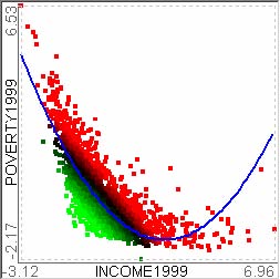
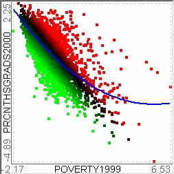
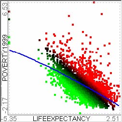
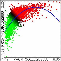
Figure 5.5 Quadracity (The coefficient of x2 term). The regression curve is drawn as a blue parabola.
Figure 5.6 shows the ranking result using the LOF-based outlier detection method. Since the current implementation does not take into account the number of items mapped to the same coordinate, the result is not so accurate, but it still makes sense at most cases. In this ranking result, while it is interesting to know which one has the most outliers, sometimes strong outliers can be found on a scatterplot with the fewest outliers. Future implementations of “outlierness” could play a better role for this case, for example, Figure 5.6(d) has one strong outlier, Union, FL, where there are a distinctively large number of lung cancer cases and the county is relatively poor.
|
|
|
|
(a) 14 |
(b) 12 |
|
|
|
|
(c) 6 |
(d) 1 |
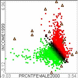
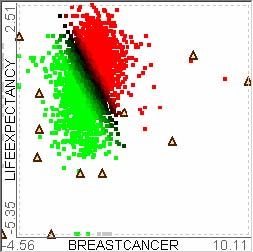
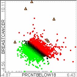
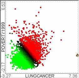
Figure 5.6 The number of outliers. Outliers whose LOF is greater than (minimum LOF + maximum LOF)/2 are highlighted as triangles.
The rank-by-feature framework is to HCE users what maps are to the explorer of unknown areas. It helps users get some idea about where to turn for the next step of their exploratory analysis of a multidimensional data set. The rank-by-feature framework in HCE 3.0 can handle much larger data sets with many more dimensions than this application example. More columns with environmental, educational, demographic, and medical statistics can be added to this example data set to discover interesting relationships among attributes across many knowledge domains.
- 5.2 Microarray Data Set
Microarray technology is actively used these days to study gene products. Biologists take samples and hybridize them in gene chips (or microarrays) to measure the activity of several thousands to tens of thousands of genes. A microarray data set consists of tens or hundreds of microarray chip measurements, so microarray data sets are usually multidimensional. In this section, I show an application example of the rank-by-feature framework with a microarray data set. A group of biologists in the Children’s National Medical Center injected a toxic material to a murine muscle to examine the muscle regeneration process. They took samples from the area where a toxin was injected at 27 different time points and measured the activities of about 12,000 genes.
The biologists start exploring the data set by looking at all 1D projections (or histograms). They can quickly browse all histograms by dragging the item slider in the histogram browser. They easily get to know that all dimensions have a similar distribution that looks like Figure 5.7. In an attempt to rank histograms by the size of the biggest gap, the sample taken at the 16th day (labeled 16D in Figure 5.7) has the biggest gap. Then, users can select the bar to the right of the gap and learn that the gene name belonging to the bar is “Troponin T3.” Troponin T3 is related to the muscle contraction. Using the profile search tab in HCE, it turns out that Troponin T3 shows a temporal pattern almost opposite to a candidate gene (MyoD) that is well-known to be related to the muscle regeneration process. This may indicate that further examination of Troponin T3 is warranted to understand how it is related to the muscle regeneration process.
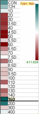
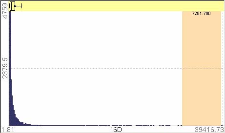
Figure 5.7 The ranking result by the size of the biggest gap. The score overview and the top ranked histogram.
Users move on to the scatterplot ordering tab and try a ranking by correlation coefficient since it is one of the most fundamental and important binary relationships. Figure 5.8 shows the score overview and two scatterplots. The time points are arranged in the sequential order from left to right and from top to bottom in the score overview. By the triangle-shaped blue green squares group (highlighted with a black triangle) in the middle of the overview, users can preattentively perceive that most of time points in the middle are highly correlated to each other as shown in the scatterplot next to the score overview. Similarly, by the rectangular brown squares group (highlighted with a black rectangle) at the bottom left corner of the score overview, it is easy to know that day 1 (1D) through day 4 (4D) samples do not correlate to the time points at the end (day 16 through day 40). At the same time the brown stripe (highlighted with a black rectangle) at the first column shows that the day 1 through day 4 samples are not correlated to the beginning time point.
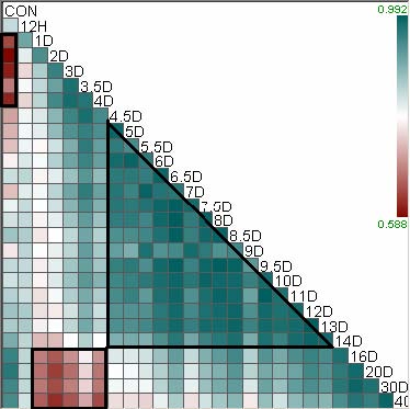
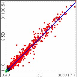

Figure 5.8 The ranking result by correlation coefficient. The score overview and the top- and bottom-ranked scatterplots.
The rank-by-feature framework saves biostatisticians a significant amount of time to explore the data set by providing efficient graphical summaries and by enabling them to interactively traverse numerous low-dimensional projections. The rank-by-feature framework sometimes leads users to unexpected finding such as distinctive outliers.
- 5.3 Summary and Discussion
In spite of their limitations, low-dimensional projections are useful tools for users to understand multidimensional data sets. Since 3D projections have the problem of the cognitive burdens of occlusion and navigation controls, I concentrate on 1D and 2D projections. Since the axis-parallel projections are much more easily interpreted by users compared to arbitrary 1D or 2D projections, I concentrate on axis-parallel 1D and 2D projections.
The rank-by-feature framework supports comprehensive exploration of these axis-parallel projections. Interactive interfaces for the rank-by-feature framework were designed for 1D and 2D projections. There are four coordinated components in each interface: control panel, score overview, ordered list, and histogram/scatterplot browser. Users choose a ranking criterion at the control panel, and then they can examine the ranked result using the remaining three coordinated components. The score overview enables users to preattentively spot distinctively high and low ranked projections due to the consistent layout and linear color-mapping, and it also helps users grasp the overall pattern of the score distribution. While the ordered list provides users with the numerical summary of each projection, the browser enables users to interactively examine the graphical representation of each projection (the combination of histogram and boxplot for a 1D projection, and scatterplot for a 2D projection). The item slider attached to histogram/scatterplot display facilitates the exploration by allowing the rapid change of the dimension in focus.
When implementing or selecting a new ranking criterion for the rank-by-feature framework, implementers should strive to limit the time complexity of ranking criterion. If there are n data items in m-dimensional space, the score function of a 2D projection is calculated m*(m-1)/2 times. If the time complexity of the score function is O(n), the total time complexity will be O(nm2). Reasonable response time can be achieved if there are efficient algorithms for computing scores for a ranking criterion. Otherwise, it is necessary to develop a quickly-computable approximate measure in order to cut down the processing time. A grid cell based approach can reduce the response time by running the algorithm on a smaller number of cells instead of actual data points. Table 5.2 shows the amount of CPU time (in seconds) to complete 2D rankings for four data sets of various sizes (# of items by # of dimensions) with our current implementation on an Intel Pentium 4 PC (2.53GHz CPU, 1GB memory) running Windows XP Professional operating system.
|
Criterion Size (row x column) |
Correlation |
Curvilinear regression & Quadracity |
Uniformity |
Number of outliers (LOF) |
|
3138 x 17 |
.05 |
.2 |
.2 |
4.1 |
|
3614 x 38 |
.1 |
.8 |
1.6 |
39.0 |
|
11704 x 105 |
2.6 |
17.4 |
38.6 |
810.2 |
|
22283 x 105 |
4.9 |
33.1 |
72.5 |
1660.0 |
Table 5.2 Performance analysis result of ranking criteria (in seconds)
In terms of scalability, the score overview is certainly better than the scatterplot matrix where a small thumbnail of the actual scatterplot is shown in each cell. However, when there are many dimensions, the score overview will become so crowded that it will be difficult to view and to read the labels. Since the screen space should be shared with other views, the score overview becomes unacceptably overcrowded in a general PC environment (with 1280x1024 screen resolutions or less) when the dimensionality is greater than about 130. In that case, a filtering or grouping mechanism will be necessary. A range slider to the right side of the score overview might control the upper and lower bound of scores displayed. If the score of a cell does not satisfy the thresholds, the cell will be grayed out. If an entire row or column is grayed out, the row or column can be filtered out so that remaining rows and columns will occupy more screen space. Implementers can also utilize the dimension clustering result that is in HCE to rank clusters of dimensions instead of individual dimensions.
Although this chapter showed only two application examples, the rank-by-feature framework can be applied to diverse data sets in various areas (e.g. such as economics, sociology, and meteorology) where features of diverse attributes and relationships among them could lead to meaningful interesting knowledge discoveries. More such applications of the rank-by-feature framework will be presented in section 7.1. Since users from a different discipline might have a different set of research interests, it could be an important future direction to enable users to customize the set of ranking criteria. Since the implementation of all those ranking criteria in HCE is almost impossible and inefficient, a better future direction would be a seamless linkage of HCE to other well-known tools where meaningful ranking criteria for corresponding users are available. When such a linkage is not feasible, many researchers could contribute their own ranking criteria as plug-ins for the rank-by-feature framework.
- Chapter 6 HCE Implementation
I have developed HCE since the fall of 2001. Version 1.0 was released in April 2002, where interactive visualization of hierarchical clustering results was possible by dynamic queries and coordination. Version 2.0 was released in January 2003 after fixing bugs and naively implementing the rank-by-feature framework for 2D scatterplots. The parallel coordinates view with interactive searches was also included in the version. Version 3.0 was released in December 2004 after implementing a more complete rank-by-feature framework (1D and 2D), tabular view, and so on.
HCE was implemented as a stand-alone PC application based on the document-view architecture [51] using Microsoft Visual C++ 6.0 and the Microsoft Foundation Class (MFC) library. The document-view architecture is a variant of the Model/View/Controller (MVC) architecture [13] that was the central concept behind the Smalltalk-80 user interface. Most modern GUI interfaces such as Macintosh and Microsoft Windows are all based on this MVC architecture. There are three explicitly separated objects in the MVC architecture - model, view and controller. The view object is responsible for the graphical or textual representation of the model object. The controller object accepts and interprets mouse or keyboard inputs from users and informs other two objects of the changes. The model object handles the behavior and data of the application domain, informs the view object of its state changes, and handles the stage change request from the controller object.
In the document-view architecture, the document object is the counterpart for the model object in the MVC architecture, and the view object is the counterpart for both the view object and the controller object in the MVC architecture. Both architectures separate data from the view of the data. One of the advantages of these architectures is that it is possible to have multiple views of the same data. Furthermore, interactive coordination among multiple views can be effectively implemented using the architectures.
To accommodate multiple-window coordination, HCE was designed as a MDI (multiple-document interface) application. MDI applications can maintain multiple forms in a single container form. As the name implies, MDI applications can handle and display multiple documents at the same time, with each view of a document displayed in its own window. Even though HCE is an MDI application, I modified the MDI framework so that HCE can handle and display only one document at a time. Views of the current document (a multidimensional data set) can be displayed in separate child forms, and the document-view architecture can support the basic coordination among views. A child form that contains a view of a document is an instance of CMDIChildFrame class. Child forms are shown within the MDI workspace of the MDI parent frame window. A minimized child form is shown at the bottom of the work space.
- 6.1 Overall User Interface Structure of HCE
The overall screen layout of HCE 3.0 is shown in Figure 6.1. MDI parent frame window holds three components: MDI workspace and two control bars. Dendrogram view, histogram, and scatterplot are displayed in the MDI workspace. Users can minimize but cannot close the dendrogram view since it is the main view of HCE and shows meta data and overview. Two control bars hold a tab control.
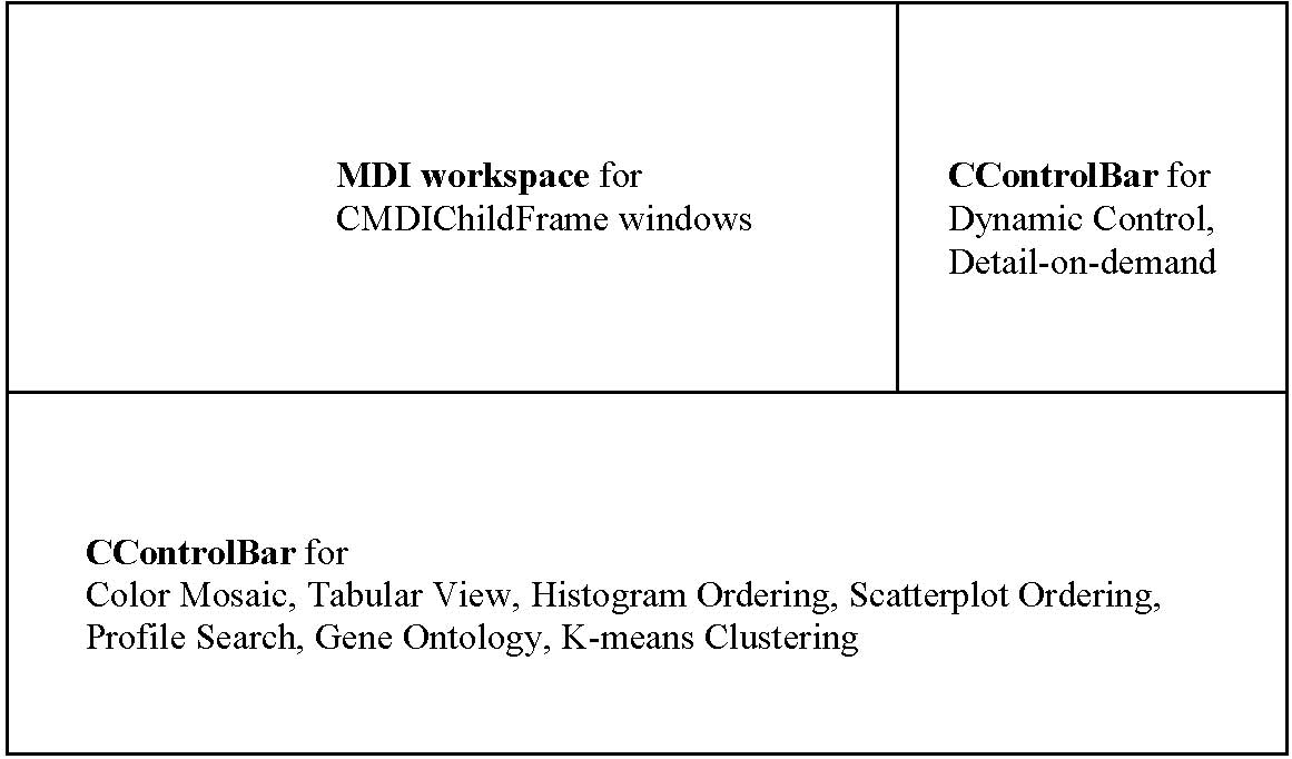
Figure 6.1 Overall Screen Layout of HCE 3.0
The control bar at the bottom has seven tab items: Color Mosaic, Tabular View (section 3.5.1), Histogram Ordering (section 4.4), Scatterplot Ordering (section 4.5), Profile Search (section 3.4), Gene Ontology (section 3.5.2), K-means Clustering. All views except color mosaic and K-means clustering in this bottom control bar were discussed in previous chapters or will be discussed later in detail. Each of them is a CFormView derived class. The other two are general CView derived classes.
MDI workspace for CMDIChildFrame windows
CControlBar for
Color Mosaic, Tabular View, Histogram Ordering, Scatterplot Ordering, Profile Search, Gene Ontology, K-means Clustering
CControlBar for
Dynamic Control,
Detail-on-demand
Color mosaic view shows the entire data set in a traditional scrollable view with scrollbars, but it superimposes a column clustering result over the color mosaic display and allows users to dynamically explore the clustering result using a minimum similarity bar. The main dendrogram view and the color mosaic view are coordinated to each other in the event of cluster selections. Users can switch between the two views so that the more important or interesting clustering result appears on the main dendrogram view. For example, if users are more interested in the column clustering result, they can see the column clustering result on the main dendrogram view and the row clustering result on the color mosaic view by switching the default views.
The control bar on the right has two tabs: Dynamic Control and Detail-on-demand. The dynamic control tab allows users to change the color mapping for dendrogram views, scatterplot views and profile search. Users can also change options or parameters for the main dendrogram view. The detail-on-demand tab shows the selected items as well as details of the item of focus.
- 6.2 Multiple Views Coordination
HCE uses UpdateAllViews method provided by the MFC library to implement multiple view coordination. When users change the status of the current document on a view through an event, UpdateAllViews function is called from the view to notify the change to all other views that are attached to the current document. OnUpdate member function for each attached view is called upon receipt of the update message. Extra information on the change that was made by the sender of the update message can be also propagated to all other views as parameters to optimize the proceeding update operations.
Figure 6.2 shows interaction relationships among major display components in HCE 3.0. All interactions are coordinated via the following events:
- • Mouse move events dynamically highlight the item under mouse cursor on the dendrogram view, parallel coordinates view and tabular view. The corresponding item is highlighted on all other views of the current document.
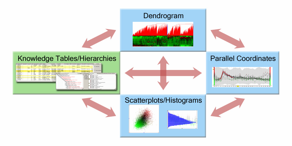
Figure 6.2 Simplified interaction diagram of HCE 3.0
One of the problems using multiple views (or windows) is that it is necessary to manage many windows in a limited screen space. At run time, the MDI workspace (Figure 6.1) of HCE can be crowded with many child frames. Scarce screen space must be allocated to many displays rather than one, and user attention must shift back and forth rapidly. Minimizing the distance between displays, avoiding overlaps and making updates rapid all contribute to improved human performance. To partially address this problem, HCE implements a customized window arrangement method in addition to the default methods provided by application framework. The new arrangement method tries to allocate more than half of the screen to the main dendrogram view while other views such as histograms and scatterplots share the remaining space. If it does not work, the main dendrogram view takes part in the arrangement process as a regular window like other windows. There are two constraints:
- 1. There can be several columns of windows but each column can only have two or three rows of windows.
This windows management strategy needs further improvements, but it is certainly better than the two default methods, cascade and tile, since it allocates more screen space to the more important view and it maintains better aspect ratios. The current GUIs do not take enough advantage of the remarkable human visual perceptual skills and large high resolution computer displays such as 3840x2400. Some recent work such as Elastic Windows [47], GroupBar [78], and QuickSpace [41] suggested appealing mechanisms for more efficient windows management. As the screen resolution becomes higher, the tiled layout together with operations on a well-organized group of windows to rapidly rearrange windows will decrease users’ cognitive load.
- 6.3 Document-View Architecture in HCE
A simplified UML diagram in Figure 6.3 shows important classes in HCE 3.0. CMyForest is a generic class that maintains data structures for the current document. The CHCEDoc class generates and holds CMyForest class instances and all attached views access CMyForest class instances and visualize them in their own way. CHCEView is a CView-derived class and it implements the main dendrogram view. The diagram shows a bidirectional interaction between CHCEView and CMyForest since CMyForest class maintains the dendrogram structure and CHCEView not only visualizes but also updates the structure. CHCEEntireView is also a CView-derived class, implementing the Color Mosaic view where dendrograms can also be shown over the color mosaic view. CHCEKmeansView is also a CView-derived class, which visualizes Kmeans clustering results. CTrendInfo is a CFormView-derived class and it contains CTrendView which implements Profile Search function. Each item or profile is represented as an instance of CPolyLine. CActiveIndexSet class maintains the set of active items for incremental query refinement.
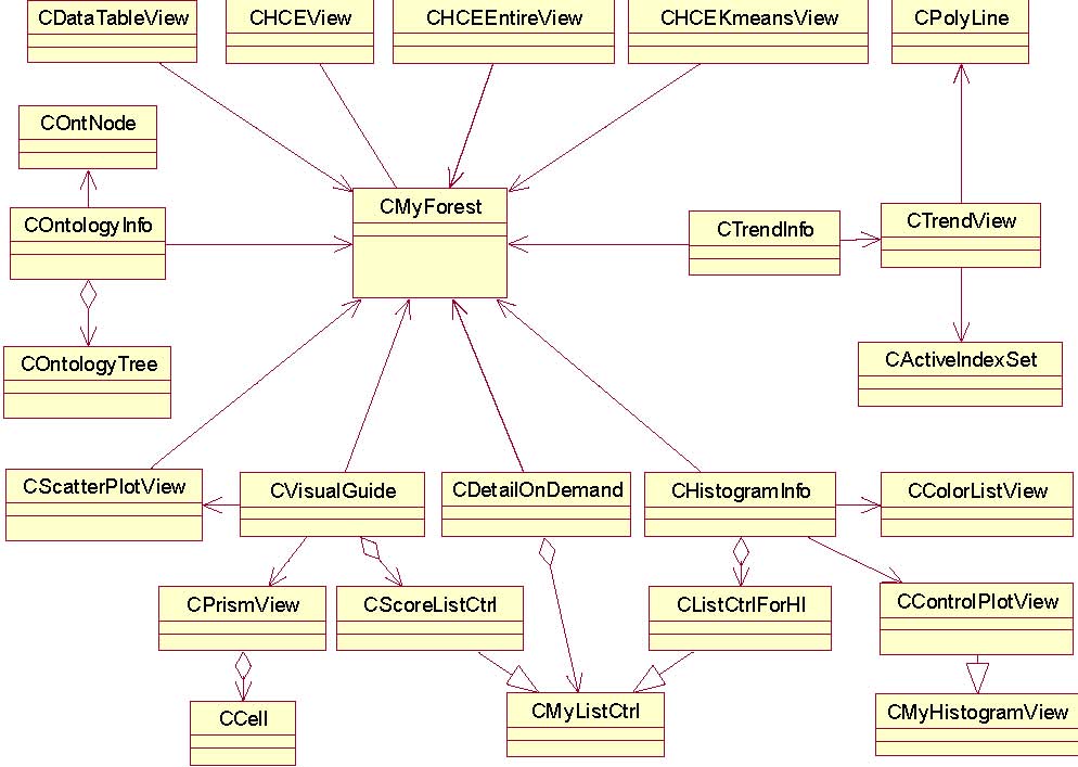
Figure 6.3 Simplified UML class diagram of HCE
CHistogramInfo and CVisualGuide are CFormView-derived classes. They are the two classes for the rank-by-feature framework (Chapter 4), which implement histogram ordering and scatterplot ordering respectively. CDetailOnDemand is a CFormView-derived class, which implements detail-on-demand feature of HCE. It shows the list of selected items and the detailed information of the item under the cursor while the mouse moves. COntologyInfo class is for Gene Ontology visualization. It is a CFormView-derived class and it parses the gene ontology data files and builds and maintains internal gene ontology hierarchies. CDataTableView is also a CFormView-derived class, which shows the raw data sets in a list control at the Tabular View (section 3.5.1).
If any view changes the status of the current document, the change is actually reflected in CMyForest instances of the current document, and update messages are sent out to all attached views by calling UpdateAllViews API function as explained in section 6.2.
- 6.4 Input File Format
An important requirement for HCE input files is that the very first column should have unique identifiers. It could be name of items, or users can fill the column by integer values from 1 to n. Users can add one special row that has field type information as shown in Figure 6.4. The first column of the row for field types should be “fieldtype.” Available types are STRING, CATEGORICAL, INTEGER, and REAL.
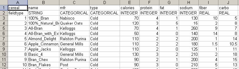
Figure 6.4 Breakfast cereal data set
Integer values should be between –2147483648 and 2147483647. Real values should be between -3.402823466e+38 and 3.402823466e+38, the decimal exponent should be between -37 and 38. If there is no field type row in an input file, all columns are assumed to have REAL-type values (floating point numbers). Many sample data files are available at www.cs.umd.edu/hcil/hce.
- 6.5 Filtering and Transformation
After selecting an input file, the preview dialog box (Figure 6.5) will show up. Users can see the first ten rows of the input file and check if the file is in the right format. Users can also perform some data filtering and transformation in this dialog box.
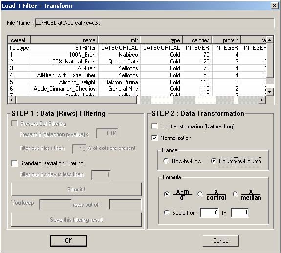
Figure 6.5 Dialog box for preview, filtering, and transformation
- 6.5.1 Present Call Filtering
This filtering is applicable only when the data set is an Affymetrix microarray data. There are two outputs from the Affymetrix noise calculations; one is the continuous p value assignment and the other is a simple “present/absent” threshold. When the probe set detection p value reaches a certain level of significance (less than 0.04 in the default setting as shown in Figure 6.5), the probe set is assigned a “present” call, while all those probe sets with less robust signal/noise ratios are assigned an “absent” call. This enables the use of a “present call” threshold noise filter. Default setting is a “10% present call” noise filter. This means that any specific probe set was required to show at least 3 “present” assignments in the 25 microarrays in the project (>10% “present” calls). All profiles that do not satisfy the requirement will be filtered out when users click "Filter it!" button.
- 6.5.2 Standard Deviation-based Filtering
Users can filter out rows based on the standard deviation. The idea is to filter out data items (or genes) that are relatively stable across the samples or time points. Rows (or genes) will be filtered out if their standard deviations considering all columns, or samples, are less than a threshold. The default threshold is 1.
- 6.5.3 Log Transformation
Users sometimes want to transform the variable to get a better result. For example, log transformations convert exponential relationships to linear relationships, straighten skewed distributions, and reduce the variance. This transformation is sometimes useful when the data set is ratio data, for example, the ratio of red/green intensities for cDNA array.
- 6.5.4 Normalization
Users can normalize the input data either row-by-row or column-by-column, and four normalization methods are available in HCE 3.0 (Table 6.1).
|
Normalization Method |
Description |
|
|
Values will be standardized, i.e. calculate the deviation from the mean and then divide the deviation by the standard deviation. After standardization, each row (, or column) will have the same mean (0) and the same standard deviation (1). |
|
|
Simply divide values by the value at the first column or row. In other words, control is always the first column or row for HCE3. |
|
|
Simply divide values by the median. |
|
rescale to a new range |
Linearly transform each row or each column to a new range of values. For example, after rescaling to the range 0 to 1, the minimum value becomes 0, the maximum value becomes 1, and values in between are linearly transformed to values between 0 and 1. |
Table 6.1 Normalization methods in HCE 3.0
If columns in an input file (like the cereal data file shown in section 6.4) have different range of values, column-by-column normalization is recommended. This normalization makes the color mapping clearer and makes columns comparable to each other. If values in all columns are already directly comparable, row-by-row normalization is recommended. For example, in Affymetrix projects each column (chip or sample) is usually normalized by probe set signal algorithms, so values in different columns are directly comparable. In such cases, row-by-row normalization improves the color mapping and accelerates the row clustering process. The choice of normalization direction (column-by-column or row-by-row) will deeply influence the clustering results and other results. There is an option to choose to use either normalized values or original values in most visualization components in HCE such as Table View, Histogram Ordering, and Scatterplot Ordering.
- 6.6 Hierarchical Agglomerative Clustering
Hierarchical agglomerative clustering (HAC) [45] was summarized in section 3.1. If we have n data items, we have n*(n-1)/2 similarity (or distance) values between every possible pair of n data items. The time complexity of the current HAC implementation in HCE is O(n2m) where n is the number of items and m is the number of dimensions. The space complexity is O(n2).
The bottleneck of HAC is the distance/similarity matrix that should be calculated and maintained. There is a tradeoff between memory requirement and speed. To maximize speed, it is necessary to keep the matrix on the main memory (RAM). To minimize the memory requirement, each entry of the matrix should be calculated on the fly whenever necessary. HCE was implemented to utilize the main memory as much as possible to speed up the clustering process. Only the lower triangular part of the matrix is kept in the memory since the matrix is symmetric and the diagonal elements are all the same (0 for distance, 1 for similarity) to reduce the memory requirement. As shown in Figure 6.6, the value and index of the current minimum of each row of the distance/similarity matrix are maintained to significantly reduce the time to find the pair of clusters with minimum distance in step 2. This additional data structure reduces the time complexity of the naïve HAC implementation by n/2.
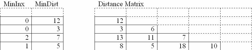
Figure 6.6 Data structure for efficient finding of min pair in distance matrix
Table 6.2 shows an experimental result on the time taken to complete the clustering of rows. If the number of rows is larger than 45000, the clustering completion time is indefinite with the current implementation of HCE running on a Pentium 4 2.53GHz and 1GB memory PC because of the memory overhead for the intermediate distance matrix. To overcome this limitation, it is necessary to develop an efficient mechanism to build and maintain the distance matrix through the clustering process.
|
Data set size |
Clustering time (in seconds) |
|||
|
# of rows |
# of columns |
HCE |
Cluster [23] |
DecisionSite [79] |
|
3138 |
17 |
4 |
21 |
1 |
|
3614 |
38 |
8 |
50 |
5 |
|
6211 |
27 |
16 |
117 |
10 |
|
12422 |
27 |
65 |
421 |
34 |
|
22690 |
40 |
226 |
* |
385 |
|
22283 |
105 |
452 |
* |
540 |
|
38305 |
6 |
430 |
* |
124 |
Table 6.2 Clustering performance analysis. Time to finish clustering rows only. HCE vsersion 2.0, Cluster version 2.11, and Sporfire DecisionSite version 8.1 were used. * indicates that the program generated an exception. The linkage method was average linkage and the distance measure was Pearson correlation coefficient.
There are some ways to improve the speed and quality of HAC. One of the interesting ways is to meaningfully partition the data set first and then run HAC with the partitions. Partitioning is also possible in many different ways. We could partition the data set using a graph-theoretic approach. Or we could partition the data set by running another clustering algorithm such as self-organizing map based clustering that is much faster than HAC and sometimes produces a reasonably good clustering result. This could be a potential hybrid approach that combines HAC and non-hierarchical (but faster) clustering algorithms to get synergistic effects.
- 6.7 Data Structures for Instant Updates
To achieve rapid responses to users’ actions, hash and map data structures were extensively used because they enable constant time lookup of items, with only a small memory overhead. In a dendrogram view, the ID of each terminal node and its horizontal position are saved into a map data structure so that selection markers can be positioned without any extensive traversal of the dendrogram and the IDs of the selected node in the dendrogram view can also be rapidly informed of to all other views attached to the same document. Similarly, in the histogram view and scatterplot view, the position of each item within the view and the ID of the corresponding item are also maintained in a multimap data structure where multiple values can be mapped to the same key. In the parallel coordinates view, incremental data structures where the active index set for intermediate query results is maintained are used to support rapid and incremental query update.
Besides the clustering process, the most processor-intensive job is the dendrogram and color mosaic drawing because of the recursive structure of their drawing function. Although a color bar (i.e. a column) of the color mosaic display has a one-to-one correspondence to a terminal node of the dendrogram display, I separate the drawing of the color mosaic from the drawing of the dendrogram whenever possible. In this way, the recursive dendrogram drawing can be done more quickly.
In addition to the speed up due to the independent drawing, to avoid massive calls for redrawing graphics objects such as dendrograms and color mosaic, I tried to keep the DIB (device independent bitmap) of current views as much as possible, so views can be refreshed quickly without calling a series of GDI (Graphics Device Interface) functions or recursive functions. For example, Figure 6.7 shows the OnDraw function for CHCEView, where DIB (m_pDib) is used instead of calling actual drawing function (Refresh) whenever it is available.
Figure 6.7 Rendering routine at OnDraw member function
A reasonably interactive rapid update for every user input is possible on a Pentium 4 2.53GHz and 1GB memory PC with a data set of up to 12000(rows) x 27(columns).
void CHCEView::OnDraw(CDC* pDC)
{
if (m_pDoc != NULL && m_pDoc->m_bForested) {
// if there is anything to draw
if (m_pDib) { // if DIB is valid
m_pDib->Draw(pDC,CPoint(0,0),m_szWindow);
if (m_bSingleSelFixed) {
HighlightSelBar(false);
}
}
else { // if DIB is not valid
Refresh(true);
}
}
else { // if there is nothing to draw
CRect rect;
GetClientRect(rect);
int iW=rect.Width(), iH=rect.Height();
pDC->BitBlt(0,0,iW,iH,NULL,0,0,WHITENESS);
}
}
- 6.8 Summary and Discussion
The current implementation of HCE enabled instantaneous updates for moderate to large data files without any special rendering hardware or any special rendering library. However, advances in data generation techniques will definitely make it necessary to use those special devices to cope with much larger data sets. OpenGL [64] or DirectX technology [61] could improve the rendering speed with most graphics cards. Special graphics card should further speed up renderings.
A special data structure in HCE for the intermediate distance matrix significantly speed up the hierarchical clustering compared to other tools like Cluster [23]. HCE also outperformed a decent commercial software to the extent that the number of rows was large just enough to fit in the main memory and the number of columns are relatively large (Table 6.2). HCE, however, still depends on the operating system in terms of the virtual memory management, so the clustering process becomes indefinitely slow as the intermediate distance matrix grows to exhaust the available physical memory. A special memory management routine is necessary to deal with data sets that need extensive external memory access for the distance matrix maintenance.
While a heuristic windows arrangement method was implemented in HCE to facilitate multiple views coordination, improved windows arrangement strategies as discussed in section 6.2 are necessary to efficiently utilize large high resolution displays so that users’ perceptual skills can be better exploited in HCE.
- Chapter 7 Evaluation
Evaluating a user interface design or an interactive system can help identify usability problems and validate an innovative idea behind the system. The first thing to do for evaluation is to decide what kind of evaluation methods to use. Lieberman’s arguments against controlled experiments in his CHI 2003 Fringe session, “The Tyranny of Evaluation [55],” emphasize the inherent variability of human subjects and the number of variables to control [33]. A controlled experiment to compare HCE to other possible approaches is hard to design and conduct due to the novelty of HCE’s capabilities and the lack of comparable alternatives. It is highly possible that interactive tools like HCE will outperform other static comparable tools. Thus, even if such study were conducted, it would not be likely to produce meaningful insight from the study. An alternative evaluation method is qualitative field tests, or case studies. These evaluation methods also have their limitations. Since one situation cannot be duplicated, the conductor may not get the same results in a different situation. Even though participants may compare with their conventional tools, there might still be other tools that could outperform the tool being tested. However, these evaluation methods are efficient to show the usefulness of a system in a real-world environment.
HCE was successfully used in two case studies with gene expression data. We had proposed a general method of using HCE to identify the optimal signal/noise balance in Affymetrix gene chip data analyses. HCE’s interactive features help researchers find the optimal combination of three variables (probe set signal algorithms, noise filtering methods, and clustering linkage methods) to maximize the effect of the desired biological variable on data interpretation [72, 73]. HCE was also used to analyze in vivo murine muscle regeneration expression profiling data using Affymetrix U74Av2 (12,488 probe sets) chips measured in 27 time points. HCE’s visual analysis techniques and dynamic query controls played an important role in finding 13 novel downstream targets that are biologically relevant during myoblast differentiation [91]. Saraiya et al. [70] evaluated HCE with three other major microarray visualization tools, and HCE outperformed other tools with the Viral data set [31]. These case studies and a evaluation showed the overall usefulness of HCE, but the rank-by-feature framework was not evaluated in the studies.
This chapter describes new evaluation results using case studies and a user survey with emphasis on the rank-by-feature framework. I have conducted new case studies with five researchers in biology, statistics and meteorology. Three case studies have been finished with valuable results, but two others have been terminated or indefinitely postponed because one researcher changed his jobs in the middle of study and the other’s expectation from the case study was not compatible with mine. Two case studies were done in the Hoffman Lab at the Children’s National Medical Center. One case study was done with a meteorologist at the University of Maryland, College Park.
The objective of these case studies was to show the potentials and usefulness of HCE and the rank-by-feature framework in a real-world environment. The main question that I hoped to answer with the case studies was “How do HCE and the rank-by-feature framework change the way researchers explore their data sets?” Participating researchers have primarily used text-based analysis tools or tools that produce static visualization. My case studies clearly show the usefulness of HCE and the rank-by-feature framework. Case study results are summarized in section 7.1.
Even though intensive case studies with a small number of subjects can show the usefulness of a system and idea, a larger scale user evaluation may help with more generalized results. I analyzed the HCE download log and users’ comments, and designed a user survey (Appendix B). About one third of the users who have downloaded HCE since April 2002 generously indicated their possible use of HCE in the download log. Using that information, a user survey questionnaire was sent out via email to all users who downloaded HCE, totaling about 1500. The user survey results are discussed in section 7.2.
- 7.1 Case Studies
One of the research labs that most intensively used HCE is the Hoffman Lab at the Children’s National Medical Center in Washington, DC. I have been a member of the bioinformatics team there and attended the biweekly team meeting for two years. My major role in the lab was to be a consultant who helped researchers computationally analyze their data sets with HCE and sometimes other tools. Researchers in the lab have been using HCE for Affymetrix GeneChip analysis since the summer of 2002. I trained five bioinformatics researchers in the lab to be educators who can teach other researchers how to use HCE. The lab director encouraged researchers to use HCE at the initial stage of their analysis where they have to get an idea on what their data set looks like and assess the quality of the raw data. I had already conducted a successful case study with a researcher in the lab. HCE’s interactive tools and coordination between the dendrogram view and the parallel coordinates view played an important role in finding 13 novel genes that are important for mouse muscle regeneration [91]. Since it did not include the evaluation of the rank-by-feature framework, the case study will not be discussed in this section.
- 7.1.1 Participants
There were five participants: two molecular biologists (P1, P2), a statistician (P3), a biostatistician (P4), and a meteorologist (P5). The two molecular biologists do not have more than basic statistical background and any experience with any statistical software other than Excel. All of them are expert users of GeneSpring [77]. P3 is a pure statistician, who is an expert in SAS, and she has a modest biological background, but she is not an expert in any biology tools. P4 has both intensive knowledge in biology and statistics, and he is an expert of GeneSpring and SAS. P5 has some knowledge of basic statistics and a data analysis/visualization tool (IDL: Interactive Data Language) [67], and he is an expert in FORTRAN programming.
Each participant has a unique data set and a distinctive analysis objective. They had not used any interactive data exploration tool like HCE before, although they have their own favorite tools for the research and analysis, which are mostly text-based and not interactive. Among five participants, even though P2 liked to use HCE’s clustering features, P2’s expectation was too high for me to satisfy in terms of functionalities that HCE can provide. This participant asked me to implement many functions that were not in HCE but in GeneSpring. After two weeks, I decided to stop the study with this participant since the expectation from this case study is not compatible with my objective. P4 was one of most interested participants, but unfortunately he left his job after one week of the case study. Thus in this chapter I report the results from case studies with three participants (P1, P3, and P5).
- 7.1.2 Methods and Goals
The main methods of these case studies were participatory observations and interviews. I not only observed and interviewed researchers, but also helped them use HCE and improved HCE according to their requirements. It was a rapid interactive iteration process where important requests were implemented during the study period and then observations and interviews were conducted again using the improved system.
For each participant, I arranged a weekly meeting for 4-6 weekly individual meetings. Although sessions were originally scheduled for thirty minutes, they usually lasted more than an hour because of prolonged discussion of problems and findings during the session. At the first meeting, I intensively taught participants how to use HCE with many examples including small general data sets and large data sets of specific interest to the research. After each meeting, participants were asked to use HCE in their everyday work. Between sessions we communicated via email or phone conversations. During the session, I sat by a participant and observed the participant using HCE, collected their implementation requests, and asked a series of questions to figure out the meaning of their findings and to examine their experience with HCE. At the end of each case study, the researchers wrote a short final report on their experiences with HCE. Interestingly some of them voluntarily sent me their report without any request. In the report, they usually included screenshots to illustrate interesting findings, and noted comments on the findings.
Case studies were focused on the evaluation of usefulness of HCE’s tools, especially the rank-by-feature framework. The observations and interviews were focused on the following aspects:
- • how does the score overview help users identify interesting projections
The next three sections describe case studies with the molecular biologist, statistician, and meteorologist, respectively. These studies are then discussed in section 7.1.6.
- 7.1.3 Affymetrix Data Set with Three Cell Types
A molecular biologist (P1) used one of the accepted animal models for acute lung injury to study inflammatory and immunological events occurring as a result of an LPS (lipopolysaccharide) injection which induces a systemic infection in a model system. P1 performed an Affymetrix microarray project with 12 samples, 4 samples for each of 3 cell types (TH1, TH2, and Platelet) from mice. TH stands for T-helper cell (immune cells). TH1 cells are active in cellular immunity and TH2 cells are active in humoral immunity. Both mature from a common precursor TH cell. The balance of each type of TH cell present in the body seems to be important in determining the progression and outcome of various disease states.
Mice were injected with LPS and sacrificed after 0, 24, and 48 hours. P1 monitored the gene expression of these peripheral blood cells. Through an interactive optimization of signal-to-noise ratios in HCE [72], P1 decided to use the MBEI algorithm available in the dChip application [54] to calculate gene expression values from the Affymetrix CEL files. The dChip program was also used to filter the complete gene list for those genes which were present in at least one TH1 sample, at least one TH2 sample and at least one Platelet sample. Expression values for this filtered gene list were then imported into HCE for further exploration with default normalization and default clustering parameters.
Histogram Ordering
As most users do with HCE, P1 also tried the histogram ordering first after loading the data set and looking at the dendrogram view. Among available ranking criteria, the “biggest gap” ranking held the most immediate interest for her. She was intrigued by the fact that gaps reveal interesting outliers. Figure 7.1 shows a ranking result by the size of the biggest gap. The selected histogram clearly shows an outlying probe set in the sample (48_1_TH2), which was identified as having the second largest gap. This probe set was similar to “A kinase (PRKA) anchor protein (yotiao) 9” which is a cytoplasmic/centriolar protein having protein-binding and kinase activity. At first P1 wrote down the probe set id and input this into NetAffix in order to obtain ontological information. But this process could have been facilitated if P1 had used the gene ontology tab and annotation function. Although P1 had been instructed in the use of the gene ontology tab, she did not use it when it would have been beneficial. After being reminded her of the function, she tried it and found it useful and efficient.
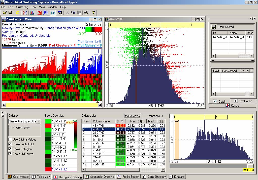
Figure 7.1 The biggest gap ranking result
P1 investigated the behavior of this probe set in other histograms using the histogram browser and discovered that the expression of this same probe set was consistently low in all TH2 samples (and progressively more so with time) and that it was consistently at a higher expression level in TH1 and Platelet cells. The behavior of a probe set like this is of interest to this project because TH1 and TH2 cells do not have very many unique cell markers, which makes it hard to identify and separate them from one another. So any gene that is very differentially regulated is of potential interest as a distinct cell marker and worthy of follow-up investigation. It is very important to have good cell markers for cell identification and separation because the balance of TH1 and TH2 cells is thought to influence the progression (recovery or fatality) of the sepsis patient.
Scatterplot Ordering
P1 tried all ranking criteria in the order that they appear in the combobox. With the very first ranking criterion, Pearson correlation coefficient, P1 noticed that relationships between samples of the same cell type were more highly correlated regardless of time point, which makes sense because the global pattern of gene expression would still be expected to be relatively cell specific and maintained from sample to sample. Figure 7.2 is a screen shot of the ranking result. She also noted that there was a fairly large degree of correlation between one of TH1 samples and Platelet samples (but not between the Platelet and TH2 samples). This is interesting in the context of other microarray analysis that was performed on this data set in GeneSpring (Silicon Genetics, Redwood City, CA) in which certain genes were identified that may be involved in Platelet regulation of the TH1/TH2 balance. This observation encourages further evaluation of the regulatory relationship between platelets and TH1 cells; this is a fairly general trend but may not have been noted with other analysis tools.
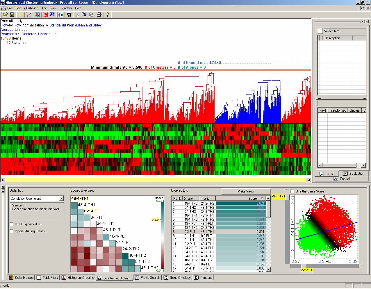
Figure 7.2 Scatterplot ordering result by correlation coefficient
Contributions and Suggestions
This case study with P1 showed that HCE informed the researcher’s overall analysis strategy and contributed to the analysis in a unique manner. First of all, HCE’s unique framework using unsupervised clustering to enable researchers to decide which probe set interpretation method to choose for their Affymetrix projects [72] attracted her to start using HCE for their analysis. There are several different Affymetrix probe set interpretation methods such as MAS5 [1], MBEI [54], RMA [44], and Probe Profiler. It is very important to choose the most appropriate method for a project because different methods produce different signal values which will be used in subsequent analyses. Since probe set interpretation selection only requires sample (or column) clustering which is much faster than gene (or row) clustering, HCE is much faster than other programs at producing a sample dendrogram. While looking into the sample clustering result and the F-measure (section 3.3.5), users usually explored the histogram ordering tab to understand distributions of samples. Then almost naturally, users move on to the scatterplot ordering tab to understand relationships between samples. Of course, this natural work flow occurs more frequently as users become more proficient with the tool.
Interactive coordination between the rank-by-feature framework and other displays such as the dendrogram view and the gene ontology view seems to enable users to draw more specific conclusions. Dynamic queries available in the dendrogram view and the profile search view definitely allows more flexibility in clustering and profile searching (by drawing an expression pattern of interest) than many other programs.
The layout of the main program interface makes the relationship between array samples much easier to interpret. In other words, the dendrogram and heat map are displayed in such a way that makes similarities and differences between arrays easy to recognize.
“There are several features that HCE offers that other programs do not with the most notable being the rank by feature functions. To my assessment, these tools allow a relatively speedy overview of the shape of one’s data. I would therefore use these sorts of features at the beginning of my analysis to note any general trends that are taking place so that I can have those in mind as I execute my subsequent analyses.”
“A great example of when this would have been helpful – I recently started analysis on a data set processed by someone else; the data was already loaded onto GeneSpring etc and as I was looking at specific lists of genes it eventually became apparent that there was something strange going on with several of my time points (which was strange because all of the quality control data for the samples looked fine) When I loaded the data into HCE – this strangeness was immediately apparent - some of my disease samples were behaving much more similarly to the controls than to the other disease samples. I would have saved a large amount of time if this data set had been loaded onto HCE to begin with and I had been able to notice that these samples had strange trends and should be carefully evaluated.”
Given all of the above, HCE adds some steps/perspectives to P1’s analysis strategy rather than changing it all together. By far, P1’s main analysis tools were dChip and GeneSpring (mostly because of their capability of comparing groups to find statistically significant differences in gene expression and GeneSpring’s ability to load in experiment parameters and save large numbers of gene lists which can be compared across projects), but through the rank-by-feature framework and the interactive visualization techniques, HCE gives P1 additional important information that these programs can not. P1 said she would definitely use HCE for future projects especially at the beginning of her analyses.
The data set used in this case study is still being evaluated - so it will be a little while before P1 publishes anything. At this point, the things P1 is following up on are genes with specific behavior patterns that P1 hope to confirm. P1 did actively use HCE to determine which signal interpretation algorithm was the most reliable for this analysis, and that should eventually be published in the methods section of upcoming papers.
- 7.1.4 FAMuSS Study Data Set
P3 is the principal statistician for the Center for Genetic Medicine, Children’s National Medical Center. Most of the data analysis P3 performs is epidemiological in nature and includes large, multi-center genetic association studies. P3’s everyday analysis tool was SAS, and P3 had almost no experience in using interactive visualization tools like HCE before this case study. I had two one-hour training sessions with P3. Since P3 is an expert in statistics, it was much easier to explain the rank-by-feature framework to P3 than to any other participants. While P3 neither analyze gene expression data nor uses the clustering abilities of HCE, P3 found HCE exceptionally useful for data exploration. P3 works with several large data sets containing categorical and continuous, parametric and non-parametric data. Most data is collected prospectively, thus data exploration is a major part of P3’s ongoing data analysis duties. HCE has been most useful for its efficient visualization ability and calculation of basic statistics.
P3 loaded a multidimensional data set from the Functional single nucleotide polymorphisms Associated with Muscle Size and Strength (FAMuSS) Study [83]. FAMuSS Study is a multicenter, NIH-funded program to examine the influence of gene polymorphisms on skeletal muscle size and strength before and after resistance exercise training. About one thousand men and women, age 18-40 year, were enrolled by one of seven exercise physiology and kinesiology sites, and trained their nondominant arm for 12 weeks. Skeletal muscle size (magnetic resonance imaging) and isometric and dynamic strength were measured before and after training. This data set has about 150 variables including anthropomorphic data, muscle strength by maximum voluntary contraction (MVC), one repetition maximum (1RM), and muscle, bone and fat size by magnetic resonance imaging (MRI). The complete list of variables is in Appendix C. Some of the measurements were done for only a subset of participants, which means that there are many missing values in the data set.
At the time I conducted this case study with P3, data collection was in active progress, and it is still going on as of March 2005. This is a part of reason why there are as much as 40% of missing data. Since this study was performed in an early stage of data analysis, most of the findings in this study were about quality of data sets and confirmation of expected relationships. As the data set becomes more complete, more interesting findings could be possible.
Histogram Ordering
“This feature is extremely useful to me as a statistician, mostly for data exploration. It allows me to look at the distributions and test normality of all variables quickly and simultaneously. Additionally useful are the listings of outliers and numbers of unique values. Typically gaining this type of information using statistics packages is very time consuming, requiring an individual test and/or graph made for each variable.”
As most HCE users do, P3 started to overview the clustering results on the dendrogram view after loading the data set. However, unlike microarray researchers P3 did not spend much time examining clustering results. Rather, P3 tried the histogram ordering. Normality criterion first attracted P3, and P3 found that several variables, such as baseline 1-RM strength, showed a bimodal distribution. It is important to know this because subsequent statistical analyses might be influenced by that. HCE also allowed P3 to see that there was a subject with a BMI (body mass index) of 2.0, an impossible number. HCE also allowed P3 to make a list of suspect data points: (1) Several subjects with BMI>40, (2) Several subjects with a body mass>300 lbs, (3) A subjects with a height of 55 inches. Follow-up examinations identified some data errors, and also confirm that some of the values were real extreme ones. These kinds of examinations are important for researchers to correct data collection errors or to identify extreme outliers.
The rank-by-feature framework interface enabled P3 to perform such important tasks more naturally and quickly. Those outliers could be removed to build a more general and accurate model. For example, the size of the biggest gap ranking revealed the baseline blood pressure is an extreme outlier on the score overview. It turned out that the format of the column (e.g., 120/80) for the variable could not be correctly processed in HCE. After removing the column, P3 could get a more meaningful score overview. For example, one of the top ranked histograms in Figure 7.3(a) revealed an exceptionally large number of skin folds of left biceps, but actually the value was not consistent with other skin fold measurements. Another top ranked item (Figure 7.3(b)) revealed an outlying item, which was not an error, but a real signal (a person who has an isometrically strong dominant arm). These findings of outliers are very important because it could lead to either development of a better analysis model or identification of interesting genes that caused the exception.
|
|
|
(a) outlier as an incorrect data |
|
|
|
(b) outlier as a signal |
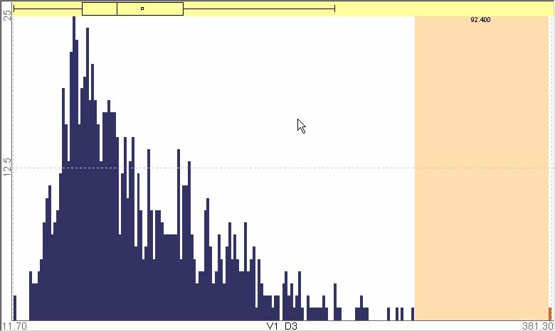
Figure 7.3 A histogram with a real exceptional item
Scatterplot Ordering
“I find this feature one of the most useful to statistical analysis. By calculating scatter plots for every variable, it not only allows the comparison of the plots of all continuous variables in a pair-wise fashion, but also allows simultaneous calculation of correlation coefficients and assessments of both linear and quadratic relationships. Obtaining this information from a statistics package again can be extremely time consuming. I could save sometimes a hundred pages of SAS text output.”
In the scatterplot ordering, the most interesting ranking criterion was “correlation coefficient” as it was for many other users. It turned out again that the linear correlation is one of the most interesting and important features that researchers want to detect as they start a multidimensional data analysis. At first, P3 tried to verify that trivial correlations are actually there in the data set. This task does not provide any new insight into the data set, but it is still important because researchers can confirm the validity of their data set. Detecting a strange behavior in the middle of a data collection process could lead to data quality improvement by a possible change in the process.
Several variables in this data set were known to be highly correlated, thus HCE allowed P3 to quickly confirm those correlations. P3 identified a suspicious case in the data set, correlation between baseline and post-exercise height (Figure 7.4(a)). These two measures should not change, but a non-perfect correlation coefficient allowed P3 to pick out individuals whose height was measured differently at the two time points. P3 could check other measurements for those individuals and might remove them from further analysis.
P3 could also easily identify several strange perfect negative correlations between variables on the score overview (Figure 7.5 or Figure 7.7). After quickly checking the corresponding scatterplots on the scatterplot browser, P3 could easily conclude that those perfect negative correlations were due to missing values. All those scatterplots actually have only one valid item and all other items have missing values (Figure 7.4(b)). Problems caused by missing values made me to improve the rank-by-feature framework in a way that ranking results could be less susceptible to missing values, which will be discussed later in this section.
P3 could easily find groups of variables that have strong positive correlations. Score overview in Figure 7.5 or Figure 7.7 shows triangular or rectangular red areas, which represent that corresponding variables are highly correlated (one example at Figure 7.4(c)). Those correlations include correlation between baseline and post-exercise measurements of 1-RM strength, isometric strength, biceps cross-sectional area, and correlation between baseline and post-exercise weight.
An interesting weak negative correlation between NDRM%CH and pre-NDRM-max was also detected on the score overview. This correlation might indicate that 1-RM strength of non-dominant arm improves less after 12 weeks exercise as the baseline 1-RM max is bigger. Simply speaking, 12 weeks exercise could make more positive changes to people who have a relatively weak arm.
|
|
|
|
(a) |
(b) |
|
|
|
|
(c) |
(d) |
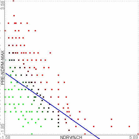
Figure 7.4 Scatterplot ordering results with FAMuSS Study data set
Contributions and Suggestions
Overall, P3 was impressed by interactive visual feedback of HCE. Since P3 had not really used the clustering feature before, P3 focused on other features that P3 thought were extremely useful to her as a statistician for data exploration. However, P3 also tried other feature such as color mosaic view and profile search, and found them also useful to see the magnitude of missing data and to quickly pick out data points that seem unusual.
P3 recommended a list of statistical tests that she wanted to have in the future version of HCE, which includes Student t-test, ANOVA, Chi square, and some non-parametric tests. When I first saw this list, I thought it might be worth implementing some of those. But later, after I discussed with other statisticians, it turned out that a more efficient and general way to have those new ranking functions in future versions of HCE is to utilize pre-existing implementation in other packages and tools such as R, SAS, and Matlab. There are a large number of commonly used statistical or numerical functions in those packages. Thus, the linkage to those packages could greatly improve the usefulness of the rank-by-feature framework and HCE. This could be another important future direction.
Missing values caused HCE to crash when P3 tried ranking criteria such as correlation coefficient and least square error because missing values are all set to 0 in HCE, so the intermediate matrix for those ranking criteria became singular if an entire column is missing. Another problem with missing values was that ranking results involving line or curve fittings could be distorted by the missing values as shown in the scatterplot at the bottom right corner of Figure 7.5. The regression line is dragged down significantly due to many missing values for the Y-axis. To solve this problem, which seemed to be important, I implemented a checkbox to enable users to choose whether they would exclude the missing values from the ranking function evaluation or not. This option significantly improved the ranking results for this case study data set. For example, the fitting result for the same variable pairs shown in Figure 7.5 was significantly improved by excluding missing values from the ranking function evaluation in Figure 7.6. Compared to the score overview in Figure 7.5, the ranking result by the correlation coefficient criterion (Figure 7.7) was also significantly improved after excluding the missing values.
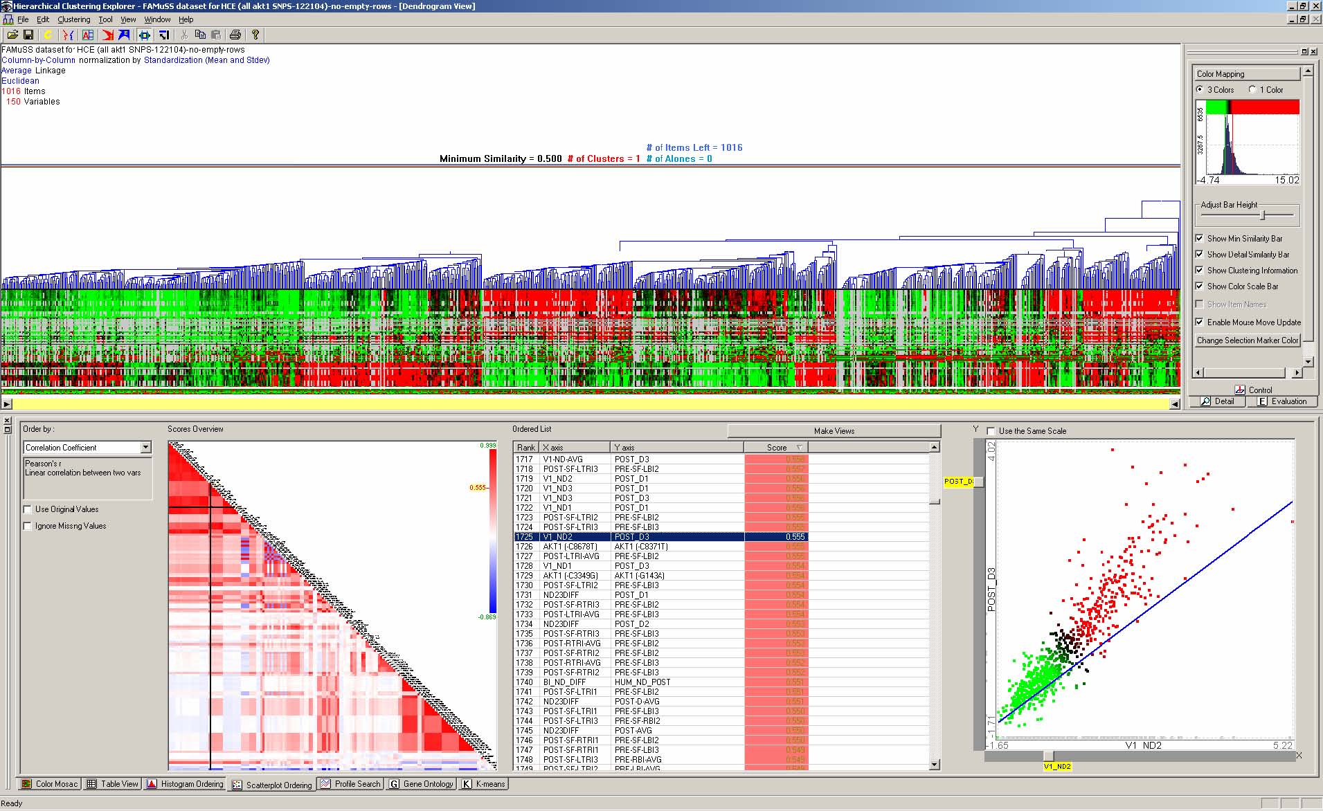
Figure 7.5 FAMuSS Study data set in HCE
Figure 7.6 An improve fitting result with missing values excluded
One important issue that came across in this case study was the problem of dealing with a large number of variables. On a common monitor with resolution of 1280x1024 (Figure 7.7), the score overview is so crowded that variable names are barely readable. A high resolution monitor (e.g., 3840x2400) could solve this problem to some extent. A zooming, filtering, or grouping function for the rank-by-feature framework might also be an interesting and useful possibility for the future development especially when the number of variables is very large.
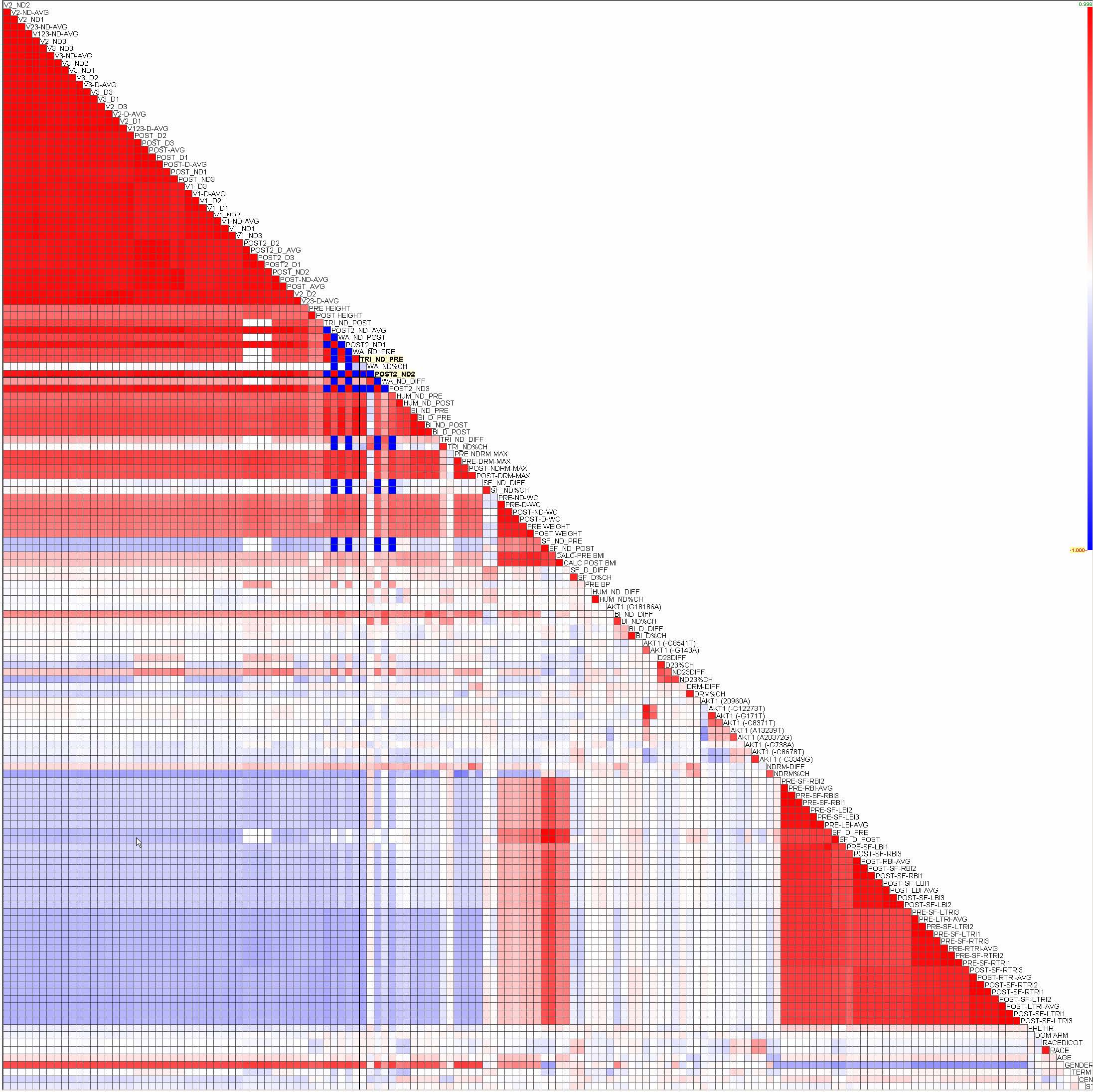
Figure 7.7 Correlation coefficient ranking with missing values excluded
P3 used HCE to do most of her data exploration at the start of analysis, so HCE actually contributed to all of the papers that have come out of FAMuSS Study. The most significant contribution was made to the paper on the finding of a strong association between AKT1 haplotypes and body composition in males, which was submitted to Science and is under review right now.
- 7.1.5 Aerosols, Clouds, and Precipitation
A researcher (P5) in the meteorology department at the University of Maryland was interested in using HCE for his research projects. After two demonstration sessions, P5 was convinced that his research could benefit from HCE, and agreed to participate in the case study. P5 said that data clustering is not necessarily required in his research field, but he often needs to stratify the data. P5 mostly used spreadsheet software such as Excel and Sigmaplot [81] to view correlation and distribution for some variables of importance. P5 has also been learning and using IDL (Interactive Data Language) from Research System Inc [67]. IDL is a kind of programming language or programming environment similar to MATLAB [82], but it is popular in the research field of P5. He has been learning IDL partially because he is familiar with FORTRAN and IDL has FORTRAN like statements for doing mathematical computations and allows FORTRAN formatting for output.
Once P5 found some interesting measurement data, P5 began to collect relevant data from various sources – satellite image from different platforms, surface observed data, or aircraft measured data. Since these data are archived by different organizations (or countries) with various data formats, there is no standardized database (available on-line) for data collection, extraction, and check-up. Thus, it usually takes a long time to prepare a data set that is clean enough to start a serious analysis. After checking with additional data, theoretical numerical simulations are made if necessary.
The data set for this case study was an in situ aerosol profiling data, which has 2829 rows (time) and 23 columns (measurements). The variables used for the analysis include amount and size of aerosols, and various meteorological conditions relevant to aerosols – cloud amount, wind, relative humidity, etc (Table 7.1). The intended purpose of using HCE by P5 was to classify aerosols according to their types or meteorological conditions and to identify certain meteorological conditions that result in different relationships among the variables representing aerosol load and properties.
|
Variable Name |
Description |
|
AOT_440 |
Aerosol optical depth (or thickness; AOT or AOD) measured at the wavelength of 440nm |
|
AOT_xxx |
AOT measured at wavelength xxx nm |
|
440-675Angstrom |
angstrom exponent calculated from AOD at 440nm and AOD at 675nm |
|
FR_All |
cloud fraction (ratio of area covered by clouds to total area of whole sky over the observing location) |
|
FR_Opaq |
cloud fraction but only for optically opaque clouds |
|
FR_thin |
cloud fraction but only for optically thin (and normally high altitude) clouds |
|
Vapor_Pres |
partial pressure of water vapor |
|
W_Speed |
wind speed (unit m/s) |
|
W_Direction |
direction of wind (0-360degree) |
|
RH |
relative humidity (0-100%; or fraction 0-1.0) |
|
Water (cm) |
total amount of water vapor (gas) throughout the column of atmosphere per unit area. In fact, the total amount of gas translated into a depth (in centimeter) of liquid water when all the water vapor is condensed at standard temperature and pressure. |
|
Temp |
temperature |
|
CN_AMBIENT |
number concentration of aerosols |
|
SUM00 |
cloud fraction for circumsolar region within angular distance between 10-20 degree from the direction of the solar beam |
|
SUM01 |
cloud fraction for circumsolar region within angular distance between 10-30 degree from the direction of the solar beam |
|
SUMxx |
defined similar to above, but with 10 degree increment in angular distance |
Table 7.1 Metadata for the aerosol data set
Aerosols, very small particles (0.01~10 micrometer) suspended in the atmosphere in liquid or solid state, can modulate the climate of the earth by absorbing and reflecting solar and infrared radiation and by affecting genesis, life, and decay of clouds, thereby even affecting precipitation. While properties of aerosols are diverse in terms of physical/optical/chemical properties, they can be categorized into several types. Measuring types of aerosols in the atmosphere is important but very difficult due to its high spatial and temporal variability. Analysis of air samples taken at the surface does not represent the entire atmosphere; therefore, indirect methods have been used by measuring solar radiation at specific wavelengths. It is desired to identify the types of aerosols from available data or at least to classify data according to their similarity.
Histogram Ordering
P5 used the histogram ordering when he investigated the data set for the first time. P5 tried all the ranking criteria, but he found the gap size ranking and the normality ranking most interesting. From the normality ranking result, on the score overview P5 could preattentively notice that AOT_670 showed the least normal distribution (Figure 7.8). On the histogram browser he realized that the data set has a bimodal distribution of AOT_670, and it also has several distinctive outliers, which were also easily noticeable in the ranking result by the biggest gap size.
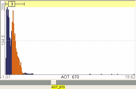
Figure 7.8 Bimodal distribution found in the aerosol data set
Unlike other case study participants, P5 wanted to move on to the scatterplot ordering after quickly trying the histogram ordering. This was in part because he was much more interested in pair-wise relationships than individual distributions. P5 was also special in terms of the way he used HCE. He was interested in finding relationships not only with all data items but also with only some subset of items such as a cluster of items. He liked to see the coordination between the dendrogram view and the rank-by-feature interface. When he examined a ranking result, he selected many clusters one by one in the dendrogram view and saw how the items in the cluster are distributed in a histogram or a scatterplot.
Scatterplot Ordering
“The main utility of HCE in my study is to quickly view data histograms, relationships (e.g., correlation) between variables, and to stratify the data, if necessary. Since HCE does the jobs all at once, it is a very convenient tool for data quick-look.”
Wind speed and wind direction, which are not expected to correlate to each other in general were viewed. But aerosol properties for a certain location may depend on wind direction and/or wind speed (especially when aerosol source regions are close). Two groups are found to be well-defined in terms of their wind-direction with similar magnitude of wind speed. Aerosol optical depth and aerosol concentration number are measured at the surface (lower two panels; see the report for the terms) and it was found that relationship between the two are somewhat dependent on wind direction. For this kind of analysis, it will be very helpful, if the multiple graphic windows (for scatter plots) can be viewed simultaneously.
P5 accidentally saw a relationship between two variables, which was never examined before. That was the quadracity between cloud fractions computed at two different circumsolar areas (Figure 7.9). There is a specially designed camera that captures images of sky for the entire hemisphere. From each the image, angular distance from the sun’s position to any pixels in the image can be computed. Researchers divided the image according to the angular distance from the sun. Circumsolar area stands for area with certain range of angular distance from the sun.
Unlike other users, instead of being satisfied by the finding, P5 used the dendrogram view to further figure out which cluster contributed or broke-down the quadratic relationship. P5 identified two clusters - one with well-defined quadracity (B in Figure 7.9) and the other with break-down of such quadracity (A in Figure 7.9). P5 did not stop here, instead he examined other relationships among aerosol-related parameters for the selected two clusters to check if it makes any difference. P5 finally found another interesting feature that the well-defined quadracity was involved in relatively low water vapor amount regardless of aerosol number concentration, whereas the break-down of quadracity was involved in low aerosol number concentration regardless of water vapor amount (two scatterplots at the bottom in Figure 7.9). This interesting feature might improve the underlying model later after further investigation.
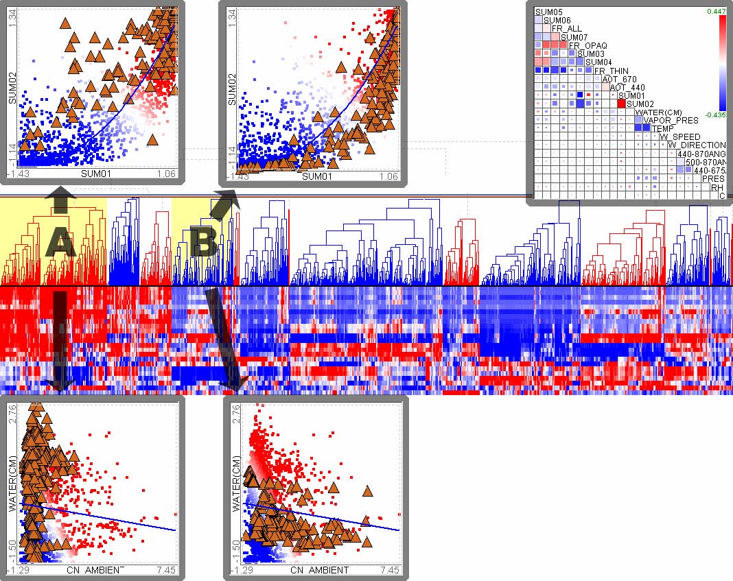
Figure 7.9 Quadracity found in the aerosol data set. Score overview is at top right corner, where a big bright red cell is for SUM01 and SUM02. Size coding by complement of least square error and color coding by the score (coefficient of the highest term). Two scatterplots at the top shows the qudraticity between SUM01 and SUM02. Left scatterplot highlights items in the cluster A, and right scatterplot highlights items in the cluster B. Two scatterplots at the bottom shows distinctive distributions of two clusters on a 2D projection (CN_AMBIENT vs. WATER).
At a weekly meeting where he explained his finding of the quadratic relationship, P5 complained that he could not see more than one scatterplot at the same time. Even though I had explained how to do it at the demonstration sessions, he forgot it. If he had known it when he tried to identify the interesting quadracity, he could have done it much more efficiently by looking at two or more scatterplots at the same time.
Contributions and Suggestions
Many different types of units are used for meteorological data, some of them vary linearly, some vary logarithmically (or exponentially), and others vary sharply under certain conditions. Normality is not always guaranteed and some types of data have multi-modality. Therefore, when importing a data set including many different types of data, those may need to be scaled respectively, depending on the characteristics of each datum. Thus, P5 suggested adding scaling functions to the rank-by-feature framework. Users could scale each variable in the histogram ordering and rank variables after scaling, and the scaling result could affect the ranking in the scatterplot ordering. Considering that many other users have suggested the similar idea, this functionality could improve usefulness of the rank-by-feature framework as well as other HCE tools.
At the first demonstration session with P5, he asked for a function to customize color mapping in the score overview. At the time, HCE only used green and red color coding by default, and users could not customize it. He prefers a red-blue color scheme intermediated by white color, which has been widely used in the meteorology research field. I accepted this request and implemented it in the next version of HCE, which was used for this case study. Another suggestion by P5 related to color use in HCE is the function of changing background color for each view in HCE, especially for scatterplot views.
This case study also identified a potential future implementation possibility. Most multiple views coordination systems maintain only one set of selected items which are highlighted in all coordinated views. If multiple sets of selected items are allowed, it could improve cognition of important patterns in some cases. For example, if users could select two clusters to color each cluster differently in Figure 7.9, users might see the quadratic relationship more clearly in a single scatterplot view or two separate views. Furthermore, if the intersection of sets of selected items is colored differently when the sets could be non-disjoint, users could visually scrutinize the interaction among those sets.
A follow-up investigation into the quadracity between SUM01 and SUM02 enabled P5 to figure out a possible case of it, which was related to the cloud detection algorithm that was used for the cloud amount measurement. He hypothesized that the cloud detection algorithm might overestimate the amount of clouds at the inner circumsolar areas (SUM01) due to the difficulty in cloud detection near the sun. This hypothesis needs to be validated through further investigations. If the hypothesis is accepted, it might contribute to the development of a better cloud detection algorithm.
- 7.1.6 Discussion
Month-long case studies with motivated users gave me a chance to look closely at how HCE and the rank-by-feature framework are used for real research projects. It became clear that HCE and the rank-by-feature framework enable users to quickly examine the data sets. GRID principles seemed to be naturally applied by most participants as if the principles had been accepted for a long time. Interactive visual examinations often led to the identification of important unexpected patterns in the data set, which is important for data verification and hypothesis generation.
Even though HCE is more stable than other research prototypes freely available, it had crashed several times over the course of the case studies. Participants understanding and willingness to accept these problems enabled case studies to finish successfully with invaluable suggestions and improvements. Regular meetings and prompt email communication were important means by which I could make the participants feel as if I were a research partners rather than merely using them as test subjects. One of most difficult parts of these kind of case studies is that the developer of the tool needs to spend ample time to understand the data set and the underlying research problems that participants are interested in. Without such understanding, it is not easy to make participants think of the conductor as a research partner. Another difficult part was that sometimes a participant might forget what had been done in earlier meetings. This is in part because the interval between meetings was too long. A better option could be a one-week intensive case study. However, this option has also its shortcomings. Participants’ research might be distracted by frequent meetings, and important design suggestions from participants could not be promptly incorporated into the tool and the case study itself.
Overall, although there were a couple of cases of early termination, case studies showed the efficacy of HCE and the underlying principles for the analyses of multidimensional data in a real-world environment. Invaluable suggestions for improvement were also made by participants, which include: (1) color coding customization, (2) missing value handling in ranking functions, (3) scaling of each variable, (4) multiple selection sets, (5) potential ranking criteria including various important statistical tests, and (6) linkage to external statistical tools.
- 7.2 HCE User Survey via Emails
HCE has been freely distributed on the web at www.cs.umd.edu/hcil/hce for research or academic purposes. As of February 2005, about 2451 downloads have been logged in the download log since I opened up the download page in April 2002. As shown in Figure 7.10, more people download HCE as newer versions are released.
Figure 7.10 HCE Download Statistics (3/1/2005)
People from all around the world downloaded HCE for various purposes. The most popular uses are clustering, microarray data analysis, data mining/analysis, visualization, and interfaces. HCE is also being used for educational purposes such as teaching materials. Other interesting users include social scientists, defense or security agencies, environmental or financial analysts. It also has been licensed to a biotech company at New Zealand.
When users download HCE from the HCE homepage at www.cs.umd.edu/hcil/hce, they are asked to fill in the registration form. There is an optional field where users can write down possible usage of HCE. Almost 30% of users placed a note on their possible usages even though the field was optional. Encouraged by this and plenty of email inquiries from HCE users, I decided to conduct an email user survey on the usage of the rank-by-feature framework and HCE. After removing duplicated email addresses and roughly filtering invalid email addresses, I sent out the user survey questionnaire (Appendix B) to about 1500 email addresses. The questionnaire consists of 13 questions regarding HCE usage in general and the rank-by-feature framework. Almost 40% of user survey emails were undelivered due to various reasons such as invalid email address and blocking by spam filters. Finally, 83 users replied, which is around 9% of all users from whom the survey email was at least not bounced. Among the 83 users, 25 users did not answer a majority of questions because they did not actually use HCE or just tried it for curiosity. Thus, this section summarizes the answers of 57 users.
- 7.2.1 HCE: Overall
Most of the users are biologists, computer scientists, and statisticians, but physicists, business managers, sociologists, geographers, medical doctors, and others in various occupations also constitute the HCE user group. Microarray data analysis and clustering analysis are the most popular uses of HCE. Other usage of HCE includes visual data exploration and data analysis in general. HCE is also used as a teaching material for information visualization and data mining classes.
Figure 7.11 How often did you use HCE when you used it most intensively?
A large portion of users run HCE with their data set just to quickly examine a hierarchical clustering result when a data set is ready once a month or once a week (Figure 7.11). Sometimes they just get a screen grab of the dendrogram. Interestingly, some users use HCE many times a day to explore the data set using various tools in HCE. Most of these active users tend to think that HCE significantly improved the way they analyze data sets while most of less active users (once a month) think HCE somewhat less significantly improved it. More users tried HCE with fairly large data sets than with small data sets (Figure 7.12). This is partially because many users tried to analyze microarray data sets where there are commonly more than 10,000 rows, or sometimes around 40,000 rows. Because the number of columns does not significantly affect the performance of most tools in HCE, I did not ask about the number of columns, but it is mostly from 10 through 150.
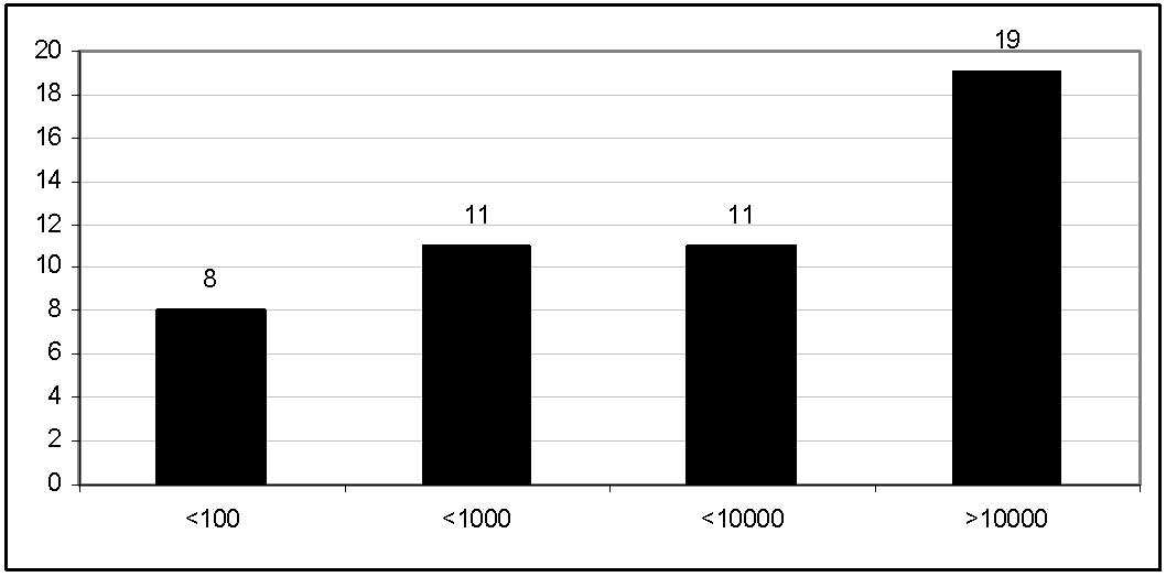
Figure 7.12 What is the maximum number of rows in data sets that you have loaded in HCE?
Since HCE had become visible to users as a cluster visualization tool, most users used the dendrogram and color mosaic feature (Figure 7.13). Even though the tabular view uses a list view control that is slightly improved from the standard windows list view control (section 3.5.1), many users found it useful for data exploration. It is important to note that a very standard tabular display like a spreadsheet is still very useful and necessary for researchers to effectively examine their data set in addition to novel interactive displays such as the dendrogram and the parallel coordinates view. The rank-by-feature interfaces (histogram ordering and scatterplot ordering) were also used by many users although they are relatively new features available only in the recent versions of HCE. The gene ontology view is only useful to molecular biologists who are interested in gene ontology, so it is used by the smallest number of users. Generalization of the gene ontology view to more general hierarchical knowledge structures might greatly improve the usefulness of the view for more general users (e.g. sociologists, business analysts) other than biologists.
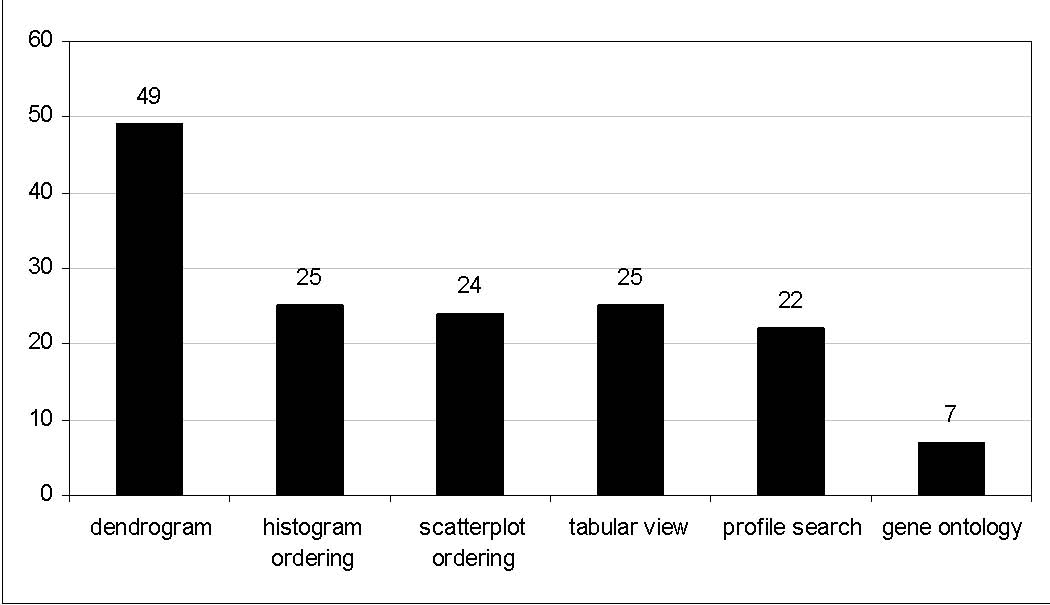
Figure 7.13 Which features have you used?
- 7.2.2 Rank-by-Feature Framework
More users said it was easier (very easy or somewhat easy) to use the histogram ordering (53%, Figure 7.14) than the scatterplot ordering (46%, Figure 7.16). This might be in part because relationships between variables are more difficult to appreciate than each individual variable alone. According to users’ additional comments, it seems clear that users try the histogram ordering first and then the scatterplot ordering, which is consistent with the GRID principles (section 4.3).
The ranking criteria are more evenly useful in the histogram ordering than in the scatterplot ordering (Figure 7.15 & Figure 7.17). Ranking criteria in the histogram ordering seems to be easier to understand than ones in the scatterplot. The least square error and quadracity criteria in the scatterplot ordering are the most difficult for users to understand. Explanations of ranking criteria shown in the rank-by-feature interface might be too short to make users understand the ranking criteria. Context-sensitive help or an online help page could encourage users to use such difficult but sometimes useful ranking criteria.
In both orderings, the first ranking criterion, normality for the histogram ordering and correlation coefficient for the scatterplot ordering, is most popularly used. Considering that average HCE users are professionals who have some knowledge of statistics, the implication of the normality test may be well understood by most users. Other ranking criteria in the histogram ordering are also almost straightforward. “The size of the biggest gap” ranking criterion is a novel concept, so it is least utilized even though the idea is very simple. As shown in case studies, once users get the idea of the gap, it could become a very useful ranking criterion for outlier detection.
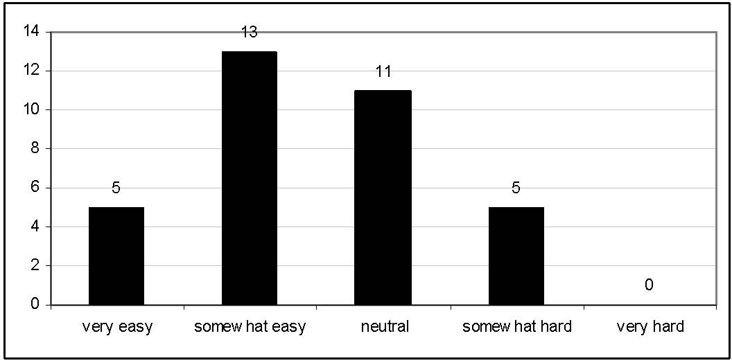
Figure 7.14 How easy was it to understand and use the histogram ordering?
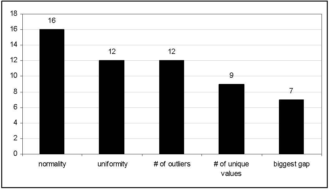
Figure 7.15 What are the most useful ranking criteria in the histogram ordering?
Correlation is a very important and well known linear association between two continuous variables. Thus, after users decided to try the scatterplot ordering, they would at least try this first ranking criterion, correlation coefficient. Most users find the score overview is very useful to examine correlations between variables. A participant commented that the complete overview of all possible pair-wise relationships prevent potential problems caused by missing some important relationships by chance. Even though uniformity and the number of outliers are 2D versions of the same ranking criteria in the histogram ordering, users seemed to have some difficulty in applying them to 2D relationships. No participant voted for the quadracity criterion. Although a case study participant (P5) found it useful, but more work needs to be done before it becomes useful to more users.
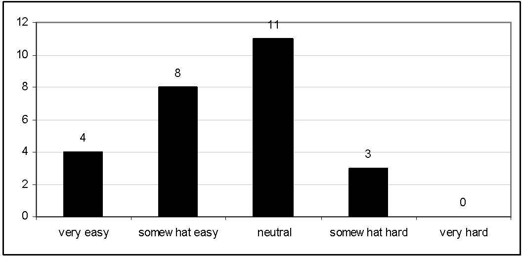
Figure 7.16 How easy was it to understand and use the scatterplot ordering?
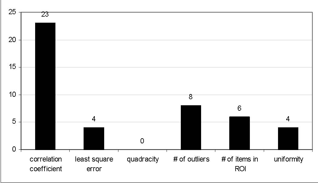
Figure 7.17 What are the most useful ranking criteria in the scatterplot ordering?
- 7.2.3 Discussion
About 96% of users said that HCE improved the way they analyze their data sets at least a little bit (Figure 7.18). About 73 % of those users felt that HCE at least somewhat significantly improved their analysis practices. A manager of corporate development at a company commented:
“We performed clustering and - based on the HCE output - modified our specifications for a software product that we offer to non-profits. Very direct link between the HCE usability and good cause!”
Users’ additional comments indicate that interactive visual presentations and sustainable robustness of HCE get credit for that. Together with appreciation for making HCE available, users suggested several improvements: (1) some evaluation measures for unsupervised clustering results, (2) more clustering algorithms or other projection techniques such as SOM and PCA, (3) more import functions for clustering results by other clustering algorithms, and (4) more improved printing/saving functions.
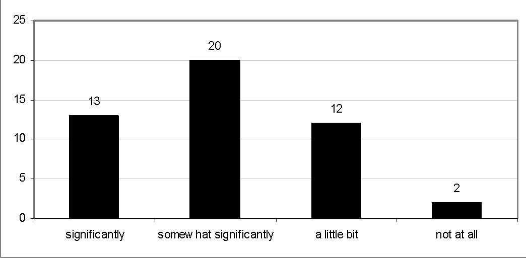
Figure 7.18 Do you think HCE improved the way you analyze your data set?
A few users also expressed their concern over the point that some ranking criteria are difficult to understand without deep statistical backgrounds:
“Overall, it's a daunting tool, and I found it hard as someone without deep statistical understanding to know how to use it. So my suggestion would be to provide either a detailed tutorial or a scaled-down set of interface options for people with simple needs.”
“I am not a mathematician and so am unfamiliar with most, if not all, the terminology used in the user guide. I am clustering data, I don't really understand what all the analysis tools do as I only need the output from the clustering process. I used most of the default settings.”
This is actually a very difficult problem to address appropriately. Even after a thorough live demonstration session, a couple of users still have a difficulty in understanding some ranking criteria. Detailed tutorials could help users go through if they are motivated. Otherwise it is not a general solution. This problem is related to whether a tool is for a general audience or for specialized users. The current version of HCE requires some statistical knowledge, which makes it a more sophisticated tool.
Several users gave their domain specific suggestions. Two biologists suggested adding a new distance measure (genetic distance for binary data) to the clustering dialog box. The director of a computational linguistics program at a university who is using HCE with his student for document clustering gave a comment:
“Actually, adding some language specific features would be quite simple and helpful for spreading this tool in even a wider community... :-).”
This user survey certainly had its limitations. First, even though users’ responses to the survey email were voluntary, there was still a danger that users who had been disappointed with HCE were less likely to participate. If I, the conductor, had randomly selected participants, the result might have been different from the current result. However, it would have been difficult to compel the randomly selected users participate in the survey. Second, the number of participants was limited. If the survey had been conducted via a web page instead of emails, the turnout might have been better due to the better-preserved anonymity. Third, a problem related to the design of the questionnaire meant that several respondents made only one selection on question 4 (Appendix B) even though it was a multiple-selection question. That is why the number of users who voted for the histogram ordering/scatterplot ordering on question 4 is less than the number of users who answered questions 6 and 9. To address these limitations of this email survey, an alternative medium for a user survey might be an HTML web page since anonymity might be better guaranteed than using emails. However, since users need to click on a link in a survey invitation email to go to the HTML web page, this additional transition could discourage users to participate the user survey. Each question should clearly express whether it is a single- or multiple-selection question. More questions could be asked to further evaluate the rank-by-feature framework.
In spite of the limitations, this user survey showed the usefulness of HCE and the rank-by-feature framework in terms of improving the way users analyze their data. The GRID principles seemed to be implicitly observed, but more work is necessary to encourage more users to smoothly advance from 1D study to 2D study. More training materials and context sensitive help are necessary to help users understand the utility and implication of ranking criteria.
- Chapter 8 Future Work and Contributions
Users’ comments, case studies, and email user survey suggested numerous possible future work. Even though there are several interesting future works for the clustering results visualization in HCE such as incorporating new clustering algorithms other than the hierarchical clustering and integrating meaningful clustering result evaluation measures, I will concentrate on the possible future works for the rank-by-feature framework in this chapter.
- 8.1.1 Scaling-up
Limited screen resolution and time complexity of ranking functions are two important factors that make it difficult to scale up the rank-by-feature framework. Limited screen resolution makes it hard to visualize the score overview when there are more than a hundred variables. By removing grid lines when there are too many cell on the overview, the visual overview is improved, but variable names on the score overview become too small to read.
Zoom-and-pan could solve this problem by allowing users to zoom in to a certain part of score overview. Filtering is another possible solution. Users could filter out uninteresting variables by dynamically changing threshold score values. If a cell does not satisfy the threshold range, it is grayed out. If an entire row or column is grayed out on the score overview, the entire row or column could be filtered out so that remaining cells could share more screen space.
Another way to solve this problem is related to the coordination between the histogram ordering and the scatterplot ordering. Users might select some uninteresting variables in the histogram ordering, and then users can exclude those variables from subsequent rankings both in the histogram ordering and in the scatterplot ordering. This coordination between two user interface components could improve the usefulness of the rank-by-feature framework by providing an interactive way to cope with high dimensionality of data sets.
Ranking groups of items rather than ranking individual items could also be a solution. Since HCE already produces the column clustering result, the rank-by-feature framework could utilize the clustering result in ranking. To begin with, users could do ranking with clusters first. Then users could choose a small number of representative variables in each cluster and perform a ranking with those selected small number of variables.
When a ranking function’s time complexity is too big to run on large data sets, we could quantize the data set into a relatively small number of bins, and then run the ranking function on the bins instead of the raw data. The approximate ranking result can be available promptly to users. If users are interested in the result and want to see a more accurate result, they can try the original ranking algorithm. Development of a new version of the ranking algorithm that can deal with bins instead of individual items might not be easy for some ranking criteria such as LOF-based outlier ranking. The outlier detection algorithm has to be significantly changed to deal with bins. The grid-based DB-out algorithm by Knorr [48] could be a possible alternative in this case.
- 8.1.2 Integration with Other Tools
There are two possible approaches to link HCE and other tools such as Excel, R, and WEKA [27]: (1) the rank-by-feature framework can be implemented as a plug-in for other tools like Excel, (2) statistical or numerical functions in those tools can be used as ranking criteria in the rank-by-feature framework. Using the first approach, the rank-by-feature framework could improve the way data sets are examined in those tools. The GRID principles could reach a more general audience through the succinct rank-by-feature framework user interface if it can be implemented in a general purpose spreadsheet like Excel. The second approach could increase usefulness of the rank-by-feature framework in HCE and HCE itself thanks to the richer set of possible ranking criteria available in those tools.
From the case studies and interviews with HCE uses, it turned out that spreadsheet programs such as Excel are widely used for data analysis. The data analysis add-in in Excel provides researchers with several essential statistical functions such as T-test, ANOVA, F-test, correlation, regression, and so on. Those statistical functions could be a useful set of ranking criteria for the rank-by-feature framework. The rank-by-feature framework could be implemented as an add-in macro using Microsoft Visual Basic for Applications (VBA) as shown in the mockup at Figure 8.1. Selection of a pair of variables or items in the rank-by-feature framework could make the corresponding columns or rows interactively highlighted in an Excel spreadsheet, and vice versa.
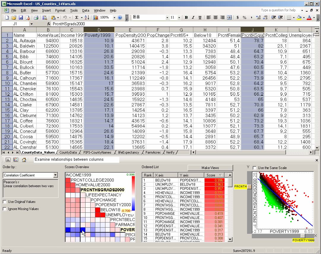
Figure 8.1 Rank-by-feature framework as an Excel add-in (mockup)
The second approach might be better when external tools have a richer set of useful and frequently used statistical or numerical functions, and the implementation of add-ins for those tools is problematic. Those functions already available in other useful tools can be a good set of ranking criteria in the rank-by-feature framework. This could dramatically save implementation efforts and also prevent potential problems of implementation errors. Packages like R that are freely available and for which there is a strong user and developer community could be a better choice than expensive commercial packages. R is `GNU S', a freely available language and environment for statistical computing and graphics which provides a wide variety of statistical and graphical techniques [66]. The R (D)COM Server package can be used to connect HCE with R by including Active X controls in the package. A COM connection might be slower than using library function calls. Linking to such tools could make HCE more useful and attract users to try interactive visualization tools like HCE.
- 8.1.3 More Interaction in the Rank-by-Feature Framework
Sometimes users see a small number of items with extreme values which significantly influence the score of a histogram or a scatterplot in the rank-by-feature framework. For example, two highly populated big counties like LA and Chicago seemed to dominate several ranking results such as normality, gap size, and uniformity in the histogram ordering. Ranking by correlation coefficient and least square errors in the scatterplot ordering are also usually influenced by those outlying items. In those cases, running the ranking again after removing those outlying items could generate a more robust result. Users could select a group of items on a scatterplot or on a histogram and temporarily remove them from the data set, and then run the ranking criterion with the new data set.
There should be some consideration on whether the temporary removal of items would influence other views, for example, whether removal of items on the histogram view would make the scatterplot ordering run again or not. If it propagates to the clustering result view, it would take some time to re-cluster a large data set after removal of those items. It is important to have a way to adjust the range of coordination while implementing this filtering mechanism. Similar consideration should also be taken when removing some uninteresting variables in the histogram ordering as discussed in section 8.1.1. Sometimes it is necessary to coordinate the two rank-by-feature framework interfaces, but users might just want to restrict the change in the current framework interface. For example, users might want to remove an outlying item for normality ranking in the histogram ordering to get more meaningful scores, but they might want to keep it for the scatterplot ordering. Filtering a small number of variables that have an exceptionally high or low score could also improve the score overview in terms of color mapping because a smaller range of score values could share the same color range after filtering.
- 8.1.4 More Improvements on Ranking
Section 4.7 explained two possible ranking criteria for categorical data, but more interesting ranking criteria and further consideration on how to deal with categorical variables may be needed to address the issue more thoroughly. ANOVA could be a meaningful ranking criterion to evaluate relationships between a categorical variable and a continuous variable. Logistic regression or loglinear modeling methods [62] could generate potential ranking criteria when categorical variables are involved. Goodness-of-fit tests for these models could be potential ranking criteria for categorical variables. A different binning strategy (or quantization strategy) could change the ranking result by association when both categorical and continuous variables are involved. The traditional scatterplot display is not enough to show the relationships between two categorical variables or between a categorical variable and a continuous variable. A significant change of the scatterplot browser might be necessary to properly show the relationships among variables if one is categorical.
As more and more ranking functions are added to the rank-by-feature framework either through linking to external statistical packages or by new implementations, it becomes more desirable to customize ranking functions according to users' interests. Molecular biologists analyzing microarray data sets might need a different set of ranking functions than meteorologists analyzing satellite sensing data. After carefully categorizing ranking criteria available in the system, the rank-by-feature framework could allow users to choose a set of ranking criteria in a certain category that users are most interested in.
While I have demonstrated the rank-by-feature framework to various users, it is still not easy to make them understand the meaning of each ranking criterion. Sometimes fairly experienced users could not understand the implication of a ranking result. This underscores the importance of developing good training materials such as an easy-to-understand application example for each ranking criterion. I started to compile such examples on the HCE webpage, and recently the application report project of the information visualization class at the University of Maryland has provided more interesting examples with various data sets. These efforts could lead to a repository of interactive visual exploration examples for multidimensional data sets.
- 8.1.5 Future Evaluations
As revealed in my case studies, researchers in different fields usually have different research styles and they use different tools and methods. Future case studies might benefit by involving users in other research fields such as business analysis and sociology. In addition, it is important to find highly motivated users who could endure shortcomings of HCE encountered during the user study. Regular meetings and timely communications are also important to make the participating researchers think of the case study conductor as their research partner not just as an observer. To some extent, especially in the beginning, participants also benefit from understanding the conductor’s research as well as the tool. A future user survey could lead to a better evaluation if an HTML web page based survey is conducted first and then email inquiries follow in cases where further investigation is necessary. In this way, a better turnout could be expected, thus more general understanding could be possible. A more in-depth understanding might be gained from personal interview of users or focus groups.
- 8.2 Contributions
In spite of the variety of data sets and the wide application domains where multidimensional data is extensively used, current software tools for multidimensional data sets are often patchworks of graphical and statistical methods leaving many researchers uncertain about how to explore their data in an orderly manner.
This dissertation offers a set of principles and a novel rank-by-feature framework in an interactive visualization tool called HCE. Those principles and framework improve the way to analyze multidimensional data sets by enabling users to systematically examine 1D or 2D projections of the multidimensional data sets in an interactive visual environment where information visualization techniques and statistical methods complement each other. Particular contributions include:
- • Graphics, Ranking, and Interaction for Discovery (GRID) principles– GRID principles extends an existing statistical strategy for exploratory analysis of multidimensional data by incorporating ranking strategies and interactive visualization techniques. GRID principles help users organize their discovery process in an orderly manner so as to produce more thorough analyses and extract deeper insights in any multidimensional data application
This research has revealed potential future work described in Chapter 4 and Chapter 8. Some of the future work might require an improvement in the user interface and the software design. Easy-to-follow teaching materials such as tutorials could attract more general users. As a serious research tool for motivated experts, close collaboration with those users on getting suggestions and feedback will increase the potential of HCE for making the expert smarter.
- Appendix A Informed Consent Form for Case Study

- Appendix B HCE User Survey Questionnaire
- 1. What is your job? (for example, biologist, computer scientist, statistician) __________________________________________
______________________________________________
_ Once a month _ Once a week _ Once a day _ Many times a day
___ dendrogram & mosaic ___ histogram ordering
___ scatterplot ordering ___ tabular view
___ profile search ___ gene ontology
_ less than 100 _ less than 1000 _ less than 10,000 _ more than 10,000
_ very easy _ somewhat easy _ neutral _ somewhat hard _ very hard
___ Normality
___ Uniformity
___ The number of potential outliers
___ The number of unique values
___ Size of the biggest gap
__________________________________________________________
_ very easy _ somewhat easy _ neutral _ somewhat hard _ very hard
___ Correlation coefficient
___ Least square error for curvilinear regression
___ Quadracity
___ The number of potential outliers
___ The number of items in the region of interest
___ Uniformity of scatterplots
__________________________________________________________
__________________________________________________________
_ significantly _ somewhat significantly _ a little bit _ not at all
_________________________________________________________
_________________________________________________________
|
Variable Name |
Description |
|
Id |
subject ID number |
|
Status |
status of subject (0=complete; 1=dropout; 2=active/incomplete) |
|
Center |
study site |
|
Term |
term of recruitment (year-term where 1=spring; 2=summer; 3=fall) |
|
Gender |
gender |
|
Age |
age |
|
Race |
race |
|
Racedicot |
dichotomous race (0=Caucasian; 1=Non-Caucasian) |
|
Bi-ND-PRE |
pre biceps cross-sectional area (CSA) of non-dominant arm |
|
Bi-ND-POST |
post biceps cross-sectional area of non-dominant arm |
|
Bi_ND_Diff |
Difference in non-dominant arm biceps CSA |
|
Bi_ND%CH |
% change in non-dominant arm biceps CSA |
|
Bi-D-PRE |
pre biceps cross-sectional area of dominant arm |
|
Bi-D-POST |
post biceps cross-sectional area of dominant arm |
|
Bi_D_Diff |
Difference in dominant arm biceps CSA |
|
Bi_D%CH |
% change in dominant arm biceps CSA |
|
Hum-ND-PRE |
pre humerus cross-sectional area of non-dominant arm |
|
Hum-ND-POST |
post humerus cross-sectional area of non-dominant arm |
|
Hum_ND_Diff |
Difference in non-dominant arm humerus CSA |
|
Hum_ND%CH |
% change in non-dominant arm humerus CSA |
|
Hum-D-PRE |
pre humerus cross-sectional area of dominant arm |
|
Hum-D-POST |
post humerus cross-sectional area of dominant arm |
|
Hum_D_Diff |
Difference in dominant arm humerus CSA |
|
Hum_D%CH |
% change in dominant arm humerus CSA |
|
SF-ND-PRE |
pre sub-cutaneous fat cross-sectional area of non-dominant arm |
|
SF-ND-POST |
post sub-cutaneous fat cross-sectional area of non-dominant arm |
|
SF_ND_Diff |
Difference in non-dominant arm sub. fat CSA |
|
SF_ND%CH |
% change in non-dominant arm sub. fat CSA |
|
SF-D-PRE |
pre sub-cutaneous fat cross-sectional area of dominant arm |
|
SF-D-POST |
post sub-cutaneous fat cross-sectional area of dominant arm |
|
SF_D_Diff |
Difference in dominant arm sub. fat CSA |
|
SF_D%CH |
% change in dominant arm sub. fat CSA |
|
Tri-ND-PRE |
pre triceps cross-sectional area of non-dominant arm |
|
Tri-ND-POST |
post triceps cross-sectional area of non-dominant arm |
|
Tri_ND_Diff |
Difference in non-dominant arm triceps CSA |
|
Tri_ND%CH |
% change in non-dominant arm triceps CSA |
|
Tri-D-PRE |
pre triceps cross-sectional area of dominant arm |
|
Tri-D-POST |
post triceps cross-sectional area of dominant arm |
|
Tri_D_Diff |
Difference in dominant arm triceps CSA |
|
Tri_D%CH |
% change in dominant arm triceps CSA |
|
WA-ND-PRE |
pre whole arm cross-sectional area of non-dominant arm |
|
WA-ND-POST |
post whole arm cross-sectional area of non-dominant arm |
|
WA_ND_Diff |
Difference in non-dominant arm whole arm CSA |
|
WA_ND%CH |
% change in non-dominant arm whole arm CSA |
|
WA-D-PRE |
pre whole arm cross-sectional area of dominant arm |
|
WA-D-POST |
post whole arm cross-sectional area of dominant arm |
|
WA_D_Diff |
Difference in dominant arm whole arm CSA |
|
WA_D%CH |
% change in dominant arm whole arm CSA |
|
Pre-NDRM-Max |
pre one repetition (1-RM) max of non-dominant arm |
|
Post-NDRM-Max |
post 1-RM max of non-dominant arm |
|
NDRM-DIFF |
Difference in 1-RM strength on non-dominant arm |
|
NDRM%CH |
% change in 1-RM strength of non-dominant arm |
|
Pre-DRM-Max |
pre 1-RM max of dominant arm |
|
Post-DRM-Max |
post 1-RM max of dominant arm |
|
DRM-DIFF |
Difference in 1-RM strength on dominant arm |
|
DRM%CH |
% change in 1-RM strength of dominant arm |
|
Pre weight |
pre weight |
|
Pre height |
pre height |
|
Pre BMI |
pre body mass index |
|
Pre BP |
pre blood pressure |
|
Pre HR |
pre heart rate |
|
Pre-SF-RBi1 |
pre exercise skin fold of right biceps – measurement #1 |
|
Pre-SF-RBi2 |
pre exercise skin fold of right biceps – measurement #2 |
|
Pre-SF-RBi3 |
pre exercise skin fold of right biceps – measurement #3 |
|
Pre-RBi-AVG |
average of 3 pre right biceps skin fold measurements |
|
Pre-SF-RTri1 |
pre exercise skin fold of right triceps – measurement #1 |
|
Pre-SF-RTri2 |
pre exercise skin fold of right triceps – measurement #2 |
|
Pre-SF-RTri3 |
pre exercise skin fold of right triceps – measurement #3 |
|
Pre-RTri-AVG |
average of 3 pre right triceps skin fold measurements |
|
Pre-SF-LBi1 |
pre exercise skin fold of left biceps – measurement #1 |
|
Pre-SF-LBi2 |
pre exercise skin fold of left biceps – measurement #2 |
|
Pre-SF-LBi3 |
pre exercise skin fold of left biceps – measurement #3 |
|
Pre-LBi-AVG |
average of 3 pre left biceps skin fold measurements |
|
Pre-SF-LTri1 |
pre exercise skin fold of left triceps – measurement #1 |
|
Pre-SF-LTri2 |
pre exercise skin fold of left triceps – measurement #2 |
|
Pre-SF-LTri3 |
pre exercise skin fold of left triceps – measurement #3 |
|
Pre-LTri-AVG |
average of 3 pre left triceps skin fold measurements |
|
Dom Arm |
dominant arm (R=right / L=left) |
|
Post weight |
post weight |
|
Post height |
post height |
|
Post BMI |
post body mass index |
|
Post-SF-RBi1 |
Post exercise skin fold of right biceps – measurement #1 |
|
Post-SF-RBi2 |
Post exercise skin fold of right biceps – measurement #2 |
|
Post-SF-RBi3 |
Post exercise skin fold of right biceps – measurement #3 |
|
Post-RBi-AVG |
average of 3 post right biceps skin fold measurements |
|
Post-SF-RTri1 |
Post exercise skin fold of right triceps – measurement #1 |
|
Post-SF-RTri2 |
Post exercise skin fold of right triceps – measurement #2 |
|
Post-SF-RTri3 |
Post exercise skin fold of right triceps – measurement #3 |
|
Post-RTri-AVG |
average of 3 post right triceps skin fold measurements |
|
Post-SF-LBi1 |
Post exercise skin fold of left biceps – measurement #1 |
|
Post-SF-LBi2 |
Post exercise skin fold of left biceps – measurement #2 |
|
Post-SF-LBi3 |
Post exercise skin fold of left biceps – measurement #3 |
|
Post-LBi-AVG |
average of 3 post left biceps skin fold measurements |
|
Post-SF-LTri1 |
Post exercise skin fold of left triceps – measurement #1 |
|
Post-SF-LTri2 |
Post exercise skin fold of left triceps – measurement #2 |
|
Post-SF-LTri3 |
Post exercise skin fold of left triceps – measurement #3 |
|
Post-LTri-AVG |
average of 3 post left triceps skin fold measurements |
|
V1-ND1 |
visit 1 isometric strength of non-dominant arm – measurement #1 |
|
V1-ND2 |
visit 1 isometric strength of non-dominant arm – measurement #2 |
|
V1-ND3 |
visit 1 isometric strength of non-dominant arm – measurement #3 |
|
V1-ND-AVG |
visit 1 average isometric strength of non-dominant arm |
|
V2-ND1 |
visit 2 isometric strength of non-dominant arm – measurement #1 |
|
V2-ND2 |
visit 2 isometric strength of non-dominant arm – measurement #2 |
|
V2-ND3 |
visit 2 isometric strength of non-dominant arm – measurement #3 |
|
V2-ND-AVG |
visit 2 average isometric strength of non-dominant arm |
|
V3-ND1 |
visit 3 isometric strength of non-dominant arm – measurement #1 |
|
V3-ND2 |
visit 3 isometric strength of non-dominant arm – measurement #2 |
|
V3-ND3 |
visit 3 isometric strength of non-dominant arm – measurement #3 |
|
V3-ND-AVG |
visit 3 average isometric strength of non-dominant arm |
|
V23_ND_AVG |
average of isometric strength of non-dominant arm from visits #2 and #3 |
|
V123_ND_AVG |
average of isometric strength of non-dominant arm from visits #1, #2 and #3 |
|
Post-ND1 |
post isometric strength of non-dominant arm – measurement #1 |
|
Post-ND2 |
post isometric strength of non-dominant arm – measurement #2 |
|
Post-ND3 |
post isometric strength of non-dominant arm – measurement #3 |
|
Post-ND-AVG |
average of post isometric strength measurements for non-dominant arm |
|
Post2-ND1 |
2nd post isometric strength of non-dominant arm – measurement #1 |
|
Post2-ND2 |
2nd post isometric strength of non-dominant arm – measurement #2 |
|
Post2-ND3 |
2nd post isometric strength of non-dominant arm – measurement #3 |
|
Post2-ND-AVG |
average of 2nd post isometric strength measurements for non-dominant arm |
|
Post-ND-AVG |
average of 1st and 2nd post isometric measures |
|
ND23DIFF |
Difference in isometric strength of non-dominant arm (post average – pre average from visits 2 &3) |
|
ND23%CH |
% change in isometric strength of non-dominant arm |
|
V1-D1 |
visit 1 isometric strength of dominant arm – measurement #1 |
|
V1-D2 |
visit 1 isometric strength of dominant arm – measurement #2 |
|
V1-D3 |
visit 1 isometric strength of dominant arm – measurement #3 |
|
V1-D-AVG |
visit 1 average isometric strength of dominant arm |
|
V2-D1 |
visit 2 isometric strength of dominant arm – measurement #1 |
|
V2-D2 |
visit 2 isometric strength of dominant arm – measurement #2 |
|
V2-D3 |
visit 2 isometric strength of dominant arm – measurement #3 |
|
V2-D-AVG |
visit 2 average isometric strength of dominant arm |
|
V3-D1 |
visit 3 isometric strength of dominant arm – measurement #1 |
|
V3-D2 |
visit 3 isometric strength of dominant arm – measurement #2 |
|
V3-D3 |
visit 3 isometric strength of dominant arm – measurement #3 |
|
V3-D-AVG |
visit 3 average isometric strength of dominant arm |
|
V23_D_AVG |
average of isometric strength of dominant arm from visits #2 and #3 |
|
V123_D_AVG |
average of isometric strength of dominant arm from visits #1, #2 and #3 |
|
Post-D1 |
post isometric strength of dominant arm – measurement #1 |
|
Post-D2 |
post isometric strength of dominant arm – measurement #2 |
|
Post-D3 |
post isometric strength of dominant arm – measurement #3 |
|
Post-D-AVG |
average of post isometric strength measurements for dominant arm |
|
Post2-D1 |
2D post isometric strength of dominant arm – measurement #1 |
|
Post2-D2 |
2D post isometric strength of dominant arm – measurement #2 |
|
Post2-D3 |
2D post isometric strength of dominant arm – measurement #3 |
|
Post2-D-AVG |
average of 2D post isometric strength measurements for dominant arm |
|
Post-D-AVG |
average of 1st and 2nd post isometric measures |
|
D23DIFF |
Difference in isometric strength of dominant arm (post average – pre average from visits 2 &3) |
|
D23%CH |
% change in isometric strength of dominant arm |
Bibliography
[1] Affymetrix, Microarray Suite User Guide, Version 5.0, http://www.affymetrix.com/products/software/specific/mas.affx
[2] C. C. Aggarwal, J. L. Wolf, P. S. Yu, C. Procopiuc, and J. S. Park, "Fast algorithms for projected clustering," in Proceedings of ACM SIGMOD International Conference on Management of Data. Philadelphia, Pennsylvania, United States: ACM Press, 1999, pp. 61-72.
[3] R. Agrawal, J. Gehrke, D. Gunopulos, and P. Raghavan, "Automatic subspace clustering of high dimensional data for data mining applications," in Proceedings of ACM SIGMOD International Conference on Management of Data. Seattle, Washington, United States: ACM Press, 1998, pp. 94-105.
[4] R. Amar and J. Stasko, "A Knowledge task-based framework for design and evaluation of information visualizations," in Proceedings of IEEE Symposium on Information Visualization. Austin, TX, USA: IEEE Computer Society, 2004, pp. 143-150.
[5] M. Ankerst, S. Berchtold, and D. A. Keim, "Similarity clustering of dimensions for an enhanced visualization of multidimensional data," in Proceedings of IEEE Symposium on Information Visualization. North Carolina: IEEE Computer Society, 1998, pp. 19-20.
[6] D. Asimov, "The grand tour: a tool for viewing multidimensional data," SIAM Journal of Scientific and Statistical Computing, vol. 6, pp. 128-143, 1985.
[7] Z. Bar-Joseph, E. D. Demaine, D. K. Gifford, N. Srebro, A. M. Hamel, and T. S. Jaakkola, "K-ary clustering with optimal leaf ordering for gene expression data," Bioinformatics, vol. 19, pp. 1070-1078, 2003.
[8] T. Barrett, T. O. Suzek, D. B. Troup, S. E. Wilhite, W.-C. Ngau, P. Ledoux, D. Rudnev, A. E. Lash, W. Fujibuchi, and R. Edgar, "NCBI GEO: mining millions of expression profiles--database and tools," Nucl. Acids Res., vol. 33, pp. D562-566, 2005.
[9] A. D. Baxevanis, "The Molecular Biology Database Collection: 2003 update," Nucl. Acids Res., vol. 31, pp. 1-12, 2003.
[10] J. Bertin, Graphics and Graphic Information-Processing. Berlin; New York: de Gruyter, 1981.
[11] T. Biedl, B. Brejova, E. D. Demaine, A. M. Hamel, and T. Vinar, "Optimal arrangement of leaves in the tree representing hierarchical clustering of gene expression data," Dept. of Computer Science, University of Waterloo, 2001.
[12] M. M. Breunig, H. P. Kriegel, R. T. Ng, and J. Sander, "LOF: Identifying density-based local outliers," Sigmod Record, vol. 29, pp. 93-104, 2000.
[13] F. Buschmann, R. Meunier, H. Rohnert, P. Sommerlad, and M. Stal, Pattern-oriented Software Architecture, Volume 1, A System of Patterns. Chichester; New York: Wiley, 1996.
[14] A. Butte, "The use and analysis of microarray data," Nature Reviews Drug Discovery, vol. 1, pp. 951-960, 2002.
[15] S. K. Card, J. D. Mackinlay, and B. Shneiderman, Readings in Information Visualization: Using Vision to Think. San Francisco, California: Morgan-Kaufmann, 1999.
[16] B. Chazelle, R. L. Drysdale, and D. T. Lee, "Computing the largest empty rectangle," SIAM Journal on Computing, vol. 15, pp. 300-315, 1986.
[17] A. Cockburn and B. McKenzie, "Evaluating the effectiveness of spatial memory in 2D and 3D physical and virtual environments," in Proceedings of the SIGCHI Conference on Human Factors in Computing Systems: Changing Our world, Changing Ourselves. Minneapolis, Minnesota, USA: ACM Press, 2002, pp. 203-210.
[18] W. W. Cohen and J. Richman, "Learning to match and cluster large high-dimensional data sets for data integration," in Proceedings of the Eighth ACM SIGKDD International Conference on Knowledge Discovery and Data Mining. Edmonton, Alberta, Canada: ACM Press, 2002, pp. 475-480.
[19] D. Cook, A. Buja, J. Cabrera, and C. Hurley, "Grand tour and projection pursuit," Journal of Computational and Graphical Statistics, vol. 4, pp. 155-172, 1995.
[20] S. Di Giovanni, A. I. Faden, A. Yakovlev, J. S. Duke-Cohan, T. Finn, M. Thouin, S. Knoblach, A. De Biase, B. S. Bregman, and E. P. Hoffman, "Neuronal plasticity after spinal cord injury: identification of a gene cluster driving neurite outgrowth," The FASEB Journal, vol. 19, pp. 153-154, 2005.
[21] S. Doniger, N. Salomonis, K. Dahlquist, K. Vranizan, S. Lawlor, and B. Conklin, "MAPPFinder: using Gene Ontology and GenMAPP to create a global gene-expression profile from microarray data," Genome Biology, vol. 4, pp. R7, 2003.
[22] J. Edmonds, J. Gryz, D. M. Liang, and R. J. Miller, "Mining for empty spaces in large data sets," Theoretical Computer Science, vol. 296, pp. 435-452, 2003.
[23] M. Eisen, Cluster and TreeView, http://rana.lbl.gov/manuals/ClusterTreeView.pdf
[24] M. B. Eisen, P. T. Spellman, P. O. Brown, and D. Botstein, "Cluster analysis and display of genome-wide expression patterns," Proceedings of the National Academy of Sciences of the United States of America, vol. 95, pp. 14863-14868, 1998.
[25] European Bioinformatics Institute, Expression Profiler, http://www.ebi.ac.uk/expressionprofiler/
[26] M. C. Ferreira de Oliveira and H. Levkowitz, "From visual data exploration to visual data mining: a survey," IEEE Transactions on Visualization and Computer Graphics, vol. 9, pp. 378, 2003.
[27] E. Frank, M. Hall, L. Trigg, G. Holmes, and I. H. Witten, "Data mining in bioinformatics using Weka," Bioinformatics, vol. 20, pp. 2479-2481, 2004.
[28] J. H. Friedman, "Exploratory projection pursuit," Journal of the American Statistical Association, vol. 82, pp. 249-266, 1987.
[29] J. H. Friedman and J. W. Tukey, "Projection pursuit algorithm for exploratory data-analysis," IEEE Transactions on Computers, vol. C 23, pp. 881-890, 1974.
[30] M. Friendly, "Corrgrams: Exploratory displays for correlation matrices," American Statistician, vol. 56, pp. 316-324, 2002.
[31] G. K. Geiss, M. Salvatore, T. M. Tumpey, V. S. Carter, X. Wang, C. F. Basler, J. K. Taubenberger, R. E. Bumgarner, P. Palese, M. G. Katze, and A. Garcia-Sastre, "Cellular transcriptional profiling in influenza A virus-infected lung epithelial cells: The role of the nonstructural NS1 protein in the evasion of the host innate defense and its potential contribution to pandemic influenza," Proceedings of the National Academy of Sciences of the United States of America, vol. 99, pp. 10736-10741, 2002.
[32] Gene Ontology Consortium, "Gene Ontology: tool for the unification of biology," Nature Genet, vol. 25, pp. 25-29, 2000.
[33] A. M. Graziano and M. L. Raulin, Research Methods: A Process of Inquiry, 5 ed: Allyn & Bacon, 2004.
[34] D. Guo, "Coordinating computational and visual approaches for interactive feature selection and multivariate clustering," Information Visualization, vol. 2, pp. 232-246, 2003.
[35] D. Guo, M. Gahegan, D. Peuquet, and A. MacEachren, "Breaking down dimensionality: an effective feature selection method for high-dimensional clustering," in Proceedings of the third SIAM International Conference on Data Mining, Workshop on Clustering High Dimensional Data and its Applications. San Francisco, CA, USA, 2003, pp. 29-42.
[36] A. Hinneburg and D. A. Keim, "Optimal Grid-Clustering: Towards breaking the curse of dimensionality in high-dimensional clustering," in Proceedings of the 25th International Conference on Very Large Data Bases: Morgan Kaufmann Publishers Inc., 1999, pp. 506-517.
[37] A. Hinneburg, D. A. Keim, and M. Wawryniuk, "HD-Eye: Visual mining of high-dimensional data," IEEE Computer Graphics and Applications, vol. 19, pp. 22-31, 1999.
[38] H. Hochheiser and B. Shneiderman, "Dynamic query tools for time series data sets: Timebox widgets for interactive exploration," Information Visualization, vol. 3, pp. 1-18, 2004.
[39] H. Hotelling, "Analysis of a complex of statistical variables into principal components," Journal of Educational Psychology, vol. 24, pp. 417-441, 1933.
[40] P. J. Huber, "Projection pursuit," Annals of Statistics, vol. 13, pp. 435-475, 1985.
[41] D. R. Hutchings and J. Stasko, "QuickSpace: new operations for the desktop metaphor," in Proceedings of the SIGCHI Conference on Human Factors in Computing Systems. Minneapolis, Minnesota, USA: ACM Press, 2002, pp. 802-803.
[42] A. Inselberg, "Multidimensional detective," in Proceedings of IEEE Conference on Visualization: IEEE Computer Society Press, 1997, pp. 100-107.
[43] A. Inselberg and B. Dimsdale, "Parallel coordinates: a tool for visualizing multi-dimensional geometry," in Proceedings of IEEE Conference on Visualization. San Francisco, California: IEEE Computer Society Press, 1990, pp. 361-378.
[44] R. A. Irizarry, B. Hobbs, F. Collin, Y. D. Beazer-Barclay, K. J. Antonellis, U. Scherf, and T. P. Speed, "Exploration, normalization, and summaries of high density oligonucleotide array probe level data," Biostatistics, vol. 4, pp. 249-264, 2003.
[45] S. C. Johnson, "Hierarchical clustering schemes," Psychometrika, vol. 32, pp. 241-254, 1967.
[46] E. Kandogan, "Visualizing multi-dimensional clusters, trends, and outliers using star coordinates," in Proceedings of the Seventh ACM SIGKDD International Conference on Knowledge Discovery and Data Mining. San Francisco, California: ACM Press, 2001, pp. 107-116.
[47] E. Kandogan and B. Shneiderman, "Elastic Windows: evaluation of multi-window operations," in Proceedings of the SIGCHI conference on Human factors in computing systems. Atlanta, Georgia, United States: ACM Press, 1997, pp. 250-257.
[48] E. M. Knorr, R. T. Ng, and V. Tucakov, "Distance-based outliers: algorithms and applications," VLDB Journal, vol. 8, pp. 237-253, 2000.
[49] T. Kohonen, Self-Organizing Maps, 3rd ed. New York: Springer, 2001.
[50] Y. Koren and D. Harel, "A two-way visualization method for clustered data," in Proceedings of the Ninth ACM SIGKDD International Conference on Knowledge Discovery and Data Mining. Washington, D.C.: ACM Press, 2003, pp. 589-594.
[51] D. Kruglinski, Inside Visual C++, 4th ed. Redmond, WA: Microsoft Press, 1997.
[52] B. Larsen and C. Aone, "Fast and effective text mining using linear-time document clustering," in Proceedings of the Fifth ACM SIGKDD International Conference on Knowledge Discovery and Data Mining. San Diego, California, United States: ACM Press, 1999, pp. 16-22.
[53] D. D. Lewis and W. A. Gale, "A sequential algorithm for training text classifiers," in Proceedings of the 17th Annual International ACM SIGIR Conference on Research and Development in Information Retrieval. Dublin, Ireland: Springer-Verlag New York, Inc., 1994, pp. 3-12.
[54] C. Li and W. H. Wong, "Model-based analysis of oligonucleotide arrays: Expression index computation and outlier detection," Proceedings of the National Academy of Sciences of the United States of America, vol. 98, pp. 31-36, 2001.
[55] H. Lieberman, The Tyranny of Evaluation, http://web.media.mit.edu/~lieber/Misc/Tyranny-Evaluation.html
[56] B. Liu, L. P. Ku, and W. Hsu, "Discovering interesting holes in data," in Proceedings of International Joint Conference on Artificial Intelligence. Nagoya, Japan: Morgan Kaufmann, 1997, pp. 930-935.
[57] H. Liu and H. Motoda, Feature Selection for Knowledge Discovery and Data Mining. Boston: Kluwer Academic, 1998.
[58] A. MacEachren, D. Xiping, F. Hardisty, D. Guo, and E. Lengerich, "Exploring high-d spaces with multiform matrices and small multiples," in Proceedings of IEEE Symposium on Information Visualization: IEEE Computer Society, 2003, pp. 31 - 38.
[59] J. Mackinlay, "Automating the design of graphical presentations of relational information," ACM Transactions on Graphics, vol. 5, pp. 110-141, 1986.
[60] MAYA Viz, Comotion, http://www.mayaviz.com/web/solutions/comotion.mtml
[61] Microsoft, DirectX, http://www.microsoft.com/windows/directx/
[62] D. S. Moore and G. P. McCabe, Introduction to the practice of statistics, 3rd ed. New York: W.H. Freeman, 1999.
[63] T. Munzner, F. Guimbretiere, S. Tasiran, L. Zhang, and Y. Zhou, "TreeJuxtaposer: scalable tree comparison using Focus+Context with guaranteed visibility," ACM Transactions on Graphics, vol. 22, pp. 453-462, 2003.
[64] OpenGL.org, OpenGL, http://www.opengl.org/
[65] W. H. Press, B. P. Flannery, S. A. Teukolsky, and W. T. Vetterling, Numerical Recipes in C: The Art of Scientific Computing: Cambridge University Press, 1992.
[66] R Development Core Team, An Introduction to R, http://cran.r-project.org/doc/manuals/R-intro.html
[67] Research Systems Inc., Interactive Data Language, http://www.rsinc.com/idl/
[68] C. J. V. Rijsbergen, Information Retrieval, 2 ed. London: Butterworth, 1979.
[69] J. W. Sammon, "A nonlinear mapping for data structure analysis," IEEE Transactions on Computers, vol. C 18, pp. 401-&, 1969.
[70] P. Saraiya, C. North, and K. Duca, "An evaluation of microarray visualization tools for biological insight," in Proceedings of IEEE Symposium on Information Visualization: IEEE Computer Society, 2004, pp. 1-8.
[71] SAS Institute Inc., SAS, http://www.sas.com/
[72] J. Seo, M. Bakay, Y.-W. Chen, S. Hilmer, B. Shneiderman, and E. P. Hoffman, "Interactively optimizing signal-to-noise ratios in expression profiling: project-specific algorithm selection and detection p-value weighting in Affymetrix microarrays," Bioinformatics, vol. 20, pp. 2534-2544, 2004.
[73] J. Seo, M. Bakay, Z. Po, C. Yi-Wen, P. Clarkson, B. Shneiderman, and E. P. Hoffman, "Interactive color mosaic and dendrogram displays for signal/noise optimization in microarray data analysis," in Proceedings of IEEE International Conference on Multimedia and Expo, 2003, pp. III-461~III-464.
[74] J. Seo and B. Shneiderman, "Interactively exploring hierarchical clustering results," Computer, vol. 35, pp. 80 - 86, 2002.
[75] J. Seo and B. Shneiderman, "A Rank-by-Feature framework for unsupervised multidimensional data exploration using low dimensional projections," in Proceedings of IEEE Symposium on Information Visualization. Austin, Texas, United States, 2004, pp. 65 - 72.
[76] B. Shneiderman and C. Plaisant, Designing the User Interface: Strategies for Effective Human-Computer Interaction, 4 ed: Addison-Wesley, 2004.
[77] Silicon Genetics, GeneSpring, http://www.silicongenetics.com/cgi/SiG.cgi/Products/GeneSpring/index.smf
[78] G. Smith, P. Baudisch, G. Robertson, M. Czerwinski, B. Meyers, D. Robbins, and D. Andrews, "GroupBar: The taskbar evolved," in Proceedings of the Australian Computer Human Interaction Conference. Brisbane, Australia, 2003, pp. 34-43.
[79] Spotfire, Spotfire DecisionSite, http://www.spotfire.com/
[80] D. F. Swayne, D. T. Lang, A. Buja, and D. Cook, "GGobi: XGobi Redesigned and Extended," in Proceedings of the 33rd Symposium on the Interface, 2001, pp. 64-76.
[81] Systat Software Inc., SigmaPlot, http://www.systat.com/products/SigmaPlot/
[82] The MathWorks, MATLAB, http://www.mathworks.com/products/matlab/
[83] P. D. Thompson, N. Moyna, R. Seip, T. Price, P. Clarkson, T. Angelopoulos, P. Gordon, L. Pescatello, P. Visich, R. Zoeller, J. M. Devaney, H. Gordish, S. Bilbie, and E. P. Hoffman, "Functional polymorphisms associated with human muscle size and strength.," Medicine & Science in Sports & Exercise, vol. 36, pp. 1132-1139, 2004.
[84] W. S. Torgerson, "Multidimensional scaling: I. Theory and method," Psychometrika, vol. 17, pp. 401-419, 1952.
[85] J. W. Tukey and P. A. Tukey, "Computer graphics and exploratory data analysis: An introduction," in Proceedings of Annual Conference and Exposition: Computer Graphics, vol. 3. Fairfax, VA, USA: National Micrograhics Association: Silver Spring, 1985, pp. 773-785.
[86] P. A. Tukey and J. W. Tukey, "Graphical display of data sets in three or more dimensions," in Interpreting Multivariate Data. Chichester: Wiley, 1981, pp. 189-275.
[87] M. O. Ward, "XmdvTool: integrating multiple methods for visualizing multivariate data," in Proceedings of IEEE Conference on Visualization. Washington, DC USA, 1994, pp. 326-333.
[88] Wolfram Research, Mathematica, http://www.wolfram.com/products/mathematica/index.html
[89] J. Yang, W. Peng, M. O. Ward, and E. A. Rundensteiner, "Interactive hierarchical dimension ordering, spacing and filtering for exploration of high dimensional datasets," in Proceedings of IEEE Symposium on Information Visualization, 2003, pp. 105-112.
[90] B. Zeeberg, W. Feng, G. Wang, M. Wang, A. Fojo, M. Sunshine, S. Narasimhan, D. Kane, W. Reinhold, S. Lababidi, K. Bussey, J. Riss, J. Barrett, and J. Weinstein, "GoMiner: a resource for biological interpretation of genomic and proteomic data," Genome Biology, vol. 4, pp. R28, 2003.
[91] P. Zhao, J. Seo, Z. Wang, Y. Wang, B. Shneiderman, and E. P. Hoffman, "In vivo filtering of in vitro expression data reveals MyoD targets," Comptes Rendus Biologies, vol. 326, pp. 1049, 2003.