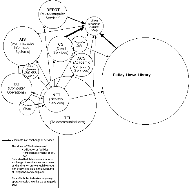
"Bubble" diagram showing present relationships among the various units subsumed (all or in part) in the Gateway Project.

The interaction between the units in CIT is more complex than can reasonably be shown on this sort of diagram. Consider, for instance, the use of the network. Everyone who uses a computer is likely to use the network, and since the network is maintained by Netwrok Services, there should be an arrow linking everything to the Network Services Bubble. Similarly, a very large number of UVM people make use of the Zoo Unix cluster, and again, there should be an arrow depicting this relationship.
To make it understandable, arrows are only shown when there is a direct providing of a service.