It encompasses the style, size, spacing, and arrangement of characters, and plays a pivotal role in conveying a brand's personality, values, and message. Consistent and well-chosen typography helps establish brand recognition and creates a cohesive visual identity across various platforms—setting a tone that evokes emotions that resonate with our audiences. Whether it's a sleek, modern sans-serif font suggesting innovation, or a classic serif font hinting at tradition and reliability, typography influences how consumers perceive a brand.
The following are official fonts to be used in UVM designs:
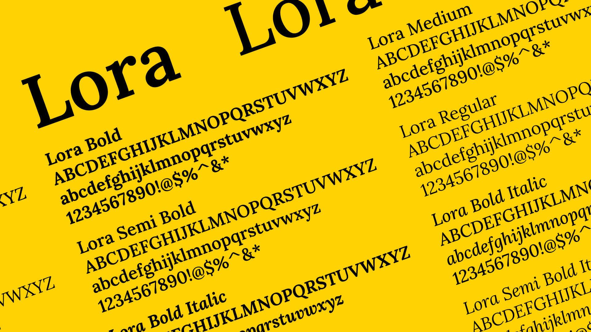
Primary Typeface: Lora
Lora is a well-balanced, contemporary typeface that draws inspiration from calligraphy. It is recognizable for its fluid curves and sharp serifs, and conveys a sense of tradition and authority while being youthful and approachable.
Download Lora from Google FontsLora Usage Guidelines
Lora is a variable font—meaning it is a font format that allows for multiple stylistic variations (i.e. weights, slant, etc.) that can be adjusted in design programs, rather than relying on pre-set variations (bold, italic, etc.), making it more flexible for use in designs. This typeface is optimized for screen visibility, but is also very effective in print.
As part of the University of Vermont brand, Lora is best suited for use in headlines. In more academic or serious materials, it can also be paired with an Acumin headline for use as body copy.
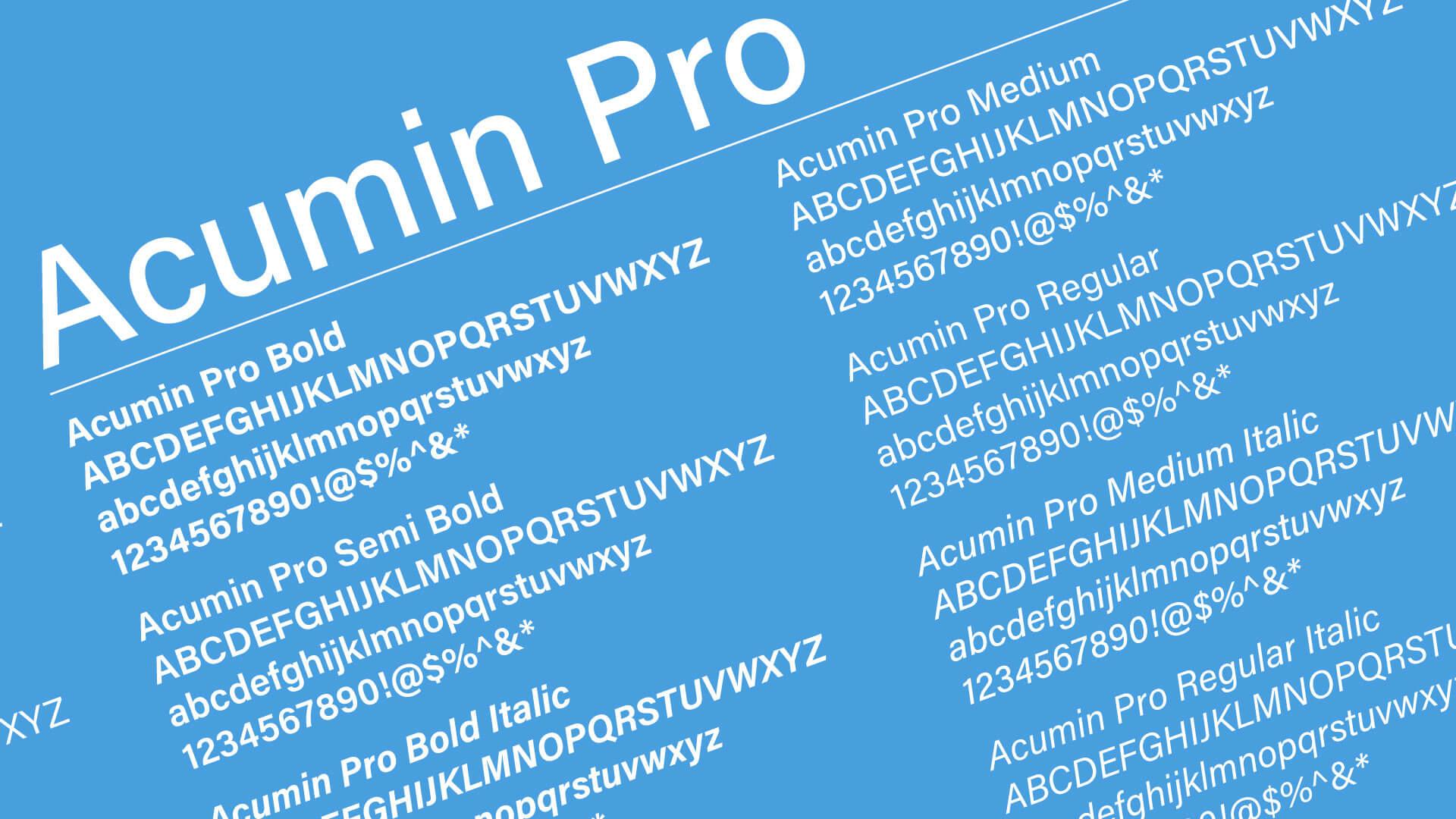
Secondary Typeface: Acumin Pro
Acumin, crafted by Robert Slimbach and released by Adobe in 2015, is a sans-serif typeface designed for text applications. It has been described as “a Helvetica for readers.”
Download Acumin Pro from Adobe FontsAcumin usage guidelines
The extensive Acumin font family comprises five widths—extra condensed, semi-condensed, condensed, normal, and wide—each offered in nine weights accompanied by corresponding italics. Acumin Pro is a variable font—meaning it is a font format that allows for multiple stylistic variations (i.e. weight, width, and slant) that can be adjusted in design programs, rather than relying on pre-set variations, making it more flexible for use in designs.
As part of the University of Vermont brand, Acumin is best suited for for folios, sidebars, sub-headings and body copy. Acumin is the University’ preferred typeface for print design. As body text, Acumin works well with a bold Lora header; or a bold, semi-condensed or extra-condensed Acumin header.
Acumin Pro is available as a part of Adobe Fonts subscription (included in most Adobe CC plans). It is also available for purchase seperately.
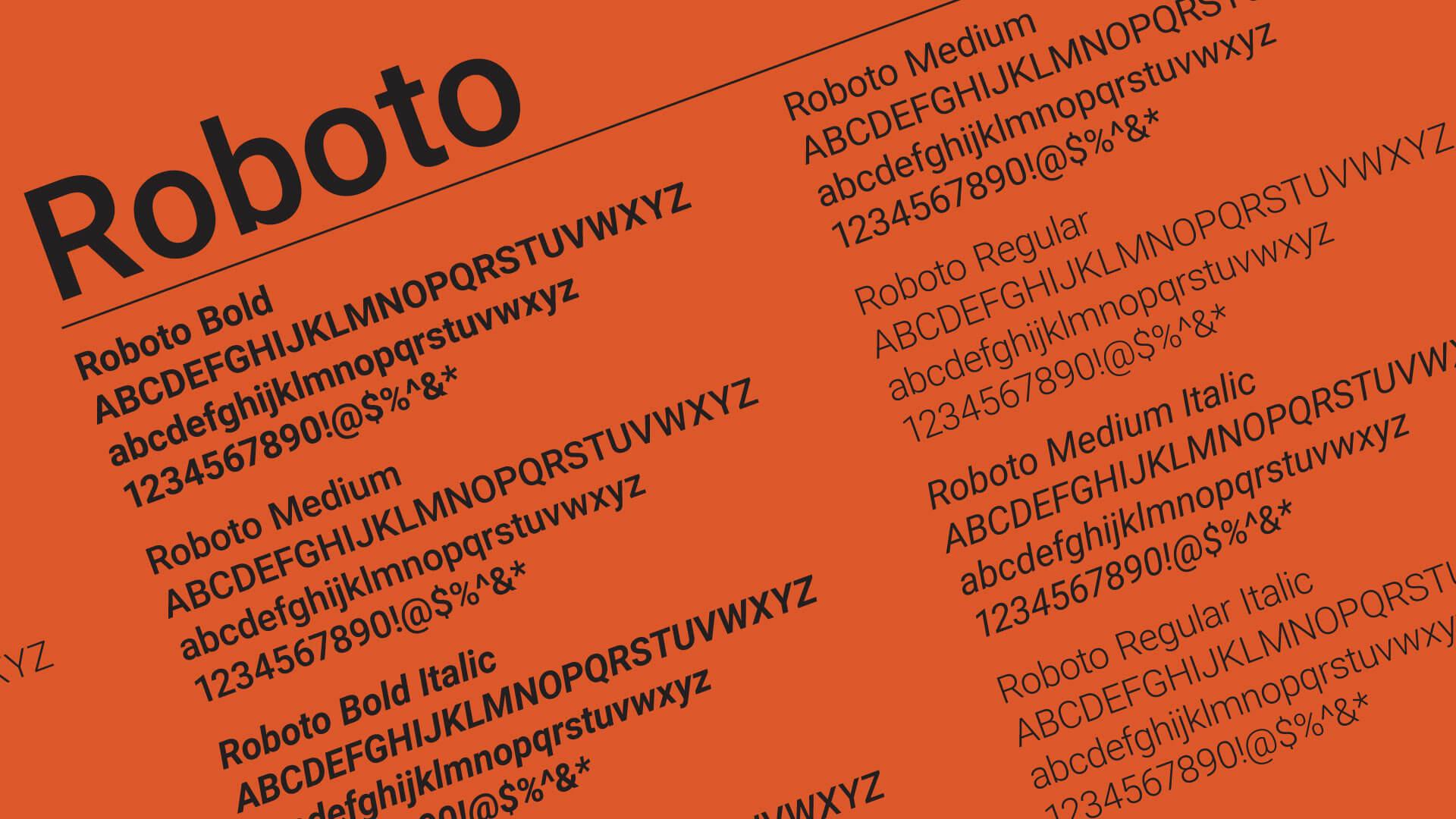
Alternative Font: Roboto
Roboto is a structured sans serif with predominantly geometric forms and friendly and open curves. These qualities contribute to a more organic reading cadence often associated with serif typefaces.
Download Roboto from Google FontsRoboto usage guidelines
A sibling in spirit to Acumin, is meant to be used as a substitute for Acumin on the web - and for designs in which Acumin is unavailable.
As part of the University of Vermont brand, Roboto is best suited for for folios, sidebars, sub-headings, and body copy. Like Acumin, Roboto pairs well with a bold Lora header.
A variable version of Roboto—Roboto Flex—is also available for download. While Roboto has predetermined styles (weights), Roboto Flex allows for multiple stylistic variations (12 available Axes, including weight, width, and slant) that can be adjusted in design programs, rather than relying on pre-set variations, making it more flexible for use in designs for the advanced designer.