Click the link below and save the following JMP file to your Desktop:
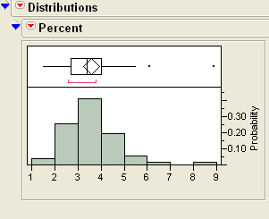
Proceed as in the Histogram tutorial to get the following JMP output:
Click the red down arrow next to Percent and select Normal Quantile Plot (JMPs terminology for the Normal Probability Plot):
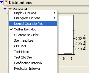
You should see:

Goodness of Fit Test
Click the red down arrow next to Percent and select Fit Distribution, then select Normal:

You should now see the following additional output on the far right:

Click the red down arrow next to Fitted Normal and select Goodness of Fit:
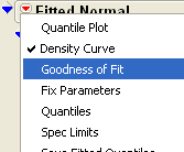
You should now see:
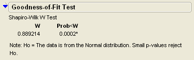
The smaller the number under Prob<W, the less likely it is that
the data comes from a normal distribution.
In this case - since Prob<W is equal to 0.0002 - we see that the data
are not likely to have come from a normal distribution.